I am preparing for a course in drawing roofs. One of the conditions is drawing with pastels, so I'm starting to understand what kind of material it is and how to work it .The first posts on this topic can be read here:
[Pastel. Two variants of one picture] Part 1
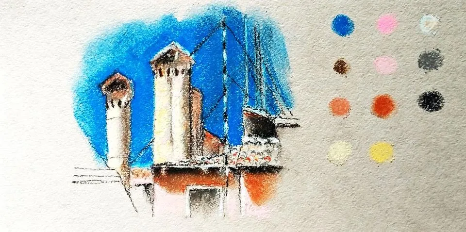
For the second work, I take the palette wider, but all the basic principles remain the same: building a picture, then filling with pastel and highlighting the silhouette across the sky.
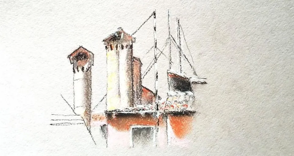
For the first option, I took a kraft paper of a light color. Kraft is a smooth paper, so chalk should have been good for it. But something went wrong (but maybe I do not have enough experience) - so it turned out what happened. Pastel Podolskaya.
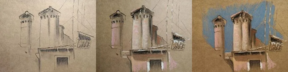
For the second art I use pastel paper PALAZZO and pastel MUNGYO. I sketch a dark brown color and a slight feathering in the shadows, fix the fixative:
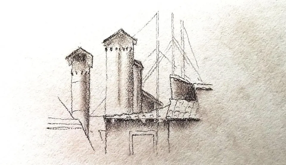
Fill the volume
And I add a bright sky:
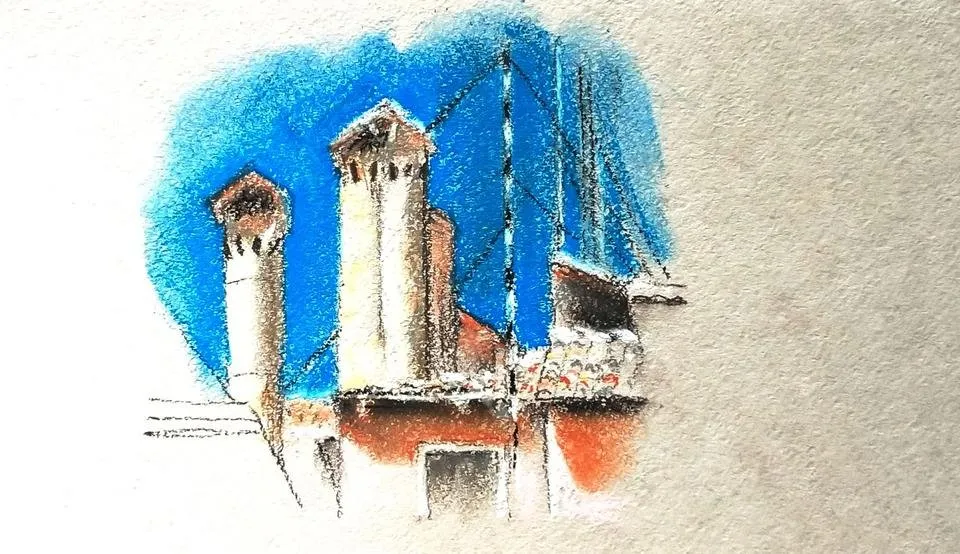
As you can see, with the second art it turned out more fun. I suspect that it's all about the color I'm using. And what do you think?
I remind you that I have a competition on photography of roofs here:
https://steemit.com/contest/@amalinavia/roofs-i-m-looking-for-interesting-photos-contest-get-sbd-for-the-photo
Thank you for watching!

Join us @steemitbloggers
Animation By @zord189
Order now!