Hi there
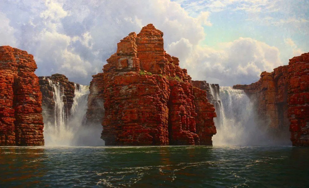
I'd love to show you the process of how I painted an epic waterfall scene of The Kimberley in Western Australia. Due to the length of my article, I've cut it into 3 parts. Enjoy!
If you want to check out Part 1 , click below:
https://steemit.com/painting/@andrew.tischler/my-art-in-the-making-painting-an-epic-waterfall
Step Two – Shifting Elements
I had not anticipated what a change in scale would do to the composition. Something niggled at me and I need to change something. After sitting with the painting for hours scratching my head I realized the cliffs could use some enlargement and extra character. I thought about how the cliffs would look it you were to approach them. It then took on a different vantage point from closer to the base of the cliff, and this made the geology a little more pronounced. Simultaneously, this diminished the waterfalls by comparison. This wasn’t entirely a bad thing, as it added another level of depth through forced perspective. I sketch in new lines on the painting and then fill in the shape to allow the cliff to meet this new edge.
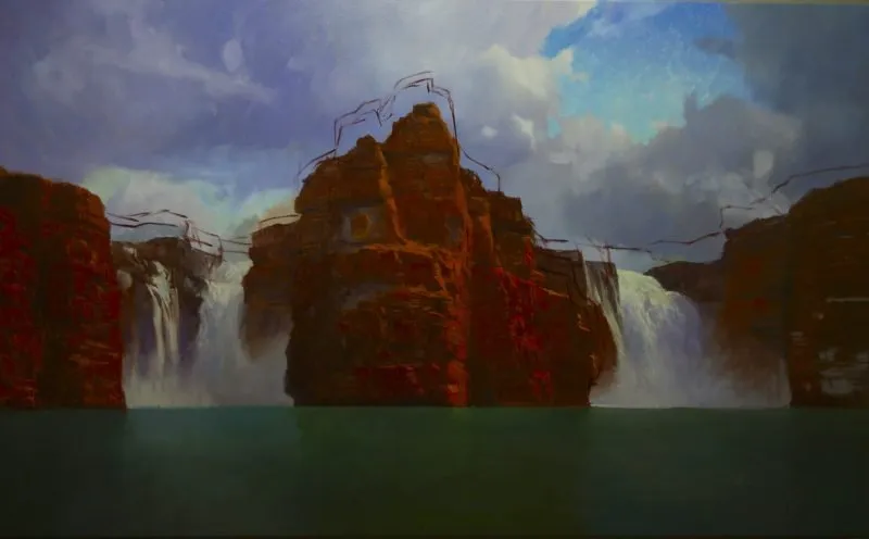
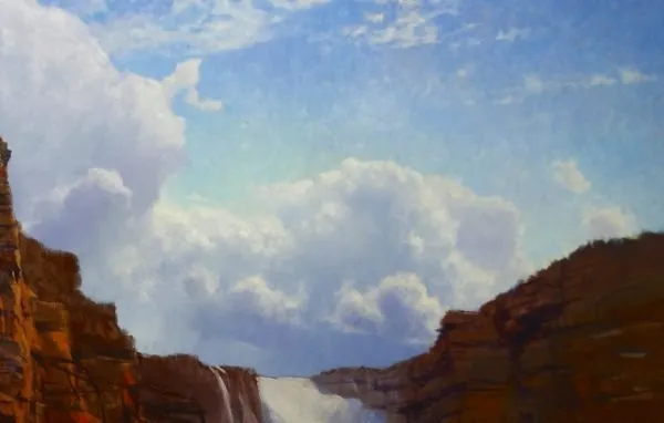
As I stand back and observe the scene fully I begin to see other possible changes. Whilst I am happy with the mood of the sky, I believe it has become too heavy to the right of the main cliffs. The storm forms a concentric ring, encircling a blue window and this happens to be nestled in the similarly shaped curve of the receding cliffs. This must be changed. I think I may introduce an open patch of sky here. Perhaps this change may allow for some restful place in the composition? I think so.
Before
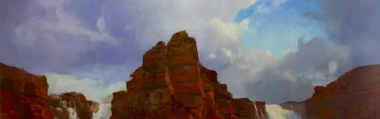
After
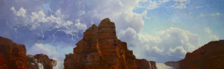
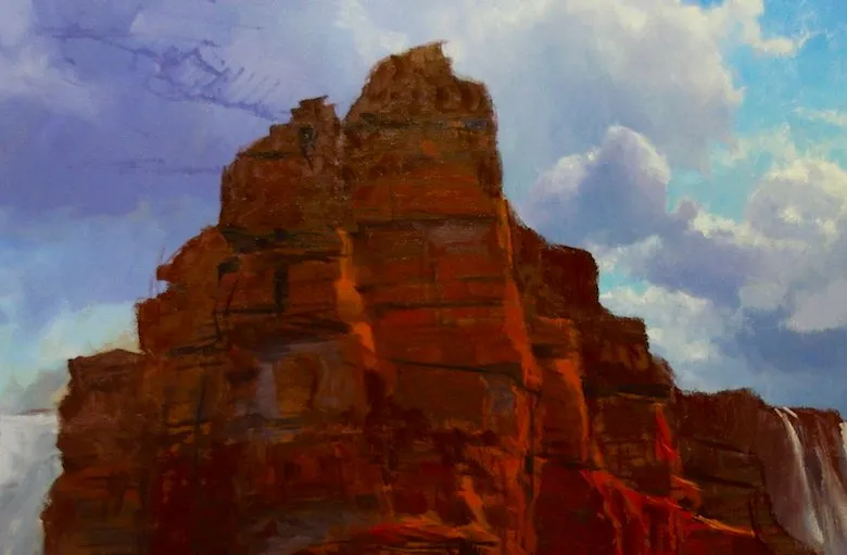
Step Three – Modelling Zones
Modelling the individual zones of this epic painting can take several weeks. This painting was on the studio wall for 6 weeks total! The hours are long and a typical work week can see me putting in 60 hours of “Easel Time”, even more if there is an intense deadline. It’s all part of the fun! The most involved part of this long and arduous process is the modelling. This is where tones are teased out, and manipulated with greater sensitivity, and more complicated colour mixtures are introduced.
Now I require a little more structure in my cliffs. I must emphasize the fissures and cracks that run along its face in a linear horizontal fashion. There is an added bonus with these lines, where as they climb the height of the cliff, they begin to angle downwards towards the horizon, enforcing a sense of perspective. The structure of the cliff begins to take shape. I am using a Burnt Umber and Ultramarine mix to create a dark tone, painted in with a bristle wedge shaped brush.
My Sky starts to gain complexity. I begin to map out even more colours. I start by intensifying the range of blues in the window of open sky. This is the same combination of blues as I have already mentioned, however, I increase the saturation here. It just so happens that blue looks quite intense when placed adjacent to its complement, orange. I employ a technique called optical colour mixing which is based on fragmented colours congealing and mixing together when viewed from a distance. I want the resulting surface to feel alive and “crawl”. This is achieved by increase the amount of single brush marks and varying the colours ever so slightly across the surface.
Now that I have cloud-masses I can shine light on them and allow them to take on even more shape. I strive to make each shape unique, and though there may be a pattern in the way clouds are formed I try to make each cloud individual in its character.
Cliffs
The most complex part of the painting would have to be the cliffs. Now that I have a good base to work with I take on the cliff one patch at a time. There is no shortcut that I know of when it comes to painting this kind of sedimentary deposit. I model each brick as it is a form in its’ own right. It has a highlight, a base colour, some variation perhaps, and a shadow line. How do you build a cliff? One block at a time!
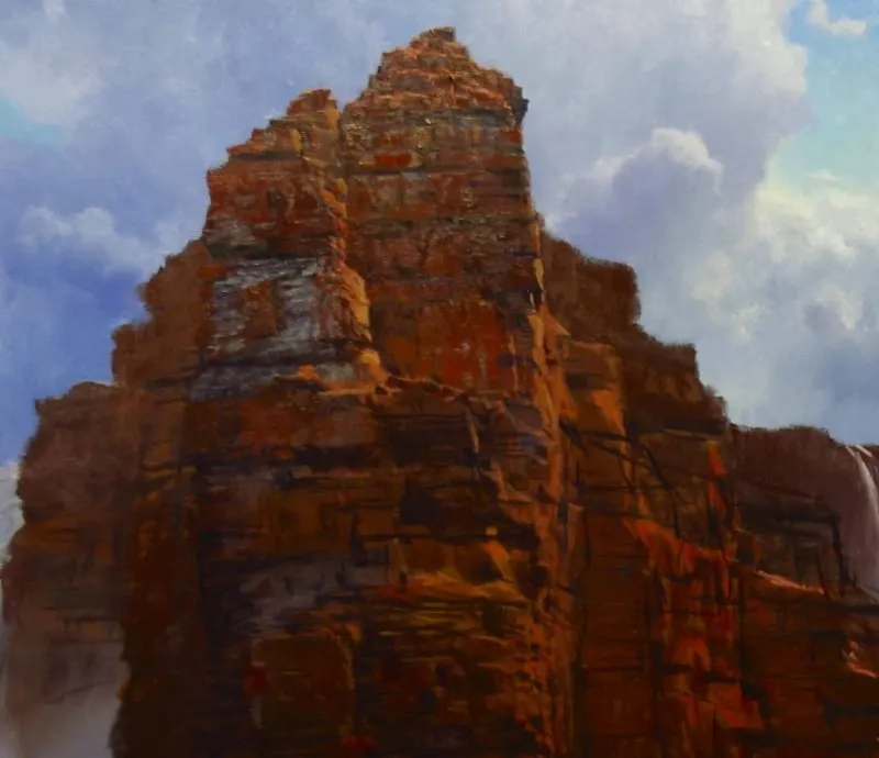
I increase the saturation is areas sporadically along the surface of the cliff to add interest and give the feeling of a weathered texture. Using some new colours made by Langridge Handmade Oils, I introduce Transparent Red Oxide to add a dimension to the Cadmium reds. Also, by using Quinacridone Magenta, I can round out my red notes and stop these colours in their tracks if they get too out of hand. There are also some ochre’s present in the scene, so a mixture of Yellow Oxide and Nickel-Azo Yellow integrate with these reds well.
I hope your enjoying the process, if you want videos on painting, you can catch me on youtube @ https://www.youtube.com/user/AndrewTischlerArt
Part 3 Coming soon!