Hi Steemers
If you want to checkout the process of how I turned this photo into a painting and haven't seen Part 1
Check it out here: https://steemit.com/art/@andrew.tischler/behind-the-scenes-painting-the-great-australian-egret-part-one
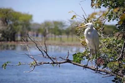
Reference Photo
Part 2 as promised - Detail and the final Painitng!
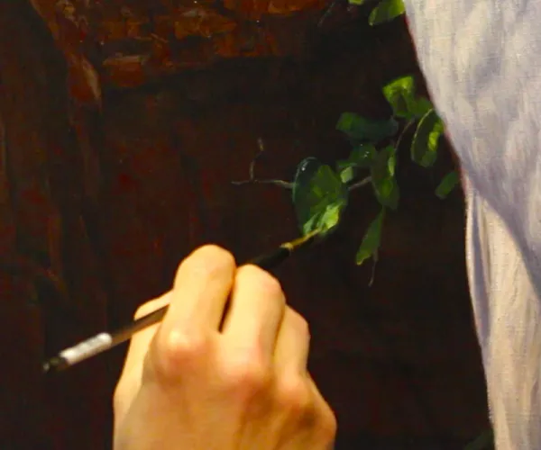
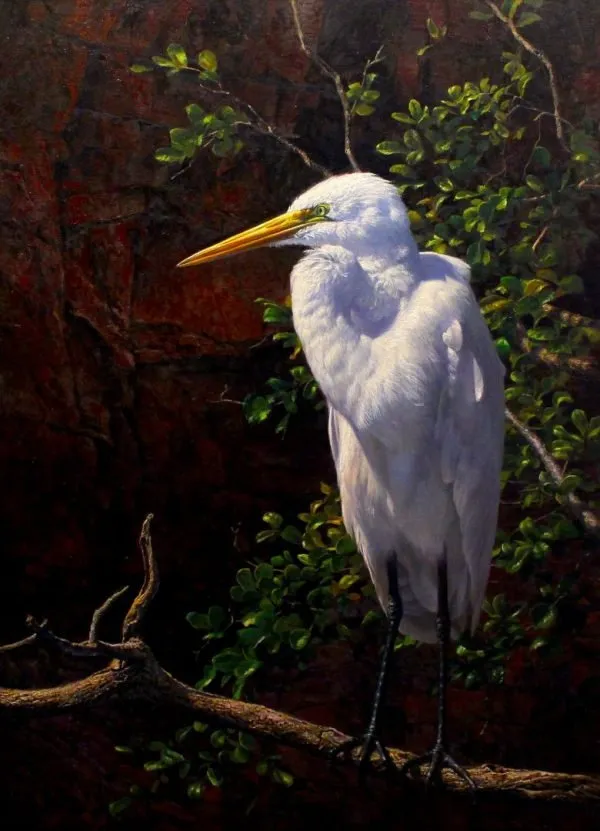
I felt that this painting needed another colour element to contrast with the red background. As green is the complementary opposite to red, it was only natural that the solution I was searching for would be foliage behind the Egret. The leaves are painted with a concerted effort not to repeat the exact same form colour and positioning, so that the arrangement appears natural. My colours here are subdued. I also do not want the tones to outshine the bird. If the background were to step out ahead of the bird, that would make for an awkward painting!
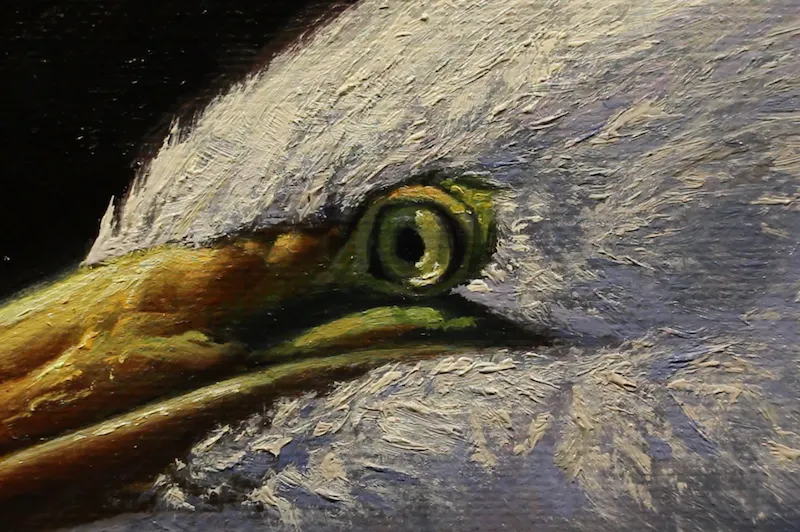
The lightest light I can go is Titanium White; the darkest I can go is black. Now, I know what you’re thinking: “Duh!”. Well we need to keep this in mind if we are to create the illusion of white feathers. We must preserve our lightest tones for the very end. I will also extend this rule for the darkest tones as well. Again, this helps round out the form and give it shape.
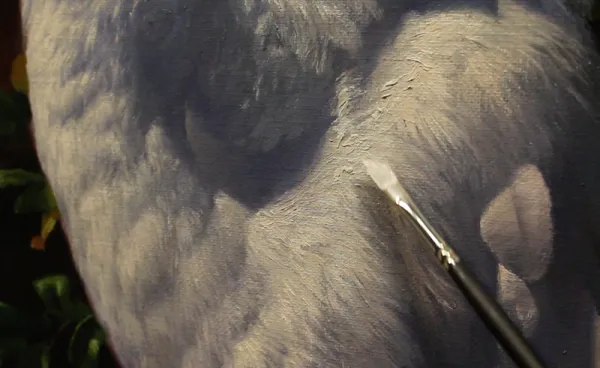
Light highlights occur when there is adequate contrast in the area. The bird may have looked white before, but it was actually a dull grey, as the pure white is added, it jumps off of the surface.
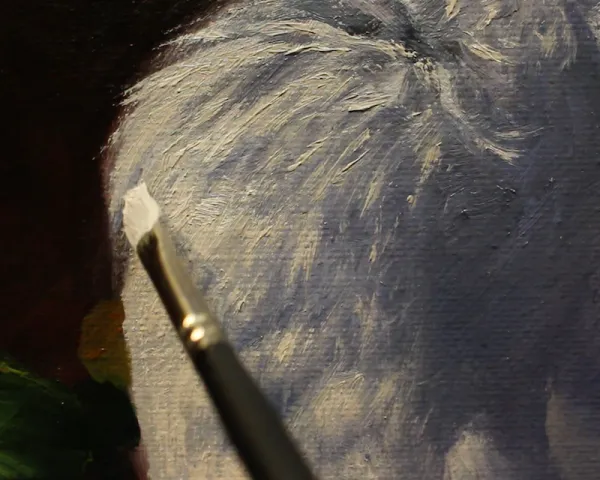
One thing that stands out more that pure white, is THICK pure white. So, I mix in a liberal amount of impasto medium and apply is sparing amounts. The thickness in the white highlights reflects light more towards the viewer. This is a little trick I learnt while trying to allow for intense highlights, under a lit gallery setting.
Thickness, form and colour is given to the Great Egrets beak. I re-define major character lines and tighten up the brushwork, along with selectively increasing the saturation in places. Warmth is again added in areas where the light will transfer down through the surface of the beak.
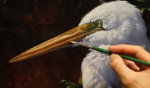
Time to give our bird a makeover, and get the direction to the fine feathers on top of the head. I add several marks in the right direction to give it the typical Egret swept-back look. Notice how there is a variation in the marks in terms of tone and colour? It is far from uniform! This I feel gives the bird a sense of presence on the canvas and makes it appear a little more realistic.
The eye has a few delicate components to it, which may or may not translate on the painting. It all depends on the individual scenario, lighting and where the bird is looking. Here the eye is a flat disc, where the light shines down the iris. The cornea, along with the aqueous humor below the surface fails to catch a highlight at this angle. I may however add a spot of light in there…still deciding!
So there you have it, The Great Australian Egret! I feel good about this addition to my portfolio, it has been a long time coming, and a subject I have put off for far too long! I believe that there are few things more detrimental to a creative practice than getting stuck in a rut painting the same thing over and over and over. Sometimes, things just need to come through you. I certainly feel a paradigm shift coming in my work, in terms of subject, and treatment.
Hope you enjoyed!
I'll be using Dtube shortly, which are all about education for artists, hope you look out for me there.