Last month, the Hive community helped me choose which of my pieces of Spider-Man Original Art was the next to get framed up for my ever growing gallery. I gave a choice between 6 lovely pieces of art, all of which were Original published covers of my lifelong favorite title…The Amazing Spider-Man. Eventually they will all be hanging on the walls here, but since I’m not rolling in dough at the moment, it has to be a more disciplined approach. Luckily the Hive community is here to help me make the hard decisions!
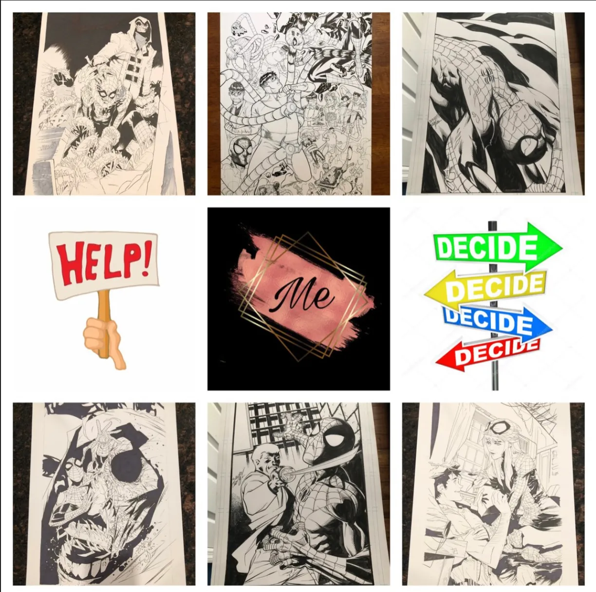
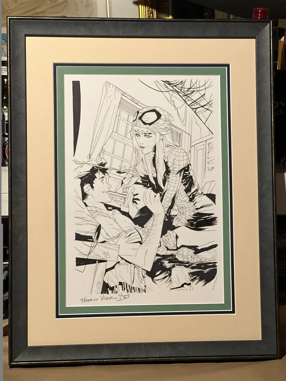
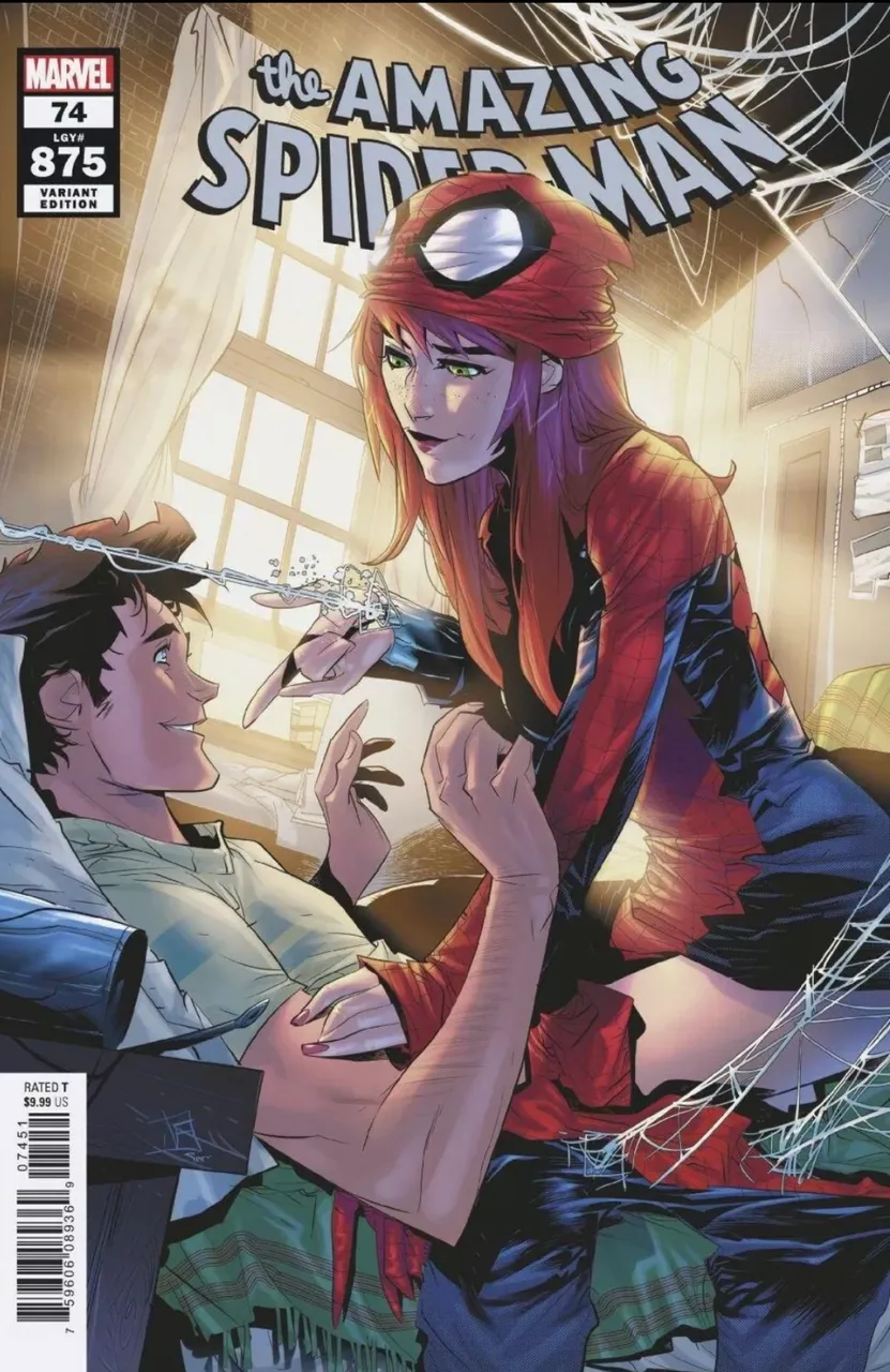
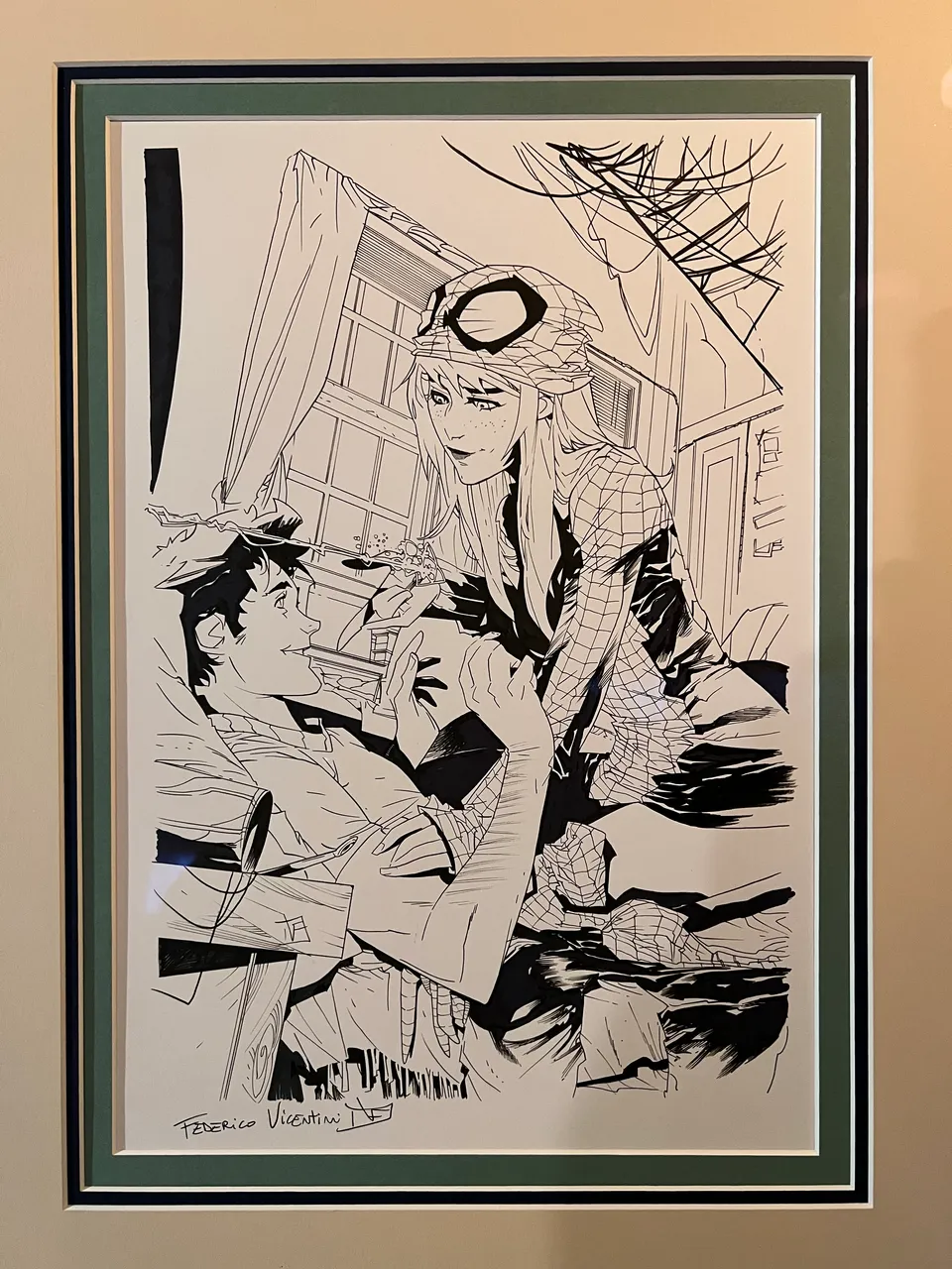
As I mentioned, the 6 pieces considered this round are all published covers with 3 covers by Federico Vincintini, 2 by Mark Bagley, and the last by Javier Garron. All are deliciously deserving but the community chose one of Federico’s pieces…the cover to Amazing Spider-Man #74. Well, a variant to it…and a lovely choice I might add.
So a few weeks back, I popped down to my local Michael’s Craft Store, which is where I get my pieces all framed up at. They hold a 70% off sale several times throughout the year, so I always try to take advantage when I’m able to. After some trial & error on what might work, I decided on a lighthearted approach. Basically…I wanted some color.
A majority of my frame jobs end up with lots of deep blacks, blues, and reds. I wanted to stray from that for this piece due to how it’s a feel good piece of art. Most of the covers depict Spidey in some sense of danger as he battles for his or someone else’s life. However in this one, we get to see a tender moment between Peter & Mary Jane as she rocks the Spidey duds. It’s a rare bright spot in a complicated life, so I wanted to embrace a bit of that.
I love the sunlight beaming through the window, so I opted to capture a little bit of that in the bright sunlight yellow matte. The other 2 mattes used are a pretty green seen in Peter’s shirt and the blanket, along with a dash of deep blue that’s found in the suit MJ is donning. As for the frame, this was a brand new option offered up. The thick housing of it has a subtle hint of blue and is surrounded by a thin piece that reminds me of the brick wall in the published colored piece.
All in all, I’m thrilled with how it came out. Once it’s sitting with the rest of the pieces in the gallery, it’ll add a little bit of happiness in an otherwise world of death, destruction, darkness, and despair that these pieces usually depict. I’d like to thank those that helped me make a decision on choosing which piece to house next. Sharing this passion of mine with you folks here is a real treat, and I look forward to your help and insight on my next trip to the framers!
Blewitt