Following up on my last post, where I showed off some of my illustrated contributions to the recent Tommy “Hitman” Hearns NFT Collection, here’s an extra look at some “behind the scenes” material as well.
My artwork creation process has been quite disorganized this year. In fact, it hasn’t really been much of a process at all, more a series of experiments... and thus the disorganization!
When confronted with an unfamiliar challenge and hitting a brick wall, I can always fall back on my comic book roots and that happened in the case of these illustrations.
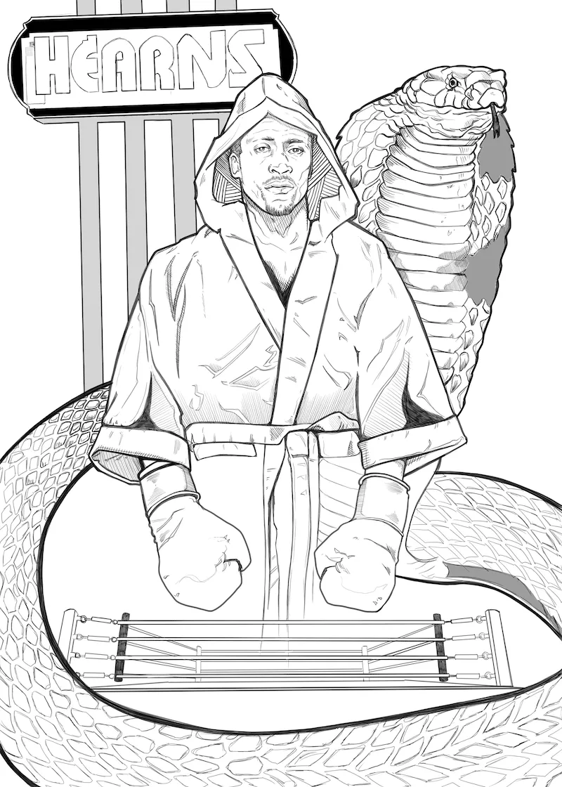
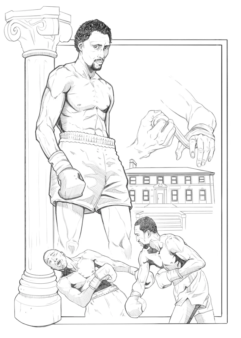
It all starts with the pencils. (Well, technically rough layouts come first… but you get the idea!) This is very familiar to me from comic artwork and the stage of production I’m most comfortable with. Tommy Hearns is known as the “Hitman,” but he also has another nickname; the “Motor City Cobra.” C’mon… with a nickname like that you just have to seize the opportunity to draw a badass snake right? So I did. In some areas these pencils actually aren’t incredibly tight and detailed. This particular image was the fourth that I worked on and by then I’d gotten a feel for what areas I was probably going to detail out entirely during the coloring stage and thus didn’t waste as much time on them during penciling.
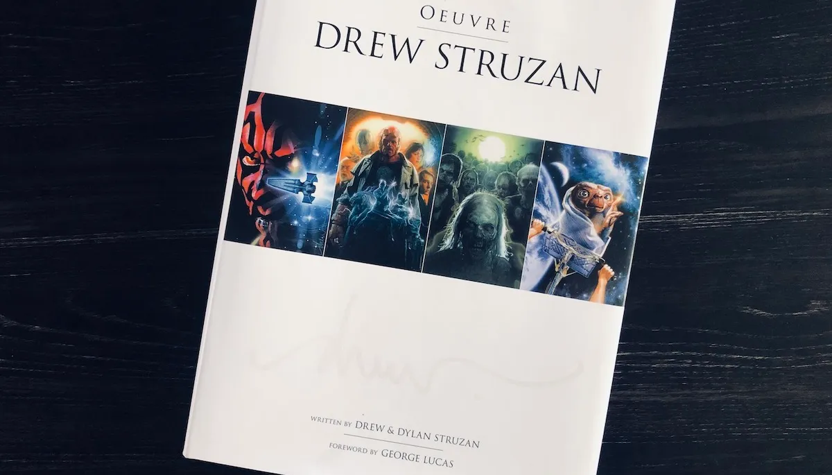
Unlike many comics which then move to an inking stage, I decided to render the pencil work more detailed than usual and go straight to color. The initial request had asked for images that were in the spirit of artist Drew Struzan. Even if you don’t recognize Struzan’s name, you’d almost certainly recognize his work. He’s responsible for a myriad of movie posters over a number of decades all done in his beautiful illustrative style. His work is synonymous with massive franchises like Star Wars and Indiana Jones. I was passingly familiar with Struzan’s work and looked up a bunch online, but being a lover of art books I also used the assignment as an excuse to pick up yet another and do some studying!
I decided to forego inking after looking more at Struzan’s work as his pieces are very textural and the pencil lines emulated that feeling better than my inking would.
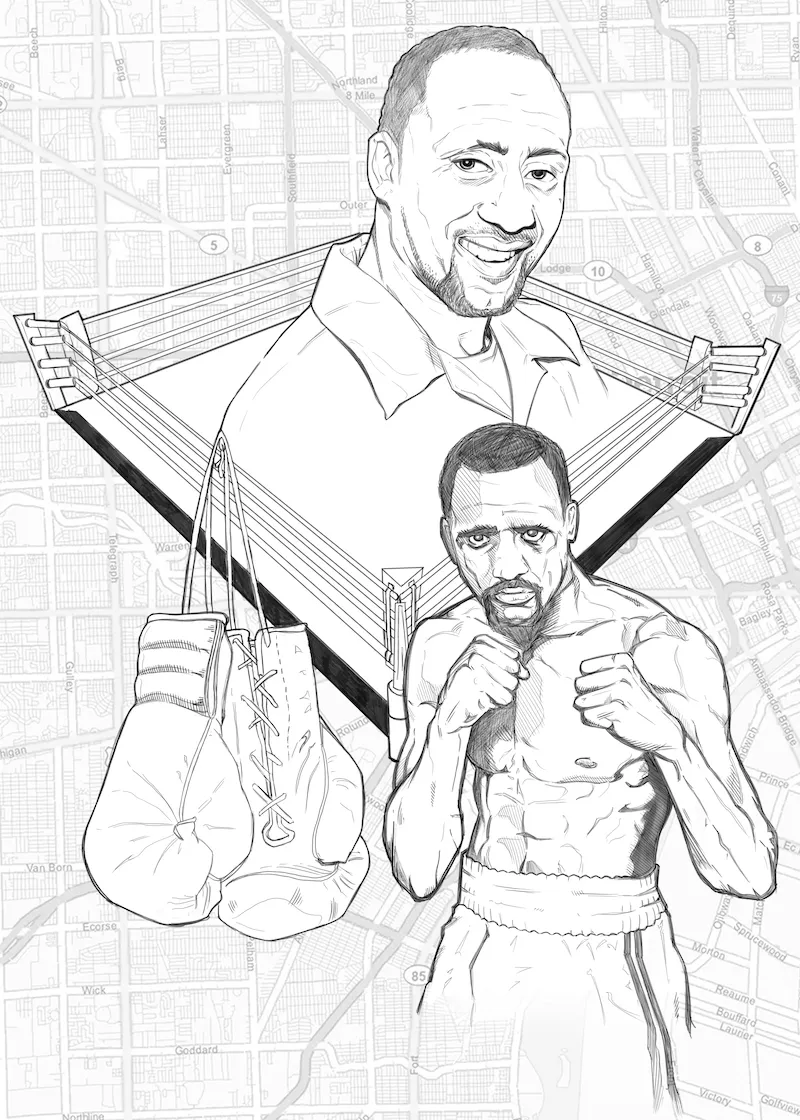
Below are a couple more examples of the pencilled work prior to color. The top one is probably the biggest direct nod toward one of Struzan’s montage style layouts as I was inspired by the poster for the movie “Angels in the Outfield,” of course substituting in a boxing ring for a baseball diamond!
When it came time to color, I first approached it in a very painterly fashion, again trying to emulate some of Struzan’s technique. However, my skill is not on that level and painting is a weaker area for me.
My first attempts were okay, but appeared rather washed out and muddy as I just wasn’t used to building up the values, colors and detail in a more traditional (albeit still digital) way.
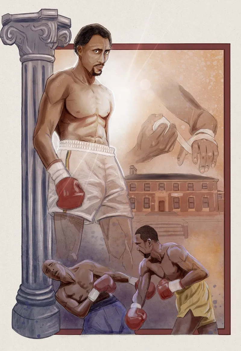
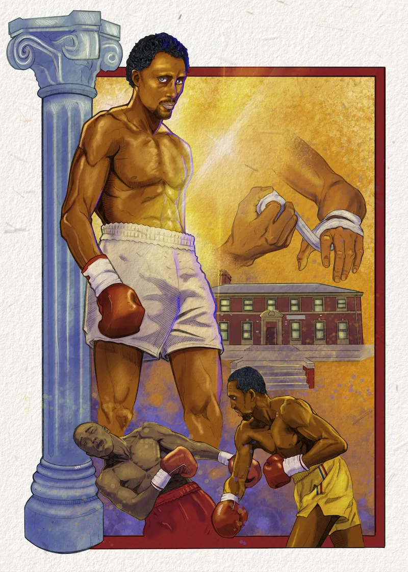
As I moved on to the second and third pieces I altered my coloring technique back to a comic book style workflow in which the entire piece is first filled with flat color and from there extra layers of both shadow and highlights are added. I’m much more used to working this way and it gave me a wider range of values and more saturated look that I liked better. While I wasn’t exactly using painterly techniques, I did my best to find and utilize brushes and textures that helped to mimic that effect with at least some success. Since the first piece now stood out from the grouping and looked very different, I circled back to it toward the end and re-rendered it into a style that was more cohesive with the rest of the set.
To top off the disarray of my learning and experimenting, in the midst of this project I also received a new piece of equipment in my studio, a brand new Cintiq drawing monitor, and I was eager to put it to use! Afterwards my workflow was split between the Cintiq at my desktop computer (all the while fiddling with new settings, configuration, and hotkeys), while also heading back to my iPad for color work as I already had a better handle on creating those more textural effects when using the Procreate application which is only available on iOS. But I digress! I think those details and discussion are best left for another post or two! (Hopefully sooner than later as my intent to share this “behind the scenes” look a couple days after my first post turned into 17 days! 17 can still be considered a couple, right?)
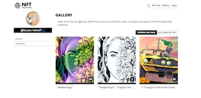
While you’re breathlessly awaiting my next post, you can always check out the Tommy Hearns Collection for yourself! Packs are still available for purchase!
See you soon, I gotta go do some more drawing experimenting!
-Bryan "the Imp" Imhoff
Follow me for more behind the scenes looks at the creation of "I Thought It Would Be Zombies..." Your votes help support its production! Also look for limited edition digital artwork for sale on NFTShowroom.com