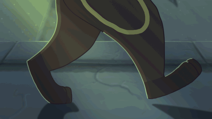
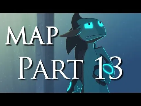
Hey everyone! Today I'm going to be showing you a breakdown of an animation I did a while back as part of a collaborative project (shown below). In this blog, you'll be learning the step-by-step process of how I produce my animations! (Just as a quick disclaimer, I am self-taught in my animations so I might not necessarily get all terminology 100% accurate. This is just my way of doing things!)
Let's get started shall we?
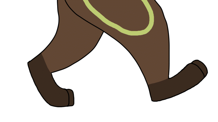
STAGE 1 - ROUGH SKETCH / KEY FRAMES
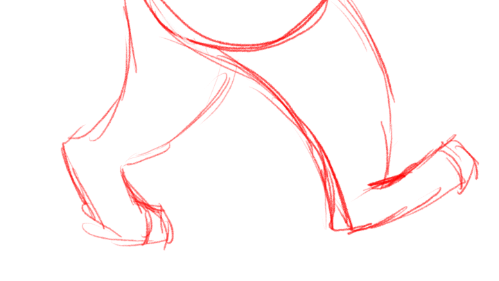
Just as an FYI, I used TV Paint Animation 10 Pro for this animation. I always start out my animations by roughly sketching out the key frames, AKA, the frames that make the action. I like to think of them as the "before and after" of an animation. These keys will have frames placed between them to smooth the animation out later.
You might notice those little charts that show up from time to time on the side of the frames as the rough sketch plays. These are called time charts. They're used to plan out the placement of your inbetween frames later so you can plan out the speed of the motion. The top of the chart shows the first key frame in the action, and the bottom of the time chart represents the last key of the action. Any points in between those two keys are the inbetween frames. Think of the time chart like a timeline. The farther down the line you are, the farther in time you are as well. If you want to make an animation speed up, most of your ticks representing the inbetweens will be closer to the first key frame, implying that, when you draw those frames, the subject will be closer to the first position than the last. If you want the character slowing down, those ticks will be closer to the last frame, and so on. If you would like, I can make a separate post explaining in more detail how time charts work. Let me know in the comments!
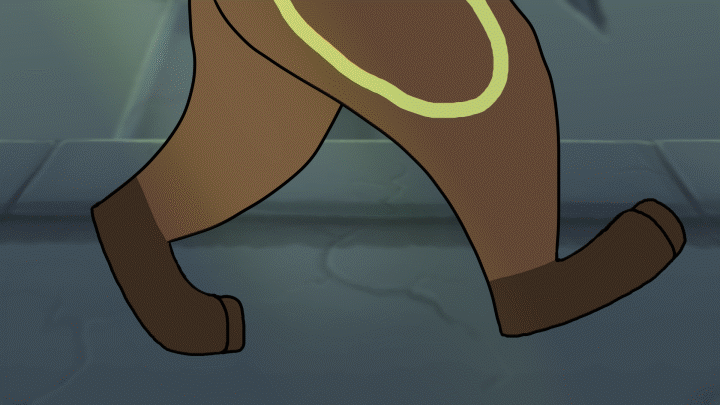
STAGE 2 - SMOOTH SKETCH / INBETWEENS
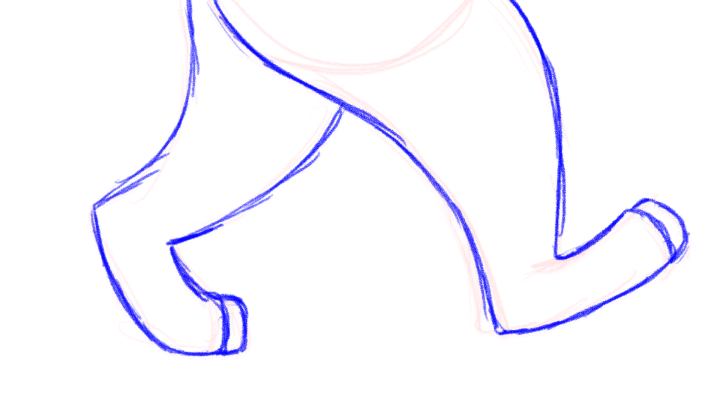
This step is pretty simple. Since I planned out my actions in the rough sketch / keying stage, I cleaned it up in the smooth sketch stage and added my inbetweens. This way I can see the action in more detail to get it ready for cleanup.
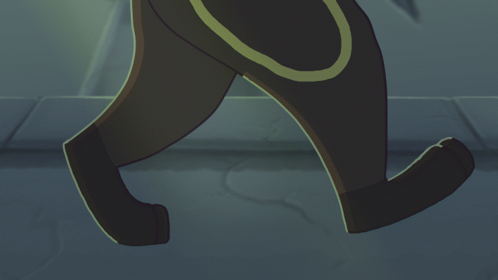
STAGE 3 - LINE ART / CLEANUP
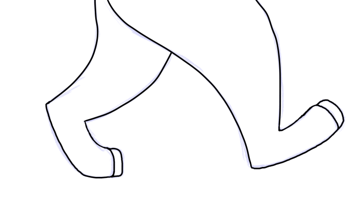
This is probably one of my least favorite parts of the process. It's not difficult at all, it's just very tedious and time consuming. It's basically just cleaning up the lines and getting the character ready for coloring, shading, etc.
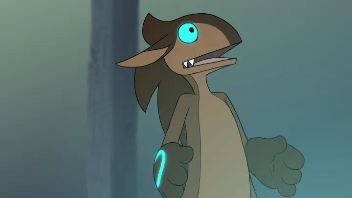
STAGE 4 - COLOR
As the name implies, I colored the character. Now it's time for the real fun to begin! Hehehe...
STAGE 5 - BACKGROUNDS AND LIGHT SOURCES
It's finally time to make this dude stop talking in an empty white space! You can add the backgrounds before or after sketching, it really just depends on what you're doing. I like to roughly sketch the backgrounds when planning my animation and then complete them later once I've made a final verdict on how I want the animation to look! In this particular animation, I painted the backgrounds in Photoshop and then imported them as layers into TV Paint and animated them using simple motion keying (one of the effects options on TV Paint). I also added the glow to the character's designs, as well as some some gradients to represent lights just so I have a mental note on where the light rays are coming from that I planned to add using Adobe After Effects later.
STAGE 6 - SHADING AND HIGHLIGHTS
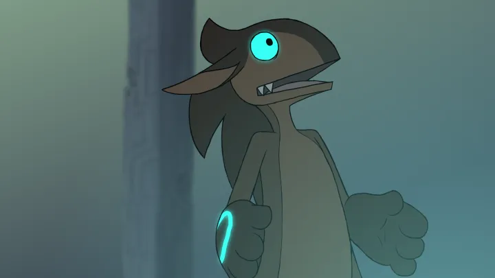
Now for me, shading and highlights are a multi-step process. For the sake of not having so many gifs playing at once, I am going to show a single frame to break down this process and show how we jumped from the character being flat and out of place to the character fitting in to the environment.
Here is our starting frame that I will use for this example (Fun Fact: This is frame 179.)
First, we want to add ambient lighting. This is the general lighting of the environment. It's the lighting that bounces off of everything and makes colors not look like their true color anymore. This will help immerse the character into the environment so he doesn't stick out like a sore thumb.
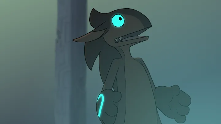
Next comes the shadows, caused by a thing called Diffuse lighting. In short, it's the directional light. If there was no ambient lighting, The shadows caused by this lighting would appear black.
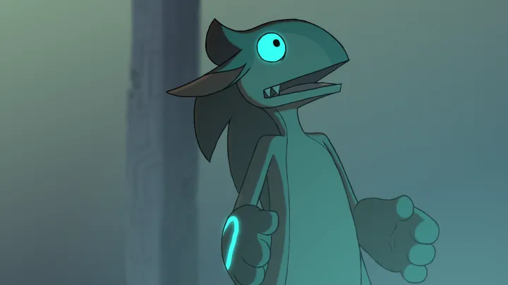
Now for the highlights. I used blue highlights from the lighting that comes from the statue behind the character.
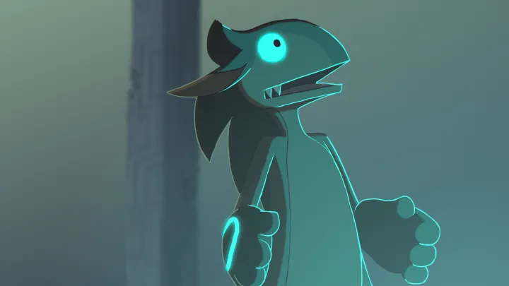
And finally, I touched up the lighting using colored line art. I always avoid using black unless absolutely necessary, because it can be quite jarring, especially with my thick line style. Instead, I color the line art to react with the lights as well, making it a darker version of the subject in the shadows and a lighter color if I want to use it to aid highlights.
STAGE 7 - EFFECTS AND FINAL EDITS
In this final step of the process, I sent the animation to SubsonicFire (someone from YouTube) who did his After Effects magic on it! And this animation was born:
I hope you all enjoyed this animation breakdown. Let me know what you think! Don't forget to toss me an upvote if you enjoyed this post, and feel free to follow for more content like this! And if you have any questions, feel free to ask. See ya!