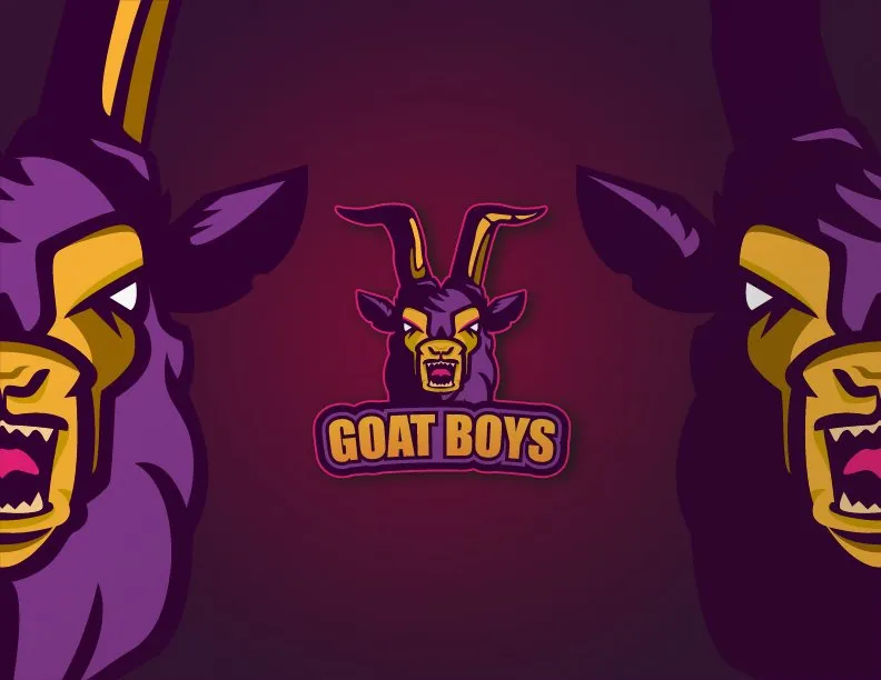
Goat Boys
This time I'm here to show you how I made a vintage Logo for personal use, one like those used to represent sports teams or that are currently being sought after by gamers, to represent their gaming teams.
These designs are inspired mostly by animals, or as some would call them mascots, this is to the liking of each one and depending on what they want to represent, so I will show you the process that this particular piece required.

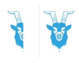
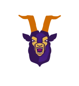
Everything starts in Photoshop CC, as I told you above, mostly based on the creation of a mascot, this is at the judgment of everyone, in my case, one of my favorite animals are goats, so I decided to create this logo and name it "Goat Boys", having the name and the animal to be used, it our job to look for some references and start creating sketches and ideas, if you want to make a logo for the team "Golden Bulls" then you know that you must look for references of a bull; I quickly made half of the goat's face as a sketch in blue and once I was happy with the result I duplicated it and mirrored it to have what we might call a symmetrical design.
Having the basic sketch, I took this image into Adobe Illustrator CC to continue and complete my work there. Using the Pen tool I start to generate solids to give shape to the goat, it is always advisable to break the image in our head so that we have clear which solids or layers will be behind and wich ones will be on top, maintaining order when creating this type of illustrations is crucial if we want our workflow not to get complicated.
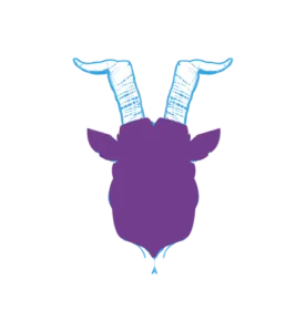
I create a solid or the silhouette of the goat's head, and here the whole vectorial journey begins, little by little we redraw or vectorize each zone, defining the spaces and delimiting each element.

When creating these basic solids, it is not totally necessary to work with the color palette that we will use at the end, in particular I like to work with random colors to distinguish each zone and so not to confuse me, later I dedicate myself to choose the respective colors.
Something important to remember is the position of each solid or line in the workspace, for example up here, you can see how the horns go behind the silhouette or contour of the face, and on top of them would be the skin layer, followed by the contour that defines areas like the eyes, mouth and so on, an organized work area is one less headache.
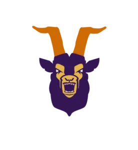
I continue to create new solids, as you see above, I already have all the main aspects of our goat defined, so now I create new shapes using a lighter tone to start generating volume.
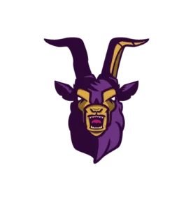
Now I've chosen the colors I plan to stay with, and I'm adding details of shadows and lights to define and enhance each area, giving it more depth and creating a more eye-catching illustration leaving the flat design behind. You can notice that I decided to color the horns the same color as the base of the goat's coat, specifically because I want the attention to go directly to the face and not to deviate to areas less important to me in this case.
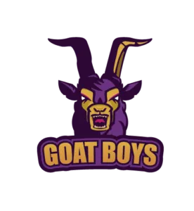
At this point my mascot is ready, just need to create or choose the typography that will accompany it; so I decided to use a bold font and by moving the text a bit, playing with the name, I achieved the result I show you next just by using the Arc tool and adding some layers of gradient.

Having our name ready, we have to join it to the mascot, I used the same color as in the face of the goat to create that contrast and balance in the design, using different tools I made the blocks that accompany and serve as a base to the font, and also makes it easier to merge with the mascot.
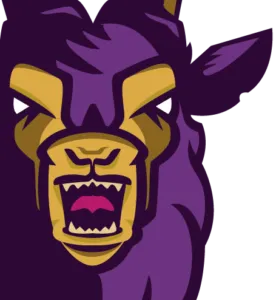
One or two details are added to the creation as we go along, such as the magenta glow I added over the eyes, all of this in order to highlight specific areas. Now my design is ready, all that is left is to present it with a striking background and to adapt to it.
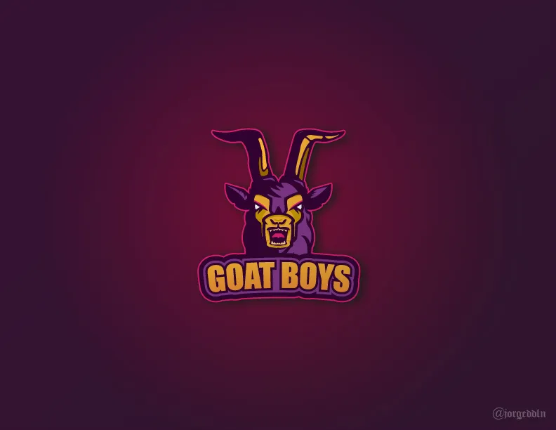
To finish, you can see that I added a magenta contour that helps to separate our logo from the background, and also combines and complements the brightness I told you above I add to the eyes, the final result is the sum of all the creative process I showed you, along with a solid background, a gradient on top of the background using certain layer modes, and also a parallel shadow created manually to give that effect that separates the logo from the back.

It is a pleasure for me to share my work with you, and above all to get your opinions, to know if you liked it and what you liked the most, if you have any questions ask me, I will gladly answer, that's what it is all about, sharing and learning, maybe by answering your question I will learn something new too.
Tell me,
Do you want to be part of "Goat Boys"?
All rights reserved, design by Jorge Arellano @jorgeddln