Hi everyone! I have been making oil paintings since 2012 and i have already posted few of my works here. But today! i will post about the process in making such masterpiece.
Materials:
Oil Paints
Paint Brushes
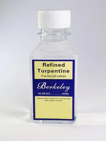
Turpentine
Canvas
Pencil
I used Grumbacher brand on my oil paintings and i prefer not to use Pre mixed colors so that i can use the kind of hue i wanted.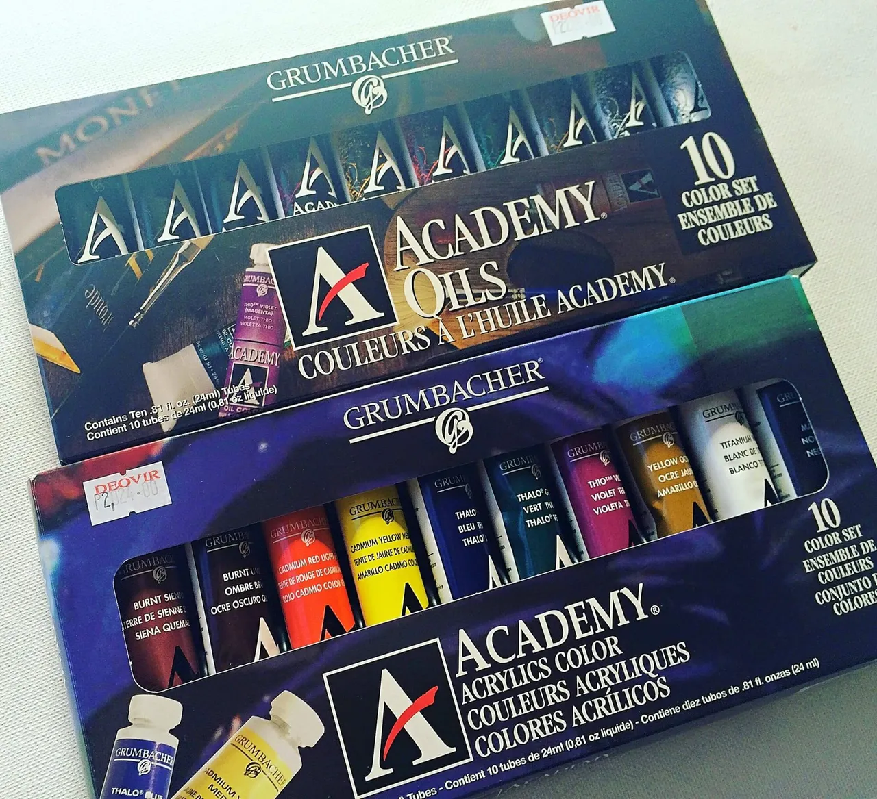
And use a rectified/refined turpentine because it is oderless. Turpentine is used as a vehicle for the better usage of the oil paints. And yes, i prefer Berkeley brand
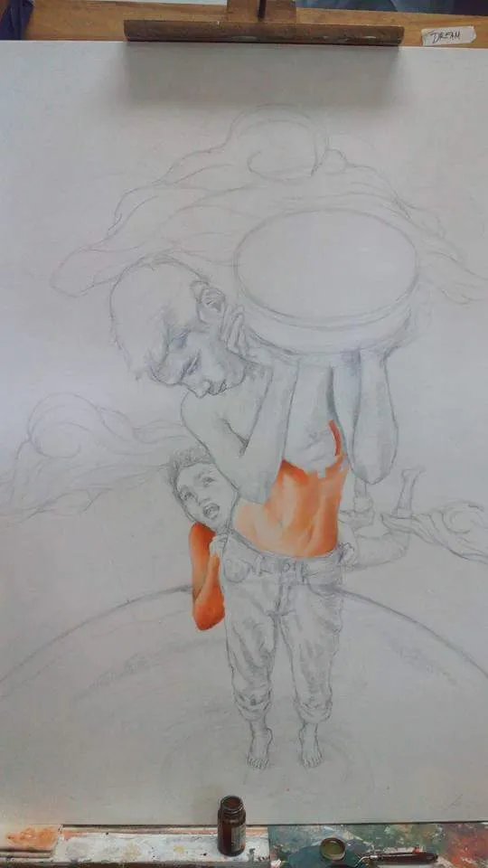
Basically the first thing I would do is to draw the said images that should be painted. But we will skip to that part since we will focus on the painting part.
The Steps (I do)
First I choose the colors I wanna use. And for me, I always paint my subject/emphasis first before anything else.
I painted the skin tone first. I used the colors Vermillion(red) and Yellow ocre(yellow) Which would result to an orange tone. For tone control I use Titanium white to lighten the color and burnt Umber to darken it. I use pointed brush for details and a flat brush for blending the paints on the canvas.
I always try my best to make it as realistic as possible so that it would be more catchy in the eyes.
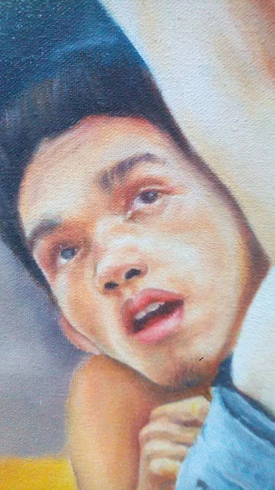
And here is a closer look for details
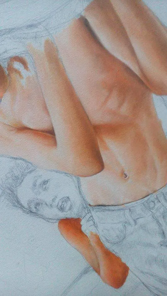
(by the way, I am the model of my own painting so please do bare with my body structure lol)
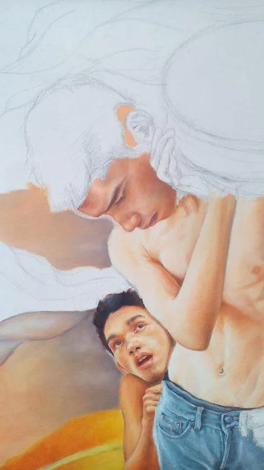
This time I tried covering all the skin tone as much as i could including the head. And put a layer of background to see if the head looks realistic with background.
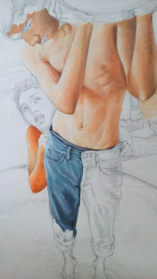
Now moving to the next part. I painted the jeans and I used the colors Cerullean Blue and Paynes gray. Paynes gray gives a tint of blue when it is mixed with white. So I believe it would be perfect for painting jeans. Same process with the skin tone. pointed brush on the details and flat brush for blending.
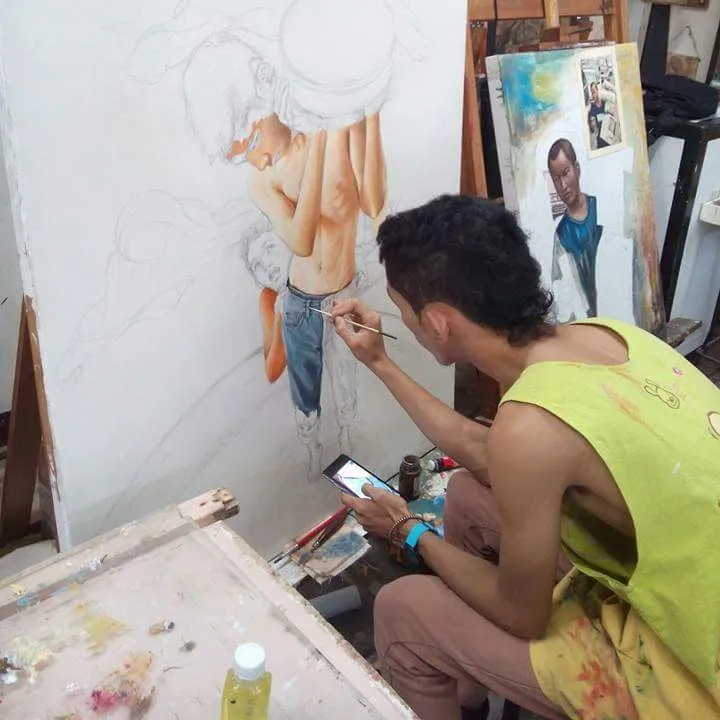
And ofcourse a picture of me while painting back in the days. Most of the time i use tiny brushes for better details. (doesnt matter what size the brushes are as long as it satisfies your need for painting the details)
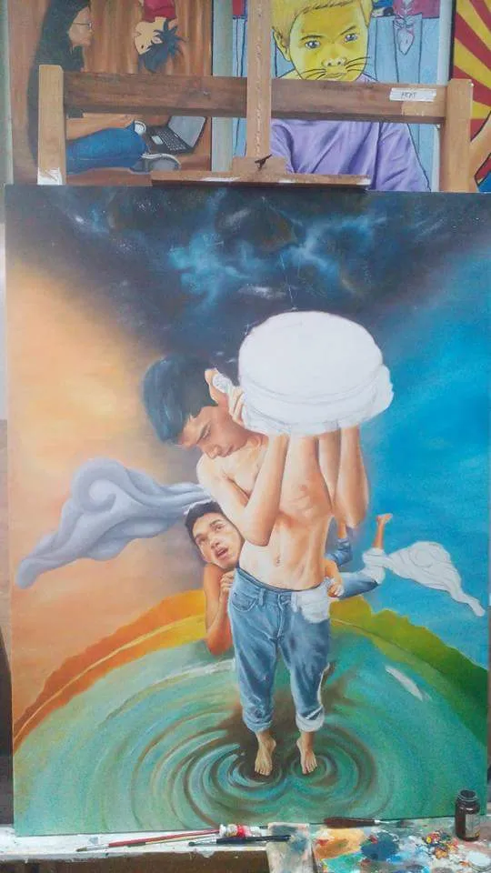
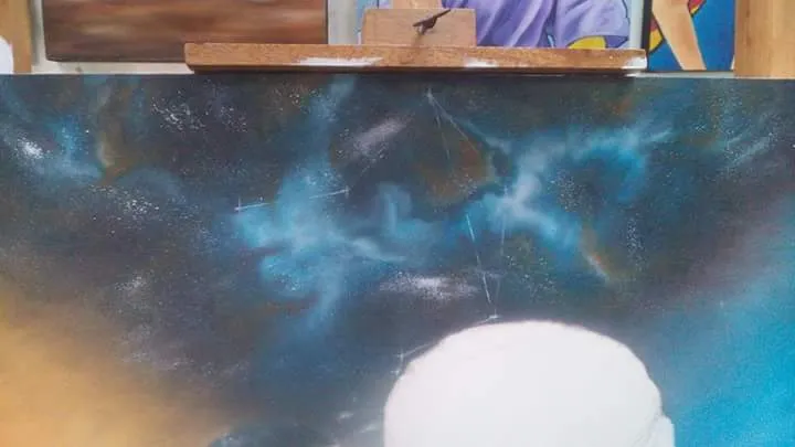
Once Im satisfied with the details i made, Its time to paint the background and foreground. I decided to paint it with complementary colors and a cosmic touch on the top. I used orange and blue for dusk and dawn effect. It is quite a challange to balance things up but studying the principles or design and elements of art made me do things i wasnt aware of. By then i can tell that i pulled it off and nailed it somehow. This time i used a larger brushes because it doesnt need much details.
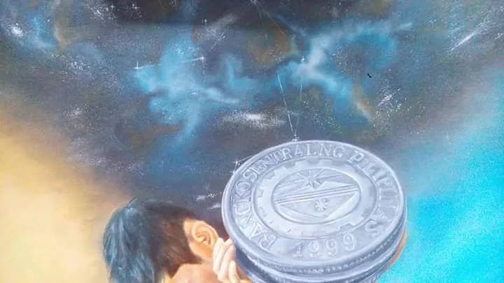
Heres a closer look to the cosmic part of the painting. I also painted a contellation of stars which is Libra for concept purposes.
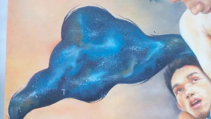
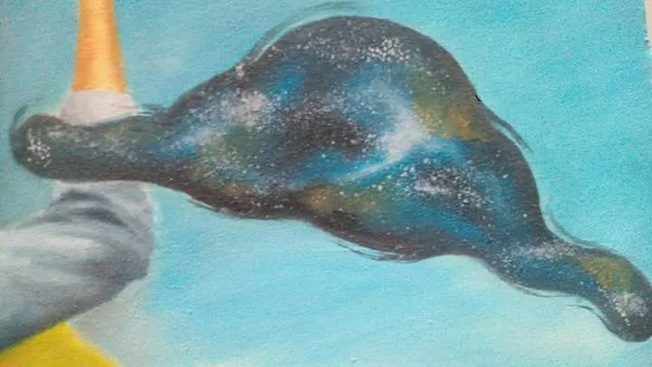
I have noticed that the cloud i painted doesnt fit on the picture so I decided to paint it same as the cosmic thing on the top part to create balance as well.
Painting cosmic effect is quite hard to explain but i suggest you guys should watch a video on how to do it. There are lots of videos on how to do it and trust me that it is easy to make it but hard to explain.
However, moving forward. I painted the coin using black and white so that i could depict a realistic coin. Still using a pointed brush for details.
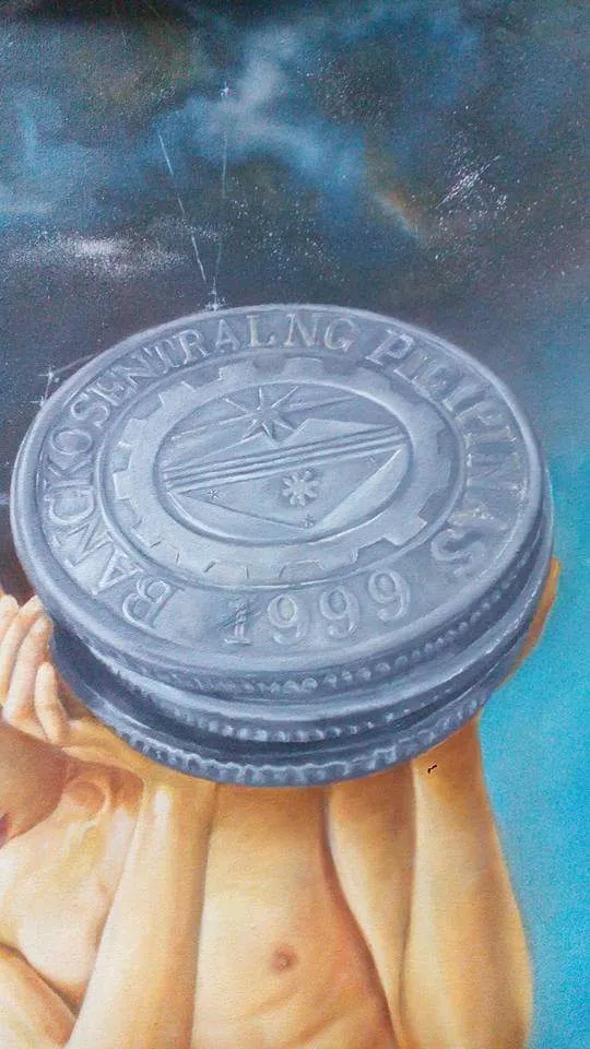
I believe I have already covered the whole canvas. But before i can say that the painting is done. I always check some details to see if it should be enhanced. Here are pictures for closer look.
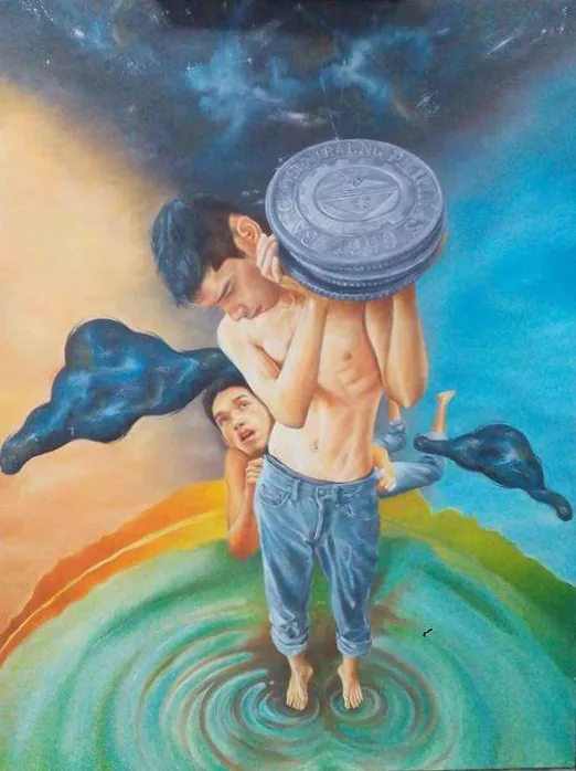
So thats it! My painting "Equilibrium". I will post again next time for the concept being explained for this work. Hope you guys like it and i apologize if i havent explained as detailed as it should be. It took me a month to paint this piece because of its details. Thank you everyone!
Till next time! :)