Hello!
I had bumped into the post of ARTZONE on the lookout for a Mula logo Contest. I thought I should give it a try and put my skills back to work. I had not been into it lately so it is just timely to do some creating stuff once again. And it would give me some excuse to have a fun break.
In my mind, I just want it to be simple but somehow will standout. I have not yet made any logo designs for tokens and coins, this would be my first time.
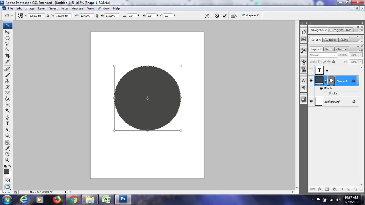
I decided to use the shape of the circle as my base. Well, that is what tokens and coins are shape of right.. hahahaha.. too obvious is it?...
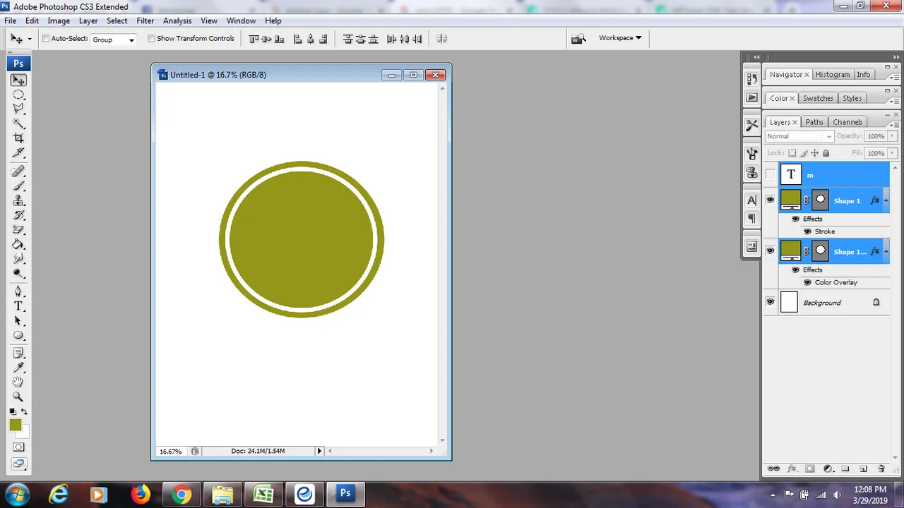
I then changes the color to gold.
I somehow wanted that the circle that would look like a coin, I added a little lining inside. And it turned out, it seemd like a stamp to me.. hahahahaha..
I looked for a cute or approriate font that would go to the logo design I have in mind.
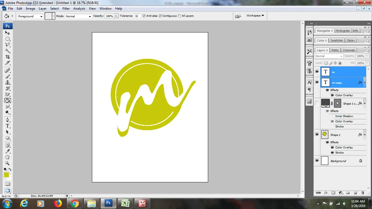
I had removed the inner circle lining just to see the difference.
It seems so blake! And sooooo simple. :(
So, I tweaked a little more.
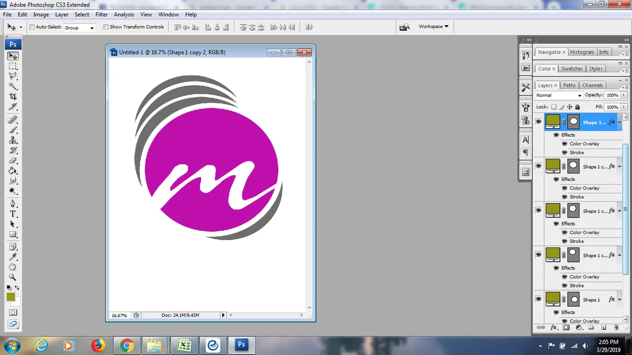
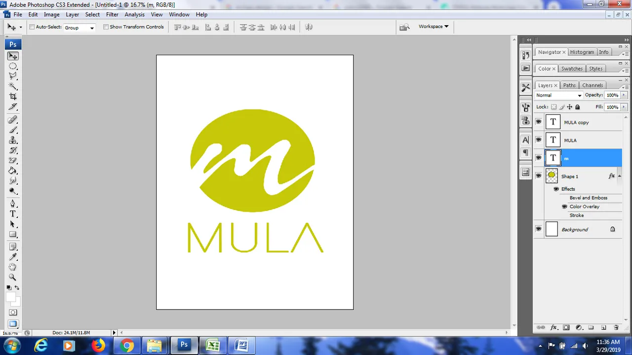
I changed the color and used the same shades as their previous logo. And added some accents to bring out the logo to life.
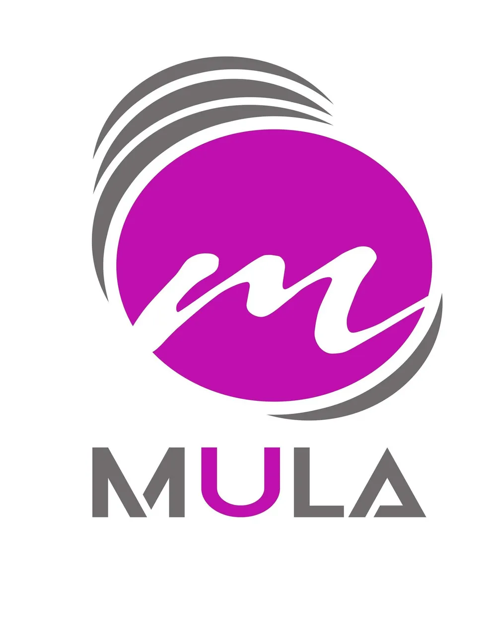
This is the final logo design I have created for MULA.
Hope you like it.
Thanks @artzone for the opportunity.
Cheers!
-maquemali