Hi!
My thought process was "Hm... the logo has to look well on coinmarketcap or coingecko, so it better be round" :P.
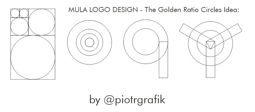
The idea was to use the famous golden ratio.
In the end, I used only two circles and that gave me basic proportions and the line thickness to work with.
I'm "the less is more" type of guy.
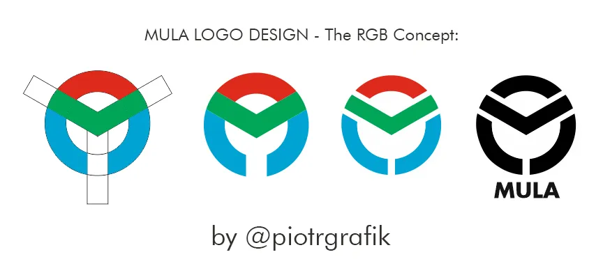
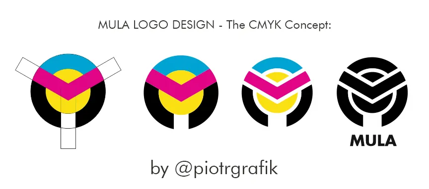
And then I walked two ways with the color scheme:
The 4 color - CMYK (Cyan, Magenta, Yellow, blacK)
And The 3 colors - RGB (Red, Green, Blue)
Actually, I prefer 3 colors because the monochromatic version is lighter (less is more :))
The design allows to see Letters M.U.L.A in it and it's readable even as a small icon.
I think this logo serves the purpose well.