Hi everybody!
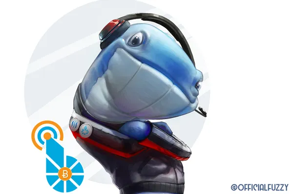
This time I wanted to make a design for the amazing @officialfuzzy, just to show my gratitude for all the good advices given almost daily, all his patience and because the whale he uses in his post hurt my eyes he's a great guy that helps the community in ways you couldn't even imagine yet.
So before we get into the process and the new image of his now, I want to invite you to join us to the next virtual hangouts that is organized every Friday. You will be able to understand a little bit deeper about what #steemit #bitshares and #whaleshares can do for you and for the community and society itself. Also you will be able to introduce yourself and have the opportunity to talk with geniuses from the present topics!
Said that, Let's get started !
(Before that tho' and to not write "Credit: Anritco" under every single image: All the images are my own creation and so I own the rights of them)
Since it is already tradition, let's start from the final result!
I wanted also to tell you that I tried to animate this little fellow but failed miserably. So I decided to make few short animations just showing the step by step of it as always ;).
For this artwork I really wanted to do something original. Something that would bring a lot of "coolness" to the character, a lot of originality and personality. So the dynamics were almost everything. See how I drew the first "S" shape and then everything else around and based on that!

You guessed right! The "S" shape is mostly for giving some rhythm and even better dynamics to the whole artwork! It really works! I use it in almost all the concept designs I use to do for all type of clients of the art industry. And I have almost never heard complaints!
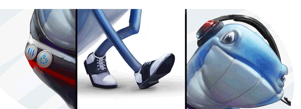
After the first and predominant shape we proceed to make a really fast and innacurated sketch to start telling to our eyes how the structure will be. Something like telling to our eyes "hey, we are slowly moving from lines and shapes to a 3D interpretation of light and shadows! (because the color not yet, no no my lord!... Remember, step by step).
Just a little reminder about how I apply colors: when I start from the scratch with a gray-scale base I ALWAYS place colors with a gradient map due to the amazing variations you can get from it. Sometimes I use even two, three, FOUR different gradient maps in different parts of the painting and for different elements-materials. For this particular artwork I only used one and then added a "normal layer" with few colors. Finally some levels and exposure correction plus an overlay layer and there you go!
And we are heading our final stop (Yeah! That escalated quickly!): Rendering!

Ohh look at the magic of that .gif! It is soo cool!
Without going to deep into this, the first step is to understand which areas is the one that has to be rendered more than others! Remember about the areas of interests? If not, I recommend you to give a look to this post where I take you through the process of one of my portraits and I explain this topic with a lot of love.
And for this artwork I had since the very beginning defined which would be the focal point and focus area. And actually made a circle pointing it! (Actually if you see closer you will find out that since I start rendering, everything stars there, in that area, and then it spreads all to the surroundings).
Once that we have the colors, the structure, the materials and textures (and of course, the right light, cast shadows and scattering) we can call it finished! But there are few things that need to be there to referring to our beloved Fuzzy...
And that's the end! Now it's all set up and really for deliver! No more words to say but thank you and have a great, great day (or night)!