
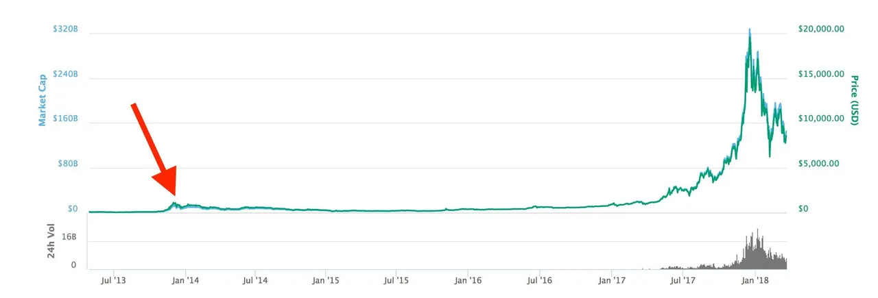
Today Julian Hosp (a german crypto investor and co founder from TenX) shared on Facebook a post, where he says in few years we'll look back to today and it will look like the first picture.
The actuell market. The red arrow = the crash 2014.
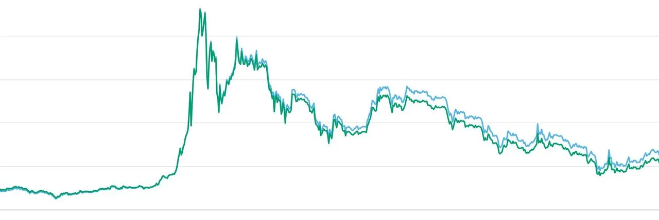
Now we take a closer look at the market in 2014 and we see similarities with the chart from the last weeks/mounths:
I put the link of his post here:
https://www.facebook.com/groups/kryptoganzeinfach/permalink/990438027782718/
(Maybe you are not able to see the post because he shared it in the closed crypto group)
What do you think about the chart? People say: "story repeats itself" and i'am also optimistic. But let me know your opinion!