I'll start with an apology. You were suckered in with a cheap click BAIT headline, that has no basis in fact and can't be proven by any data. Sorry about that.
But I'm on a tirade about all the HODL wing nuts that keep posting about HODLing to the MOON.
Those were the folks I wanted to sucker in and try to get them to look at one chart. Maybe one chart would be enough to make them stop and think, before they waste any more STEEM bandwidth on HODL to the MOON crap posts.
Global market cap chart below is simple cut/paste from coinmarketcap.com
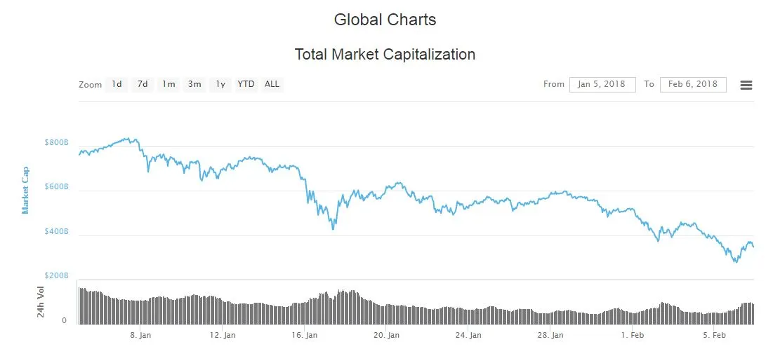
What can you see on this chart?
Market cap dropped by $150 Billion from Jan 7th to Jan 11th and then recovered by $100 Billion in the next 24 hours.
Was that blip upwards the end of the big January drop? NO !! The SLIDE continued.
Market cap dropped by $300 Billion from Jan 13th to Jan 17th and then recovered by $150 Billion in the next 48 hours.
Was that blip upwards the end of the big January drop? NO !! The SLIDE continued.
Market cap dropped by $200 Billion from Jan 28th to Feb 2nd and then recovered by $60 Billion in the next 24 hours.
Was that blip upwards the end of the big January drop? NO !! The SLIDE continued.
We have had another $60 Billion price BLIP upwards in the last 24 hours. Does that prove that the bottom is in, and we are at the end of the Q1'18 crypto price drop?
Editors note: that was a rhetorical question, readers are left to answer on their own.
Summary that I believe you should take away from this simple chart and the comments above:
1) no one knows if the bottom has been reached. Maybe yes, maybe no. No amount of triangles and TA BS is going to be useful in determining if the bottom has been reached. If you spend your time reading the triangle TA BS and the Elliot Wave triangle nonsense (from you know who, the Ragin Cajun Haejin dude), make sure you realize it is 100% useless as a prediction tool, it is for entertainment value only. Which to be fair to Haejin, he does disclaim all his posts as useless except for entertainment.
2) your eyeballs are more capable of discerning the pattern in the attached chart, than any other instrument. The pattern in the chart is simple. Do you see it? Does a trend jump out at you from the line on the chart? Data shows that $800 Billion market cap has been whittled down to $350 Billion over the last month, and there is no evidence WHATSOEVER in just this price chart, that suggests the month long trend has been broken.
3) No one knows with certainty where the crypto market is going to be one month from now. But an unbiased observer has to admit that chart shows that the chances of another $150 Billion drop down to $200 Billion; is at least as likely as a $150 Billion increase up to $500 Billion.
And for the final, ta da, wrap-up; please explain on the basis of this available factual data, why you are HODLing to the MOON, as the price has been on a month long slide that shows no signs of abating? And WTF does that phrase even mean?
If the chances of up in the next month are the same as the chances of down in the next month, why not just take your gambling funds to Las Vegas and choose your favorite color, Red or Black?
If your answer on why you are HODLing forever, no matter what the price data is showing, because you BELIEVE in the long-term value of cryptos, then COOL. If you are right you can get rich without a lot of work. But please explain to me, just one more time, why HODLing forever and ever and no matter what the price data is showing is the best path to your dream of getting to the MOON without doing any work.
STEEM On!!
DaveB