Yesterday in my post I talked about how Bitcoin may be ready to breakout based on a particular chart setup.
That post can be seen here:
For those of you that may have missed the chart setup and how it relates to bitcoin, it can be seen here:
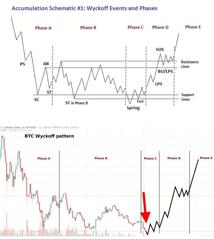
I am surprised by how similar these charts are.
They are very nearly identical.
This kind of setup kind often precedes large moves higher in the medium term.
No guarantee that it continues.
Keep in mind that there is no guarantee that bitcoin will keep following this pattern and end up breaking out to the upside, but up to this point it is pretty interesting how closely it has followed this accumulation pattern.
Also one thing to note is that we may not have seen the low just yet.
According to that chart pattern we may need one more washout before we move back up and start our ascent.
Either way, if ol Richard Wyckoff was still around trading, I would bet he would be buying bitcoin right now based on the chart setup.
Stay informed my friends.
Follow me: @jrcornel