Being "in a bubble" is not the same as being "in bubble territory."
 After the crash of the housing bubble in 2007–08, the Fed and other central banks blew massive bubbles in everything from bonds and real estate to student loans and money in general.
Everything Bubble, including Money Bubble

Indeed, we even have a money bubble – as a direct result of the coordinated money-printing programs in the US, the EU, Japan, and other countries.
In many ways, the money bubble is the cause of the many other bubbles. With so much easy money at their disposal, it’s been very easy for the financial pirates to blow up and over-inflate numerous secondary bubbles.As a result, almost everything nowadays is overvalued. Far overvalued. Insanely overvalued. And we know that the price of anything that is overvalued will eventually come crashing down to realistic levels. Most likely sooner rather than later. (Image source)
Which brings us to bitcoin.
Is being “In Bubble Territory” the same as being “In a Bubble”?
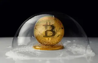
Given the increase in the price of bitcoin in 2017, some people said that it too was in a bubble. Its rapid rise (to almost $20,000) took even the most optimistic bitcoin proponents by surprise. Since then, of course, it has fallen to the $3,000–$4,000 level.
That’s a drop of over 80%. And certainly, that drop also makes it look like bitcoin was in a bubble. (Image source)
Maybe it was “Not a Bubble”
Regardless of whether or not one considers bitcoin to have been “in an actual bubble,” a quick glance at its its linear price-chart shows that it was clearly "in bubble territory." (To be clear, those two points are separate and discrete statements. Being "in a bubble" is not the same as being "in bubble territory.")
In a YouTube video (link below), Mike Maloney explained that if we look at bitcoin’s spike in “the proper way … logarithmically,” we get a totally different perspective. To clarify, let’s compare the 2 charts below.

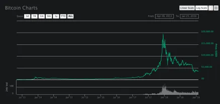
The 1st chart shows the “linear changes.” As Mike stated in the vid, it “looks like a bubble.”
Linear Chart (aka “Arithmetic Chart”) – Bitcoin, April 2013 – January 2019
The 2nd chart shows the “the percentage changes” for the same asset over the same time frame. We do not see the bubbles and crashes that appear in the above linear chart.
Logarithmic Chart (aka “Log Chart”) – Bitcoin, April 2013 – January 2019
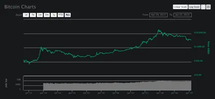
On the other hand, in the log chart, the percentage increase of the price remained quite steady over that timeframe. It appears as a solid asset whose price is increasing at a sustainable pace and to reasonable levels.
Mike adds that, if we look at it from this perspective, a further increase is fully sustainable and reasonable. That next increase might take bitcoin up to $50,000 or even $100,000. (Image source)

A bubble is when an asset trades “at a price or price range that strongly exceeds [its] intrinsic value.” As of yet, nobody can accurately determine what bitcoin’s “intrinsic value” is. (Source)
Is bitcoin’s intrinsic value around $4,000? Around $20,000? Around $100,000? Or down around $1,000? –– What do you think?
It’s been one year since the price of bitcoin peaked near $20,000. Is the price headed back there, or even beyond? Or will it soon continue its downwards trajectory? –– What do you think?
Since 2008, the bubbles in most other assets have continued to rise, inexorably and stratospherically. Bitcoin, however, has gone though booms, spikes, dips, drops, corrections, and consolidations. Maybe the bitcoin booms were not bubbles. –– What do you think?
Watch the video at the link below

Mike Maloney – "$50,000 Bitcoin?"
(Right-click to watch on YouTube) (Image source)