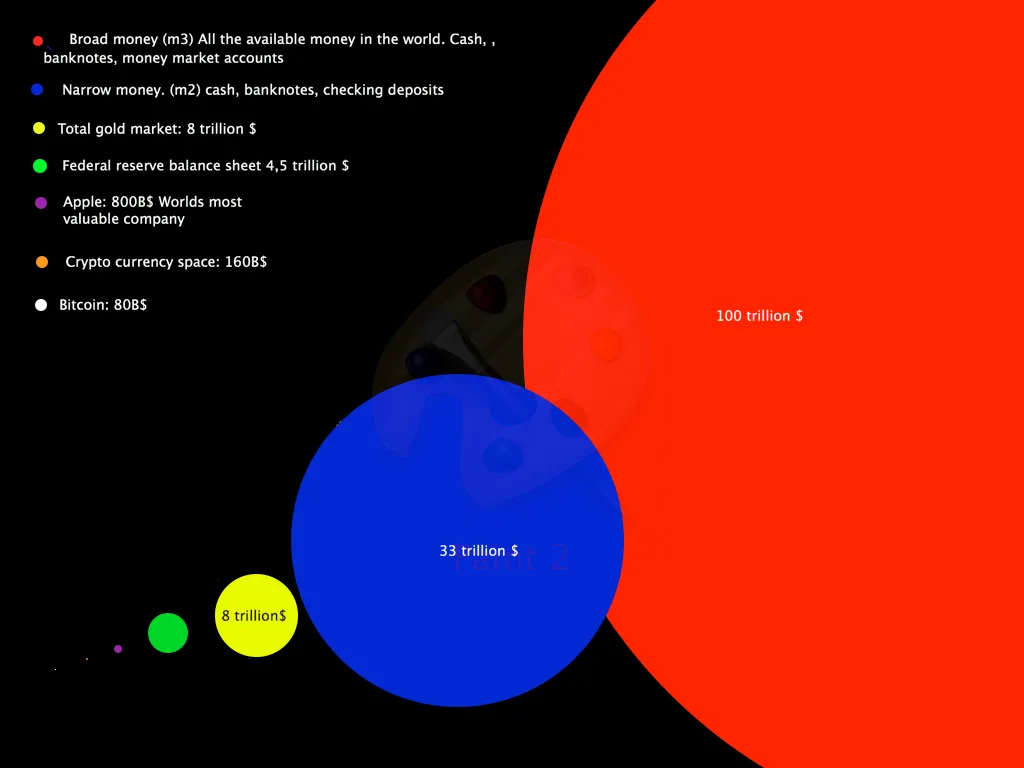
I've seen some cool graphics before, but I wanted to make my own with things I believe is relevant and fun to compare with.
For those of you who are scared that Bitcoin or even the Crypto Currency market is too big, or growing too fast. Just take a look at this. I have not even taken into account bonds, debt and all other crap that goes with the Fiat-system. This is just a comparison to sound money, companies and Gold.
So you can visualize and see why it's not madness when we talk about 50 or 100k Bitcoin. You see that little white dot there..? That's where we at now.
Hodl :)