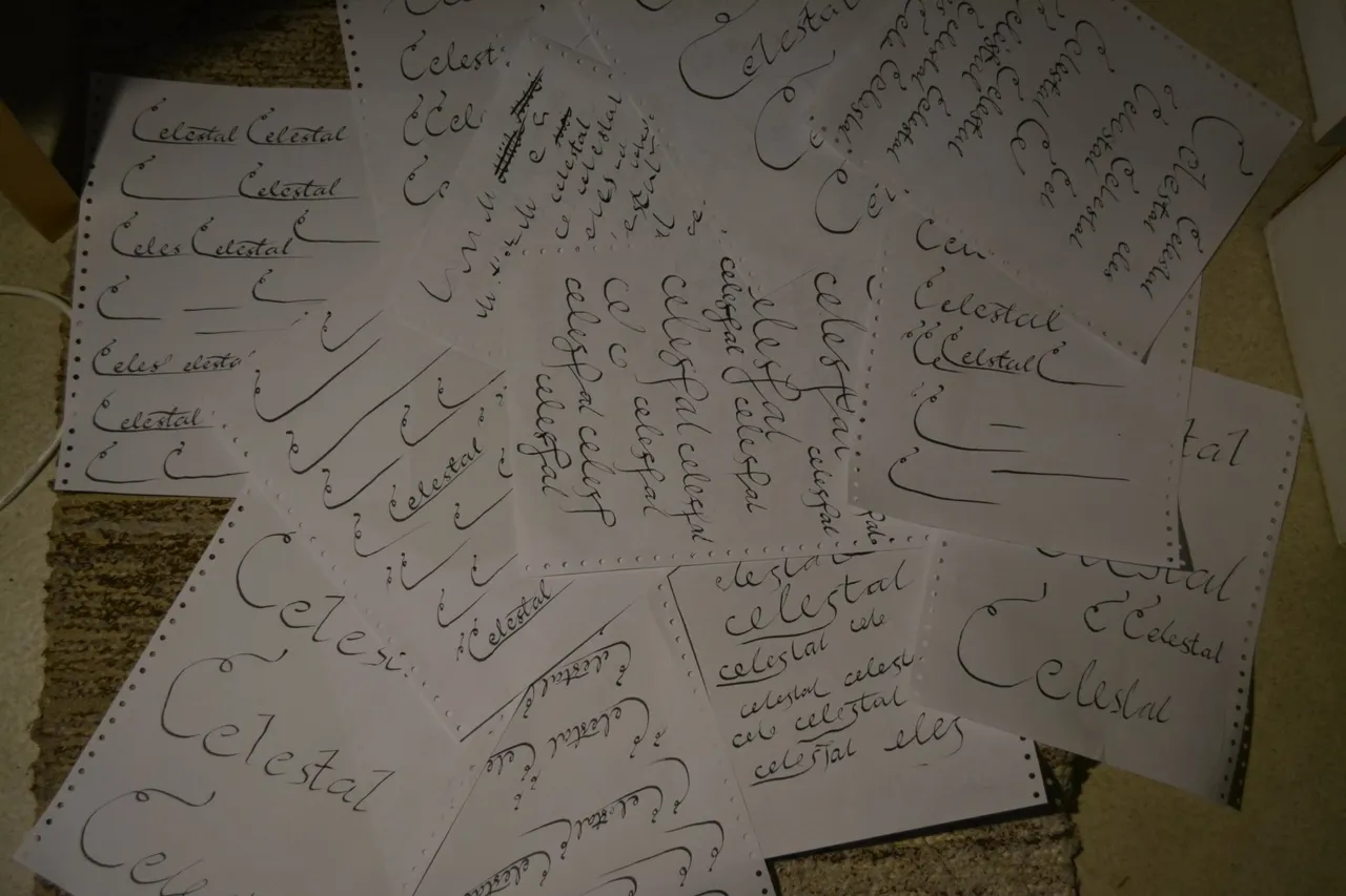
A few papers was used during it.
In the beginning I didn't really have any specific design in my mind for the signature that I'd use at the end of my posts, thus, I just started scraping something.
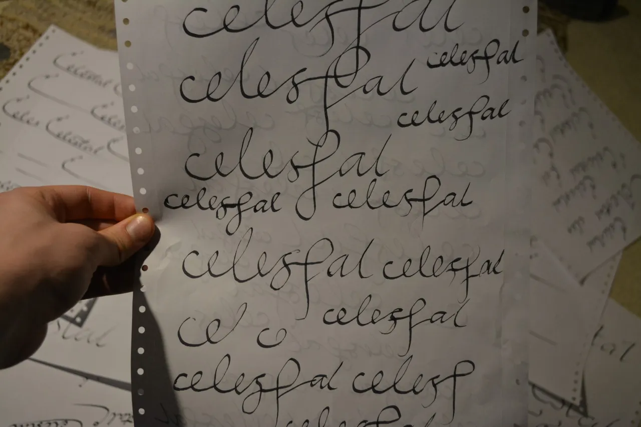

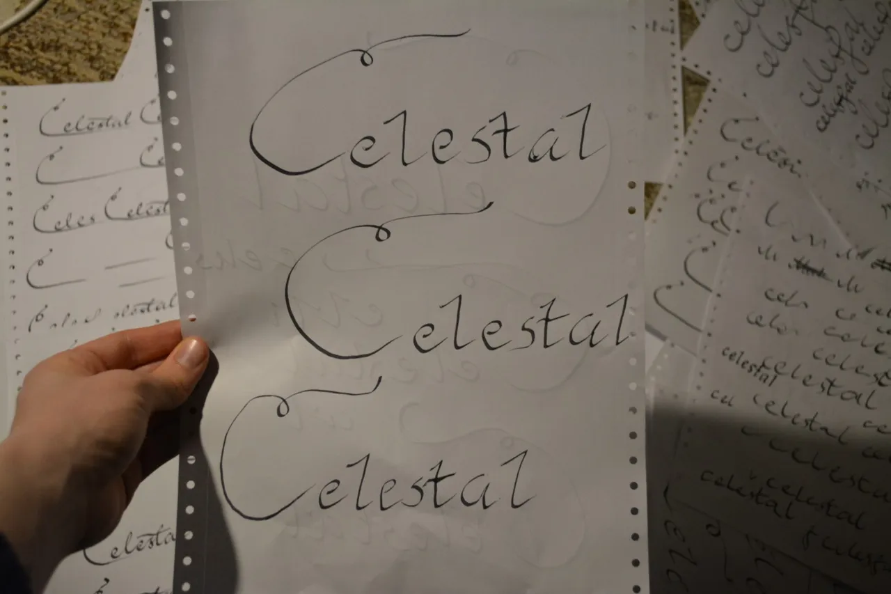
Until I picked up the idea for the C with a fancy curl.
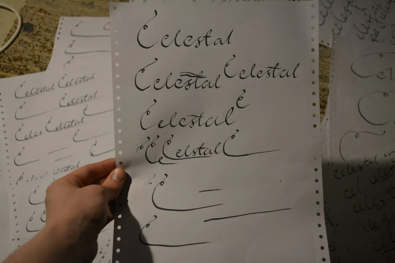
And then I got the idea I could just make the bottom of the C long to underscore the rest of the letters. From hereon the overall design started to get refined.
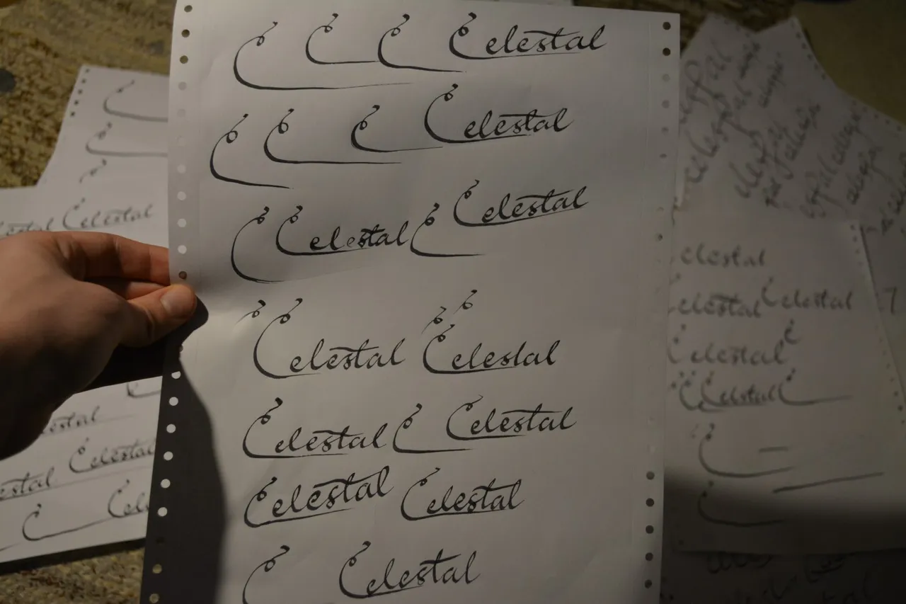
Now it was just a matter of "getting it right".
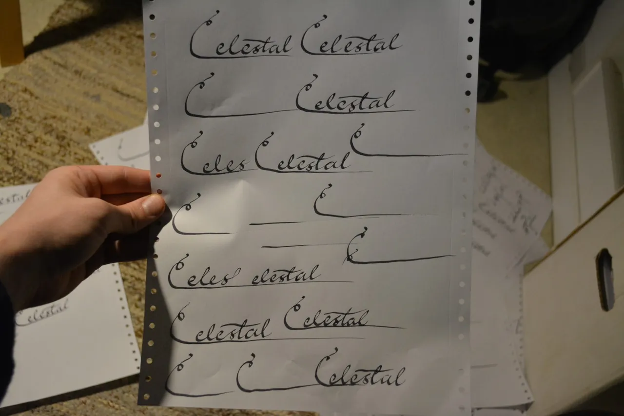
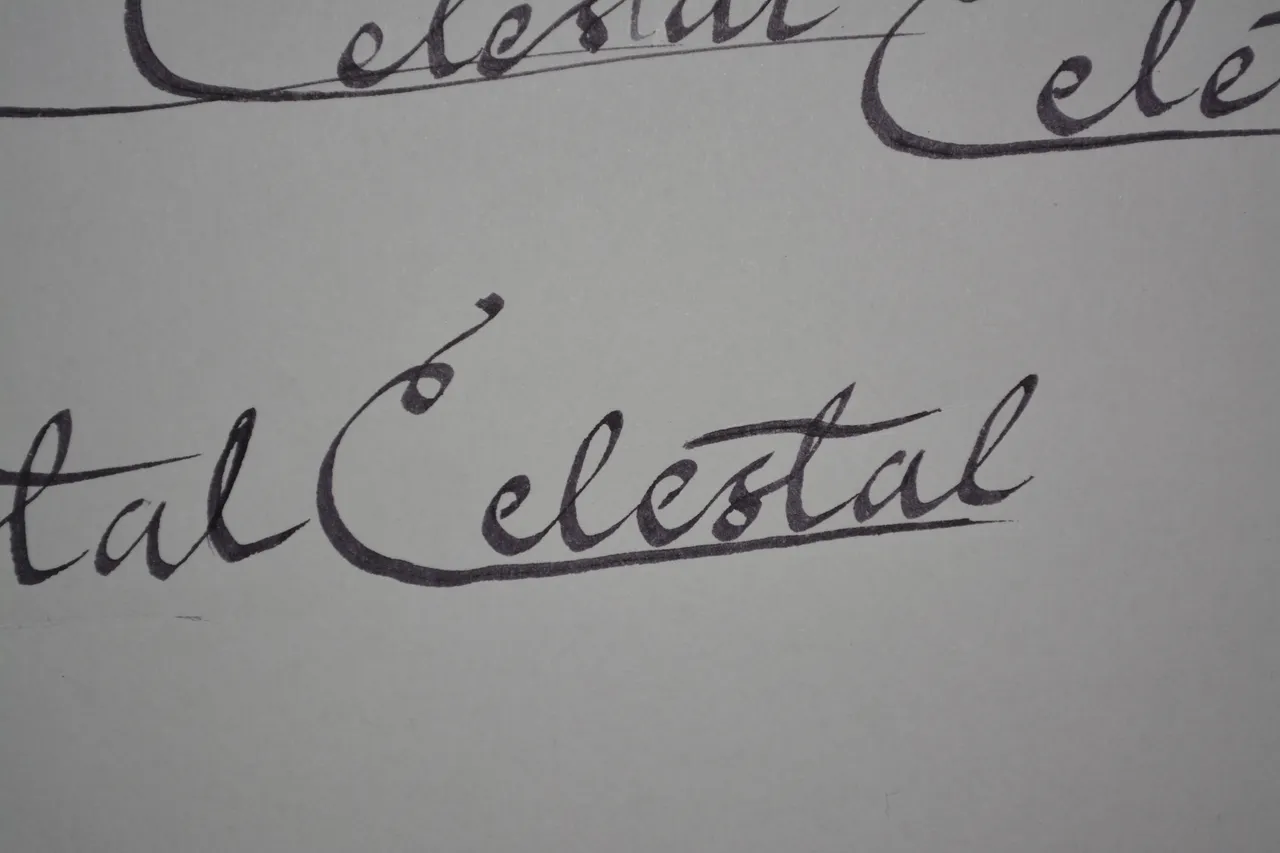
This turned out pretty good, although still not perfect: the bottom curve of C turned out not perfectly smooth. Letters (e and l) are also slightly inconsistent, but imperfection is beautiful, or so I've heard being said so, whatever. Makes it look authentic handwriting at least. Anyway, the underscore on the other hand turned out perfect with this one so I just decided to roll with it.
Since I don't have a scanner (and was too lazy to go ask in the library if they had one), I just took the photo (the one above) of it with my camera and did some shenanigans to it with Gimp and got it like this:

I made it so that the background is transparent so it isn't surrounded by a white box which would be especially visible in dark more, and I didn't make the text pitch black because I still wanted to remain some of the dynamic visible.
Then of course I just scaled it down to a neat size which is bit more aesthetic than a full-size signature from side-to-side. All in all, I'm pretty happy how it turned out.
