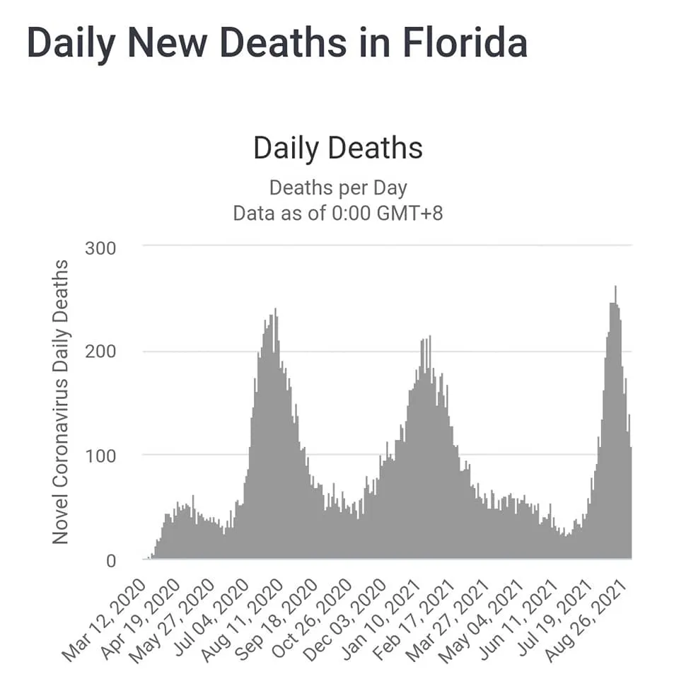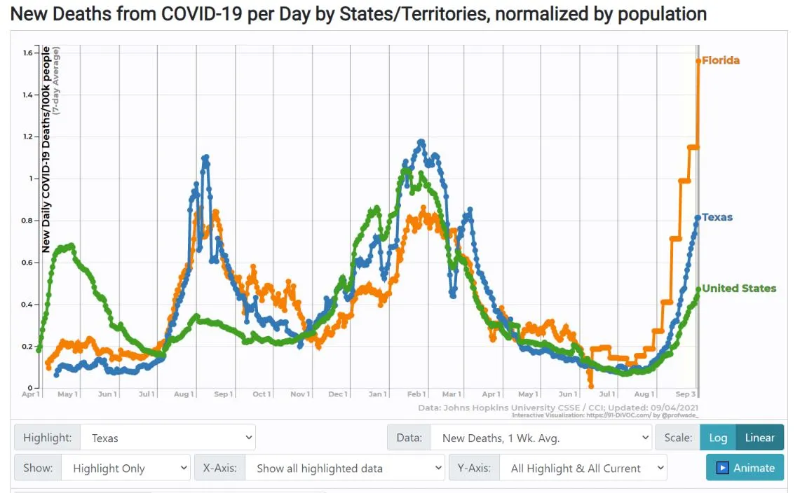
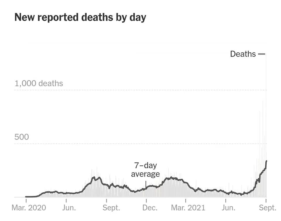
Six months after widespread availability of a safe, free vaccine that reduces the risk of death by about 95%, Florida obliterates their previous death rates. Texas is not far behind, and rising quickly.
I expected death tolls to be much lower because I believed over-65 and high risk people would vaccinate at 90%+ rates. Totally unprepared for counties where they're around 50%. And Delta while the new infections skew younger than previous waves, Delta seems to be killing more of that crowd, too.
So easily avoidable, such tragedy. I pity the medical workers and the families* of the victims.
*the INNOCENT families of the victims. Half the time it is family members that are spreading anti-vax whaarglebaargle and encouraging their parents and siblings to eat de-wormer.
Immense sympathy for overwhelmed healthcare workers and the people who have to put off care (or die) because the hospitals are overwhelmed.
What do you do when your state's post-vaccine death rate is higher than before the vaccines? Why, switch to a reporting method that always makes it look like you peaked two weeks ago, even when deaths are still rising.
That's what Florida did. The first graph shows the usual method, the second shows the post-peak mirage created by the method they adopted on August 10. (The new method logs date of death, meaning the recent two weeks are massive undercounts because of reporting lags. But rather than omit the most recent two weeks, they publish the graph that looks like it's getting under control.)
It was a CDC chart like this that led Elon Musk in April 2020 to confidently predict that COVID would be gone in a month or two, not realizing that the late downtrend was an artifact.