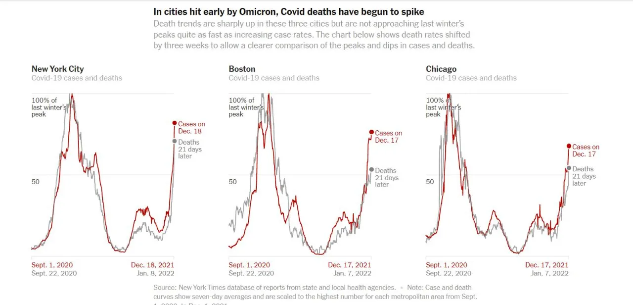
This graph, if it's accurate, is very bad news.
It shows that the Omicron death rate is almost equal to delta's in three of the earliest-hit cities. The reason I say "if accurate" is that because of the extreme steepness of the case rise, the 21-day lag assumption has a huge impact. If the real lag is 14 days or 28 days, we get a totally different picture. But 21 had been a pretty good approximation, and you can see how the curves aligned in the past.
The implications of this are staggering. If the death rate is similar and we're heading for 3-5x last year's peak...OMG. I have been working under the assumption the case fatality rate would be maybe 20% of last year's...but 80-100%?
Why would Omicron be so much worse in the US? Well, most of the fatalities come from the 65+ age group, and that cohort in the US has an unconscionable level of unvaxxed...see the second image. Those dark counties have more than 25% of seniors unvaxxed.