This post is in response to @pkaterra's request here
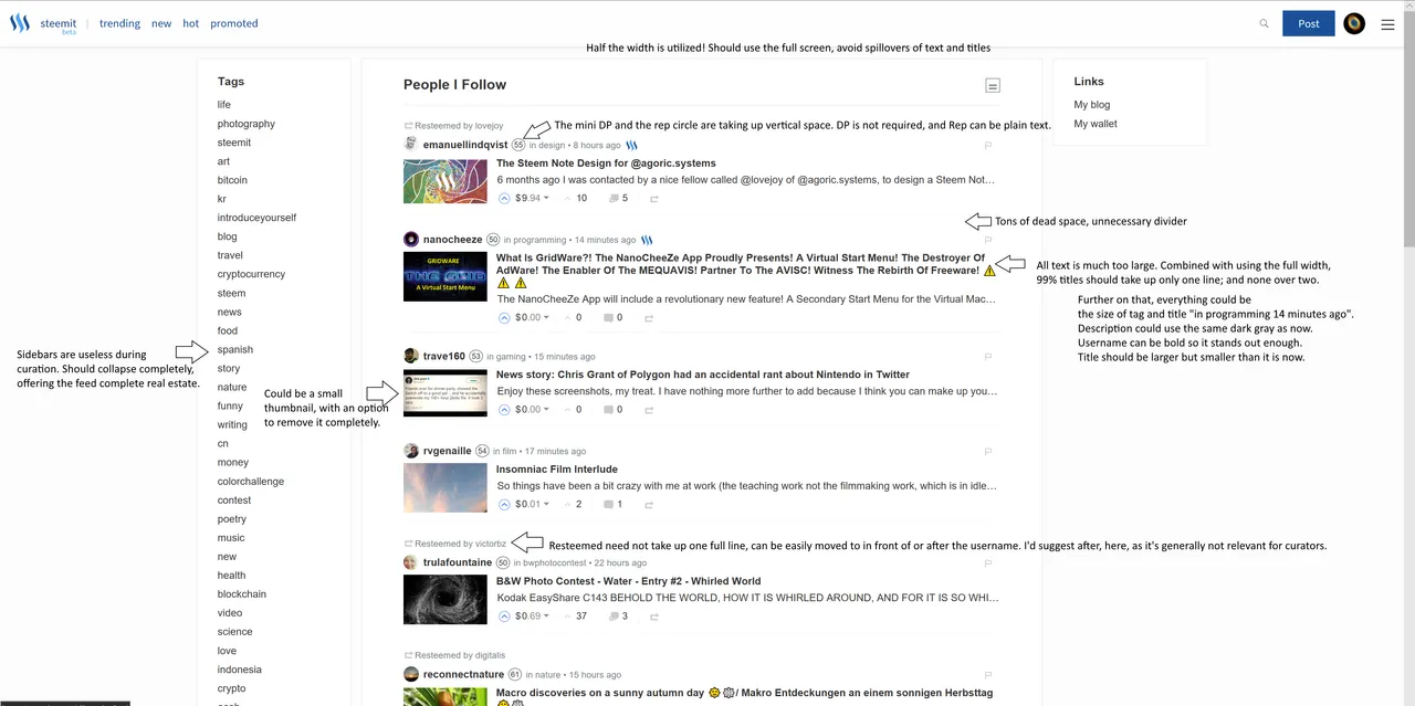
The central problem is information density. On a 27" 4K screen running at 175% scaling, I can see only 6 posts in one page. On Reddit, I can see 16. Granted, Steemit has an extra line for description, but that still means Steemit's feed is less than half as efficient as Reddit.
So here's a very rudimentary illustration that points out everything. Here's a link to the full 4K version - https://imgur.com/a/ovUyo
I'd even suggest dual paned feeds, but that would be controversial. Maybe something to think about in the future.
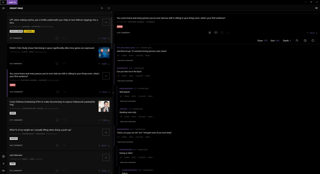
PS: This is an example of dual paned feed. It's the Reddit app called Readit. It's easy to see how this will be a lifesaver for curators. No need to constantly shuffle between feed view and post view!
In addition, I'd love to see a sophisticated filter feature. More details in an older post here, but here are some of the parameters important to me -
- Min / max Rep of author
- Tags to match / avoid
- Min / max pending payout
- Min / max votes
- Min / max comments
- Min / max length (characters)
- Min images
- Min / max SP holding of the author
- Title keywords to match / avoid
Filtering is absolutely crucial for curators. Currently, there are many workaround solutions, but we'd like to see an intuitive UI with it.
Curators, do you agree? Please add further feedback, so I can incorporate it into the image. Better still, for graphic designers, feel free to make a better infographic out of it :)
PPS: In post view it's even worse! It uses less than one-third of available screen real estate. This should be expanded too.