There are different ways to visualize data.
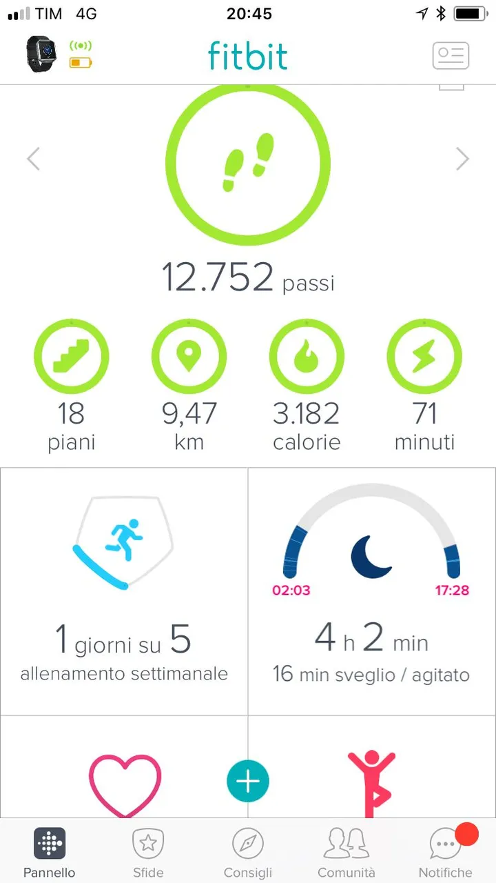
One of those is certainly the dashboard of the Fitbit application. Here is the online version showing different types of data visualization.
There are different types of graphics such as bar chart, line graphics etc..
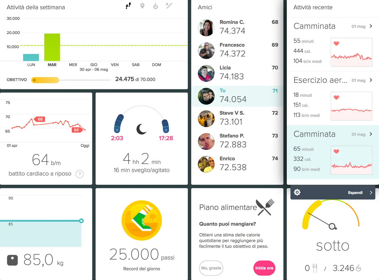
The design is really great and usability is also very good as you can add as many widgets as you want.
In the same way, the Fitbit mobile app shows also all the info the user needs and the iOS version of the application has even better usability with respect to the Android one I had previously.