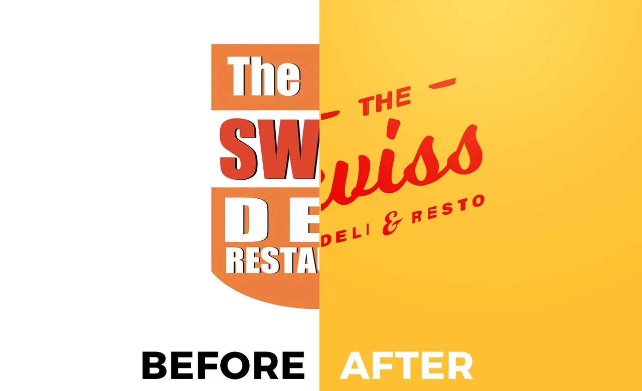
So there's this restaurant in our place called "Swiss Deli and Restaurant". I've been passing by that place for so long and I never knew that it was a restaurant because of the appearance. It looked like a pharmacy if you don't really pay attention to it.
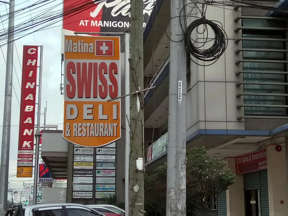
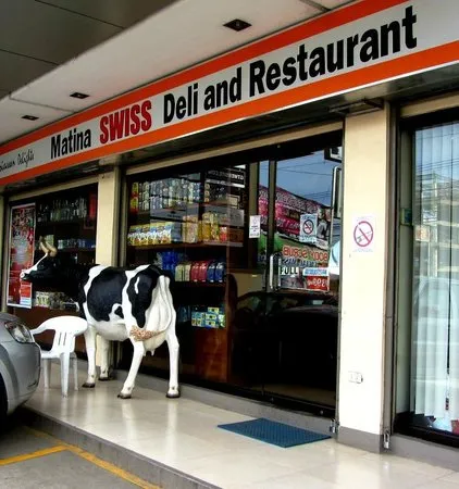
What doesn't work?

What I think doesn't work the most is the font being used. It's too bulky and too plain for it to be used in a food company. The swiss flag makes it look like a medical establishment or pharmacy. But what I like in this design is the use of Red and Orange colors. These colors are usually used for food and beverages industry so they got that one.
Design Process
I started of with some sketches. I sketched some samples that incorporates the Swiss flag. I used cursive/Script style font because it gives the logo it's homemade, personalized feel. Though I tried some solid fonts but I didn't liked it that much.
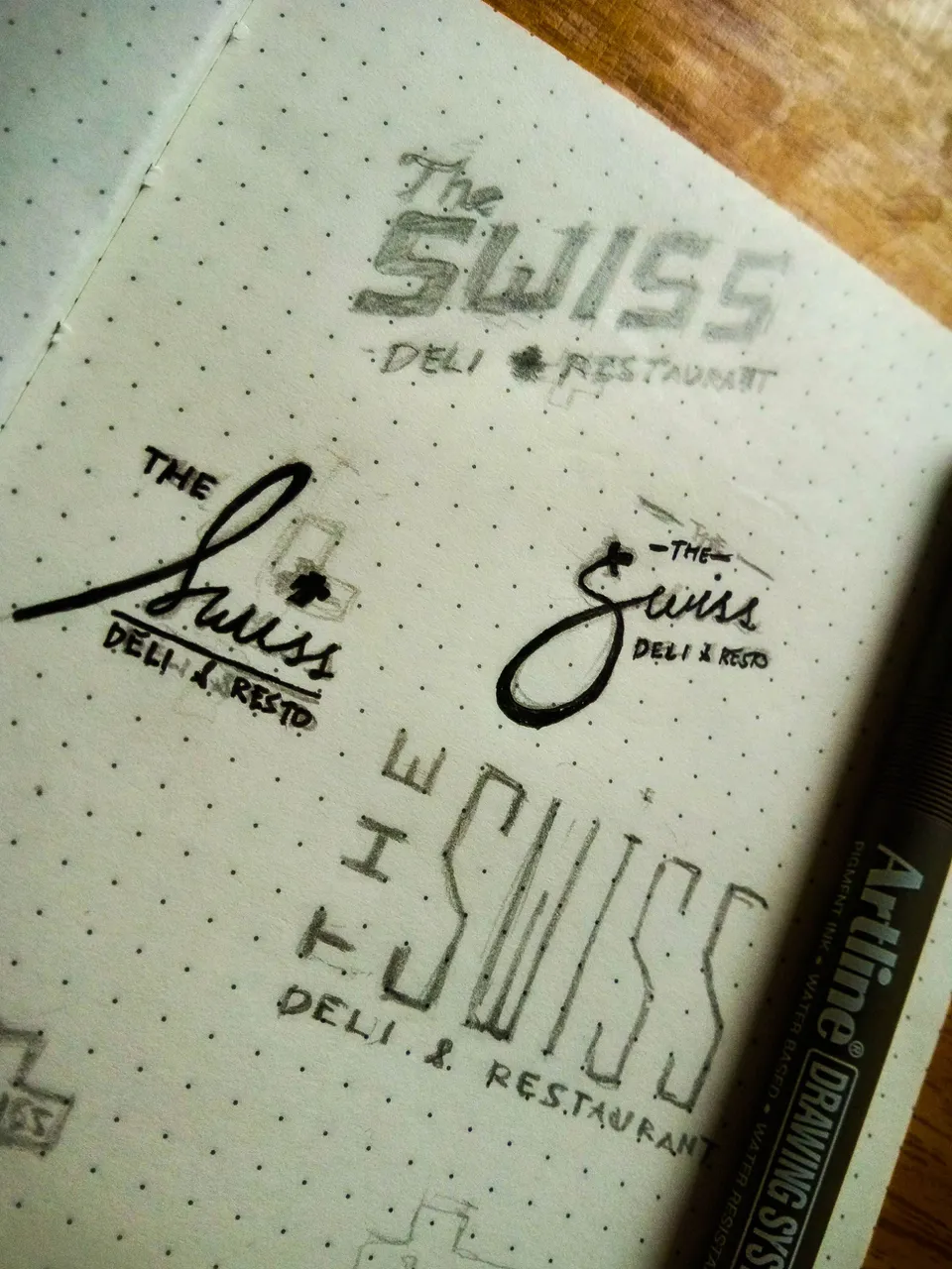
Next is I opened Adobe Illustrator and started making the digital version of the sketch. I'm not a good calligraphy artist though so i used the font Milkshake because it is close to the one I sketched. The only letter I did traced is the S.
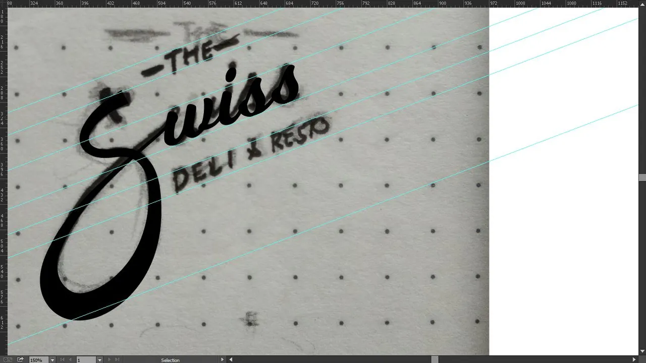
After that, I finished it with some little details, The swiss flag is at the tip of the letter S. I ended up using the same color but more vibrant since it's one of the things that they did spot on.
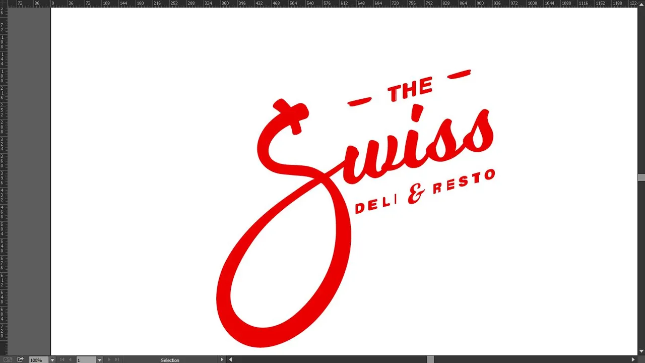
Done! I did 3 versions with different colors and 1 version in use.


I think this version would work because when you look at it in a glance, you'll know that this is in the food industry, just use it in the right placing, branding packaging and It'll work like a charm, I think.
Thank you for reading this blog! If you want to do your own #redesigntheworld challenge, you can visit this post for the mechanics: https://steemit.com/art/@embity/redesigntheworld-challenge-make-the-world-a-better-looking-place
PS:
I just noticed that the logo was effed up due to the compression of the vector size. Meh. :D