I thought a follow-up to yesterday's joke logo might be in order, since I have been wanting to share my thoughts on logo design. I created my quick mockup Canva, but you could use Adobe Photoshop, GIMP, LibreOffice Draw, or any number of other programs to create branding. The fundamental principles work whether you need a basic watermark for photos you share online or a suite of business iconography for everything from letterheads to signage.
I don't intend to discuss any legal considerations. I do suggest deconstructing logos you like with a critical eye to see how they work. I might even suggest borrowing some ideas. I definitely do not advise plagiarism, because the pros with good logos also have good lawyers and no sense of humor.
Wordmark/Logotype
Simple but effective branding can just be your name (or your business name) in a distinct typeface and color scheme. It is an easy identifier, and can be easily adapted to black-and-white by simply having light and dark versions for different backgrounds. Font choice alone could be a long essay, so I'm just going to skip over that for now. Sorry! If you want more on typefaces, let me know in the comments!
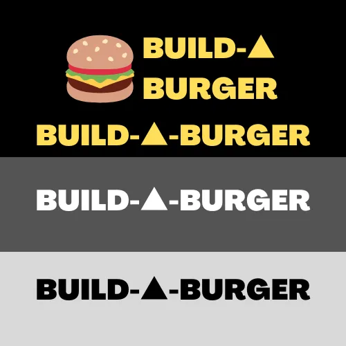
While a distinct typeface can convey a brand on its own, you will often also see special characters used within a name. Consider some exmaples in the music industry, ranging from Ke$ha and 3OH!3 incorporating normal keyboard glyphs to Prince doing.... well, this. I just used a triangle instead of the letter 'A.'
A logotype may also include a small graphical element for brand emphasis, like my burger in the top example pictured or the Windows grid on the current Microsoft logo. Consider also the FedEx logo for Federal Express with its corporate color branding, bold typeface, letters which abut one another, and that subtle hidden arrow turning the brand into an icon on its own.
Logos
What if you want something more than just your name, no matter how elegant the font or stylized the characters? There are a few general ways to go.
Initials
IBM, AT&T (usually accompanied by a globe), and most television networks or channels spring to mind.
Business
The full business name with accompanying colors and flourishes like Coca-Cola, or modern web-focused art with simple typefaces and an emphasis on a brand color like Facebook and T-Mobile.
Shapes
The blue Ford oval with its distinctive cursive text, various tri-color Pepsi circles, the aforementioned Microsoft Windows grid of colored squares, the red-and-yellow Shell seashell, or the red HIVE hexagon.
Symbols
This is a bit more abstract, but this tends to be something very brand-specific. Think of the Prudential Financial logo with the Rock of Gibraltar signifying strength and permanence, or the innumerable banks and businesses using Greek columns and other icons of tradition. Symbolism can include landmarks, historical references, mythology, and more. If you want more detail, think along these lines.
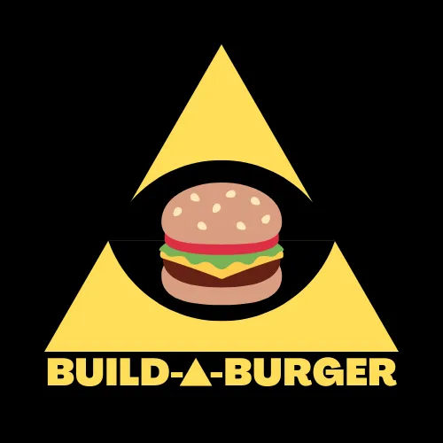
Note that my design is fairly simple. It's just a triangle with a void in the middle and a cheeseburger image. A child could draw it, and that's perfect if I'm designing the logo for an evil cabal of power-hungry sociopaths a fun family restaurant with delicious food.
I also incorporated the business name as part of the branding with the subtle psychological reinforcement of the triangle 'A' which creates extra brand emphasis.
I'm not really a huge fan of the cheeseburger in the middle, but I was in a hurry when I was trying to turn a bad joke into content. That said, it does fit the simplified logotyle branding, somincluding it here makes sense in hindsight. A cohesive branding plan should include layers of complexity which can be applied to different situations and uses, after all.
Color and Design
If anything could get more complicated than typefaces, it's color. Trends come and go. Cultural associations vary around the globe. Pay some marketing guru lots of money to hash things out, or just pick colors you like and roll with it.
Maybe more is in order. Color can be a huge part of brand identity. T-Mobile pink is quite distinct, and you can't mistake them for their competitors! McDonald's is even nicknamed The Golden Arches.
Color theory is a huge topic, but we're on the internet, so there are tools! I suggest visiting the North American Vexillological Association and reading their Good Flag, Bad Flag pamphlet or wathcing this TED presentation.. Multiple language versions are available, too! You can also study heraldic design. These many be for traditional iconography, but old principles last for good reason. Canva has a handy complimentary color wheel, and other online tools can doubtless help you find good multi-color schemes in the full spectrum of web colors.
Conclusion
As a general rule, use simple shapes, distinctive (but legible!) fonts, few colors, and consider how your logo will look on different backgrounds or surfaces. Study other logos to see what works and what does not, or what you like or dislike. And don't be afraid to share drafts for comment and criticism. If it's for a business, it might be worth hiring someone who understands both design concepts and your specific needs. Bridging the gap between modern and timeless design is truly an art.
I'm trying to kick a head cold, so I apologize if I skipped anything, left paragraphs butchered with incomplete editing, or failed to write what I meant clearly enough. Comment with your own additional advice, rebuttals to what I wrote, or favorite examples that broke all the rules!