A little while back, my good friend @detlev popped up in my inbox with an exciting proposition: “What if we ran another event here in Aachen?” Now, knowing Detlev, he’d already sketched out his thoughts on paper and... of course—turned to ChatGPT (or one of the other fancy AI tools) to whip up a quick logo. The idea was to weave a sense of community around our HIVE group, so he crafted a short prompt and voilà ... the first round of logo concepts rolled in.
When I saw one of the designs, I liked it enough to say, “Yeah, that’s pretty cool... but do you actually have a print-ready version of it?” Naturally, the answer was no. It’s amazing how AI can spark ideas, but when it comes to pixel-perfect, professional-grade artwork... especially something you want to press onto T‑shirts or print big on banners it still falls short.
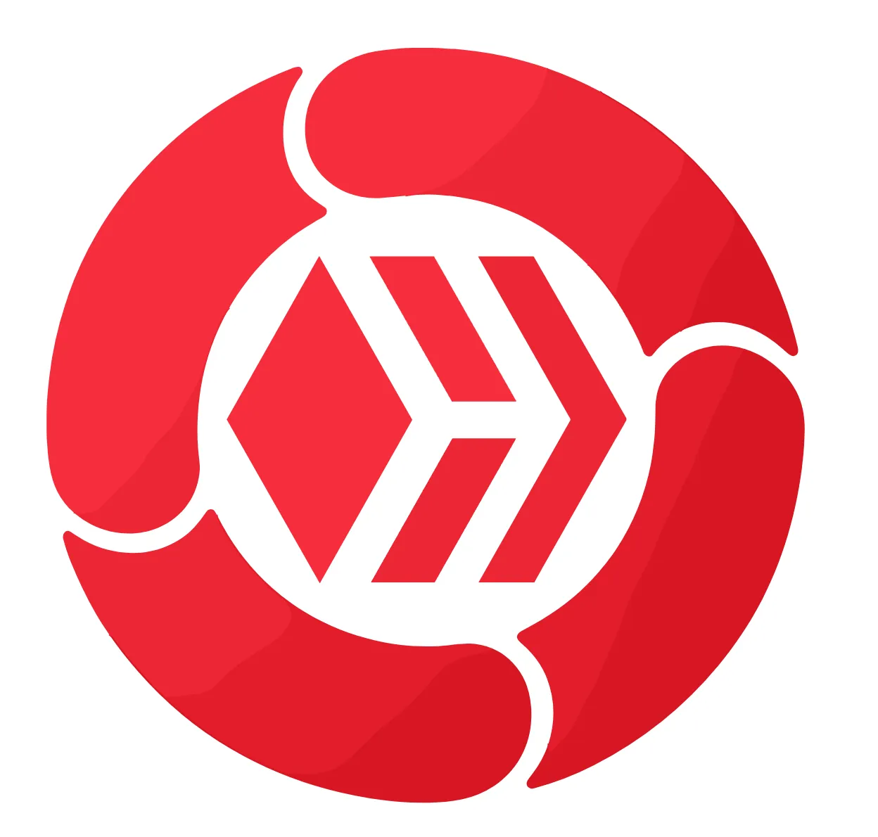
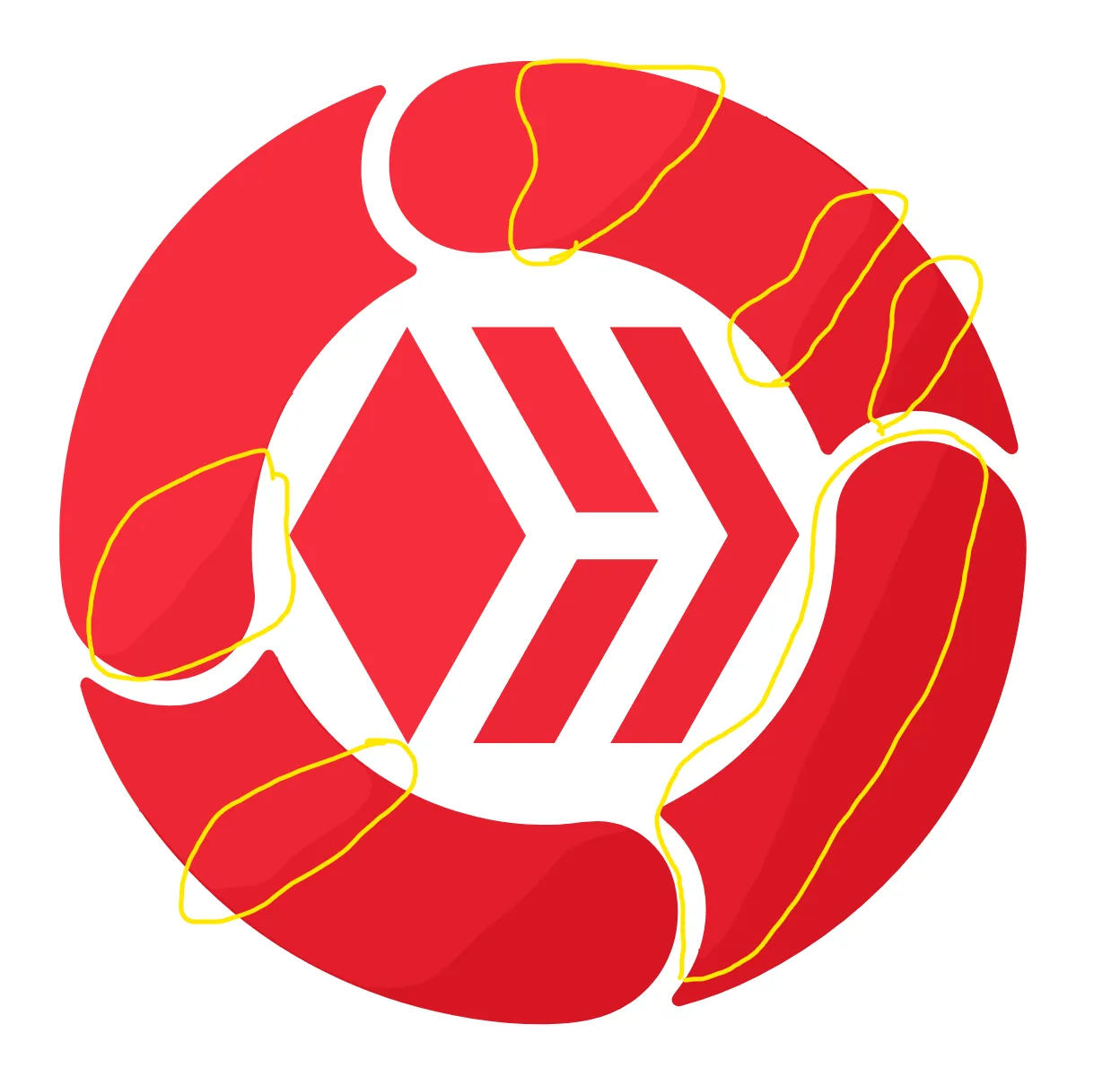
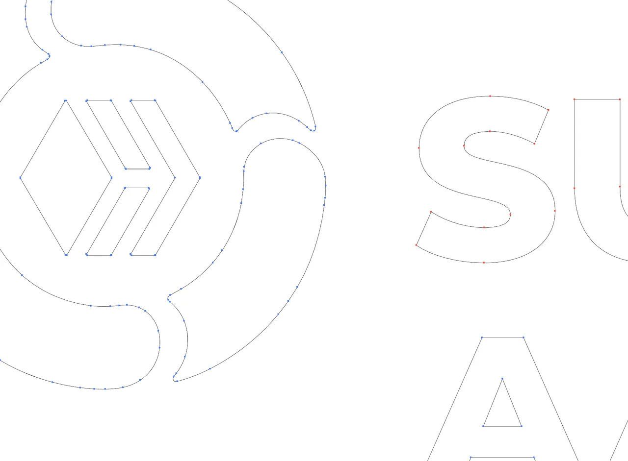
Here’s the very first draft of the logo, without any lettering. You can already pick up on the core concept on the left side: the angular hive motif, the interlocking shapes... it all speaks to collaboration and buzz. But if you zoom in, the rough edges and uneven lines become impossible to ignore. It’s charming in its own way, but not exactly ready to hit the presses.
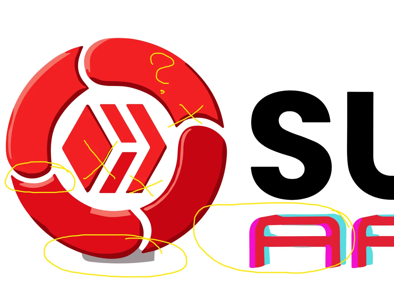
Then we added the lettering so people could actually read what it was called, and somehow it only made things worse. Detlev was set on keeping that style, and since I can’t turn him down, I decided to tackle it myself. Using the sketches and snippets he’d gathered from the AI, I set out to craft a truly professional, print-ready logo. Below you can see the version the AI generated alongside the result from an AI vectorization tool, displayed side by side.
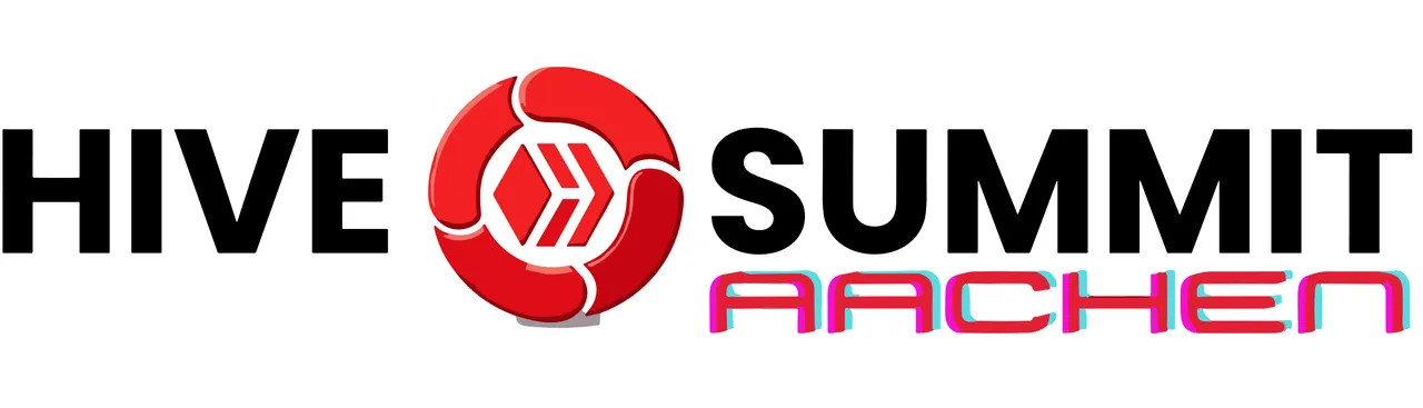
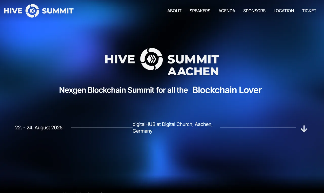
At that point I finally threw in the towel and told Detlev I would take over. I thanked him for all the AI suggestions, then spent about two and a half hours in Adobe Illustrator crafting the new logo. Now you can see the paths and outlines are all clean, so this version will work smoothly in any future application. For the web version I chose a bold typeface so the text stays legible even when the logo is scaled down. In the center hive circle I increased the spacing between the four elements to give everything a bit more breathing room. I also added a subtle gradient instead of a solid fill to make the design feel more dynamic. Finally, for the word “Aachen” we went with a lighter blue that we felt reflects the city’s tech vibe and its charm as a university town.
Final Logo Design

I think it’s great when someone starts thinking about their corporate design, especially if an AI can handle some of the heavy lifting! That’s fantastic and really helpful. But in the end, it still takes a human (in this case me, with years of experience) to bring the idea to life. So if you’ve ever used AI to draft a logo but need that final professional touch, feel free to reach out. I’ve redesigned plenty of logos into clean, print-ready vectors in the past - aswell for several projects here on Hive.
Until next time :)
If you like it - feel free to Support my Work with a Vote.
Interested to Join the Event? Checkout @detlev Post and checkout the Webpage i made aswell:
22. - 24. August 2025
digitalHUB at Digital Church, Aachen, Germany
https://hive-summit.com

Vote for my Hive Witness
U can vote for my Witness using Hive Keychain here: https://vote.hive.uno/@louis.witness
Vote for my Hive Engine Witness
Vote for my Witness on Hive-Engine using Primersion Tool: https://primersion.com/he-witnesses Enter your Username and search for louis.witness