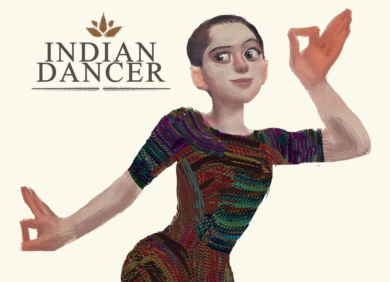
Its Friday again, my favourite day of the week. I have something in store for you guys, for today's post, I'm going to walk you through the process of me designing a character in Photoshop. The character is for a character redesign challenge in an art group. The given theme is "Indian Dancer".
Whenever I create my piece, I am very particular of the silhouette of the subject's shape and flow. There's a good number of reasons why it is important to be attentive to them. Human eyes instinctively search for clear shapes, basic shapes, and the flow of the composition. People are usually attracted to the symmetrical or complementary components in the work, rule of thirds or the golden ratio, that conform to most nature's own creation. What I meant by components are the composition, quality of lines, colors, etc.
Choosing Colours
One of the example can be seen in the use of colors. If a work consist of both warm and cool colors, you would want to separate them with one being dominant than the other. Use only about a third of the whole image with the warm colors to highlight your main subject against the dominantly cool-colored background. It is more pleasant to be looked at. The same goes with the saturation of the color.
All of these principles are our way of establishing order out of chaos. And art is order and chaos. The more we understand this, the better we grow as artists. But every now and then, there are exceptions, which is true in everything. And I think artist should learn all the rules first, in order to know when to break them. I am still learning, unlearning and relearning things myself. I am not in any way proclaiming myself as expert to give lessons but it is what I've picked up over the years and I hope it'll be helpful to others too.
References
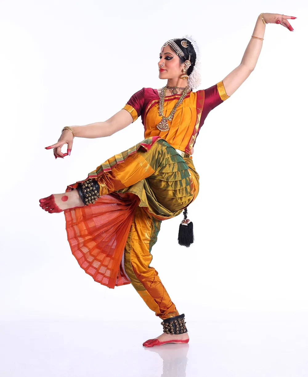
For this painting, I began with finding a bunch of references in the internet. I liked how they all looked very graceful and serene in their poses. I tried to exhibit these qualities in my own representation of the Indian Dancer.
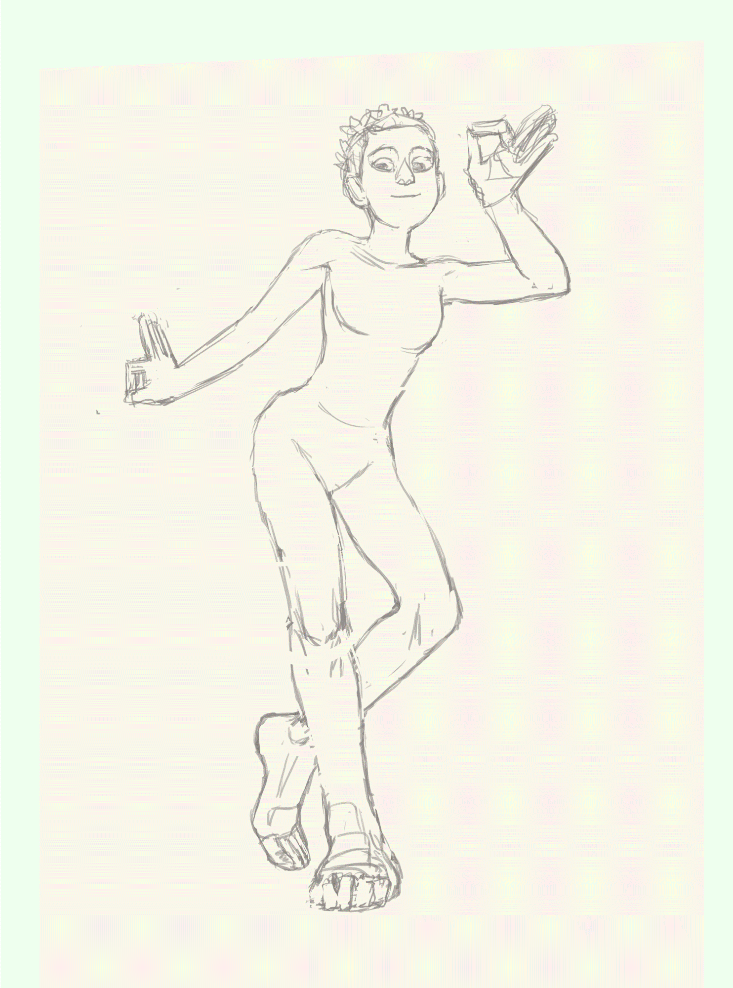
First I sketched a lineart to get the pose I want. It guided my whole process of coloring. When I started painting, I spent a lot of time on her face, which was quite a waste since the final look was very different. In the third step, I've made lines to indicate the flow of her dance pose. This was a crucial part to subtly direct the audience's eyes along the curves of her body. Diagonal lines are often used to suggest motion or movements in visual art, even in movies, as they are more interesting than horizontal or vertical lines. Except Wes Anderson's. He's my idol in symmetry. XD
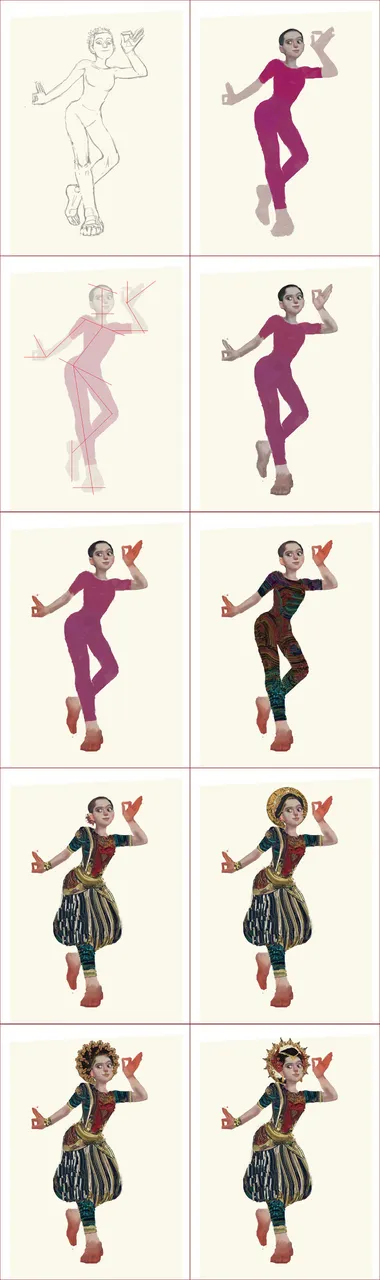
Then I detailed her hands and feet before I gave them the red henna dye. I colored her undergarment with a combination of complementary colors such as red and blue and yellow. Along the process, I put her the cultural dress on for the festive dance. I also gave her a headdress. The headdress was actually her body being repetitively rotated to form a halo, but I blocked some part of them and repainted the color to get that golden floral crown.
As I progress, I painted her skin with some realism and hopefully the flair of old brushworks. I tried to achieve this using the mixer brush tool in Photoshop, set to "Dry, Heave Load". I used the same mixer brush setting for the fabric's texture. But in this case, I was aiming for a flat look as if they were a collage of different patterns and motives.
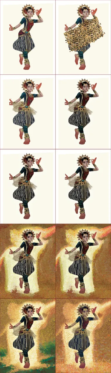
Further down the process, her facial features changed, and fixed. She looked much younger than the earlier stage of the painting's break-down. There was little adjustment to the character from here on, as I started developing the background using my other customized brush. I reduced her complexion's saturation and laid a soft sephia color layer onto the whole image. And finally I made the transparent chainmail-like skirt around her waist smaller as it stood out a little too much. And that's how I wrapped it up.
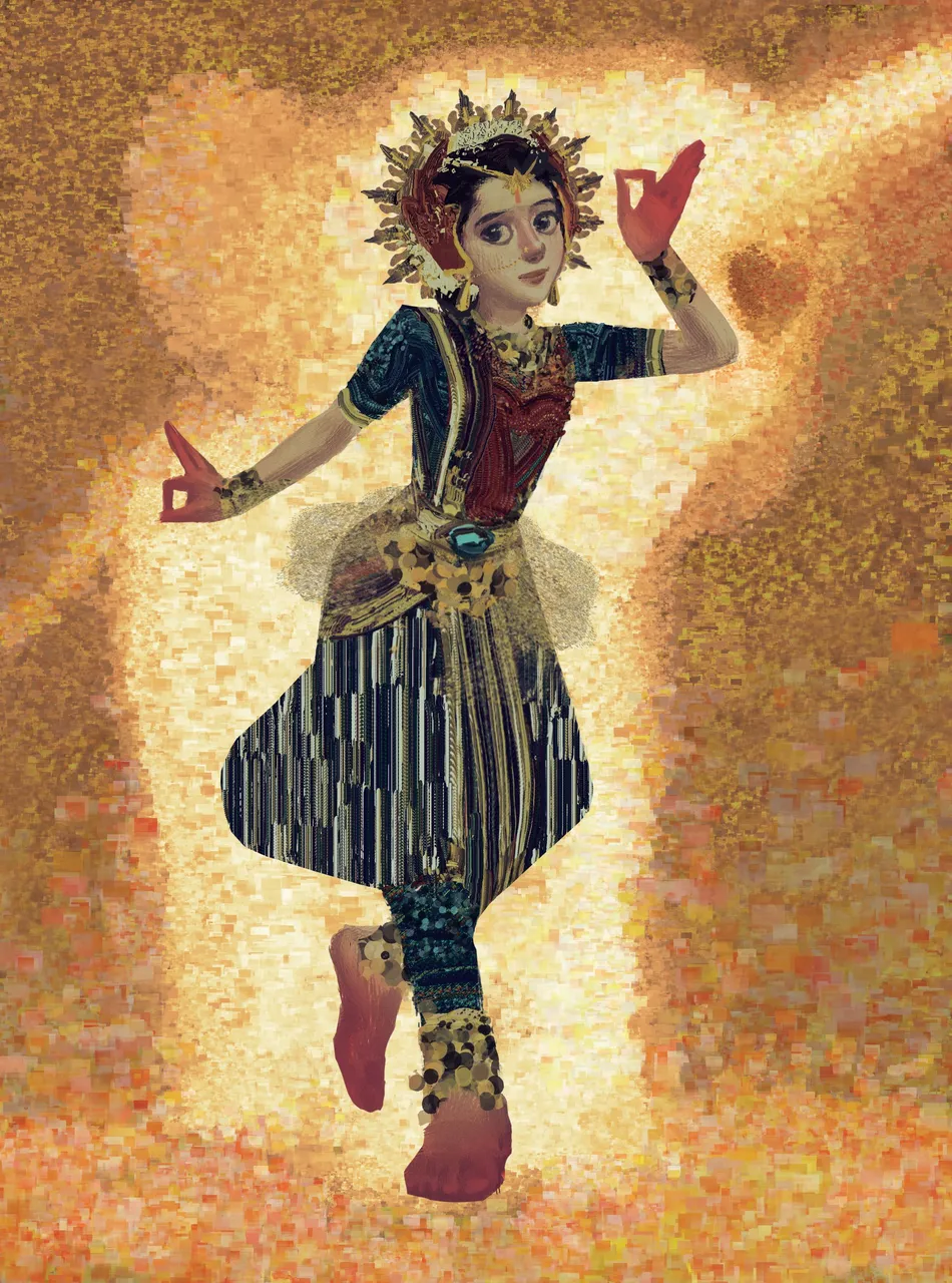
The final image looks like this. And perhaps the elephant in the room is the obvious influence of the Gustav Klimt style in the painting. Klimt was an incredible master painter who defied his own era and was only being really appreciated long after his death. He became one of the main references for many artists today. His depiction of his subjects were fusion of basic/organic forms and exaggerated realism, and was imitated in many modern artforms, including animations.
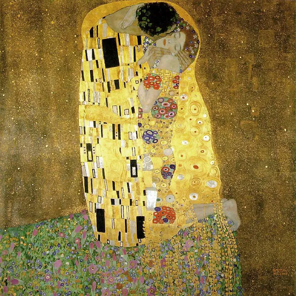
His most well-known work is "the Kiss" (1908) but I recommend you to see his other works too. Go check him out!
So, that's it for today. I hope you enjoy the process. Thank you for your support, and until next time.
- @Afique

The logo designed by @cartoonistpandan and the banner by @orenisme!