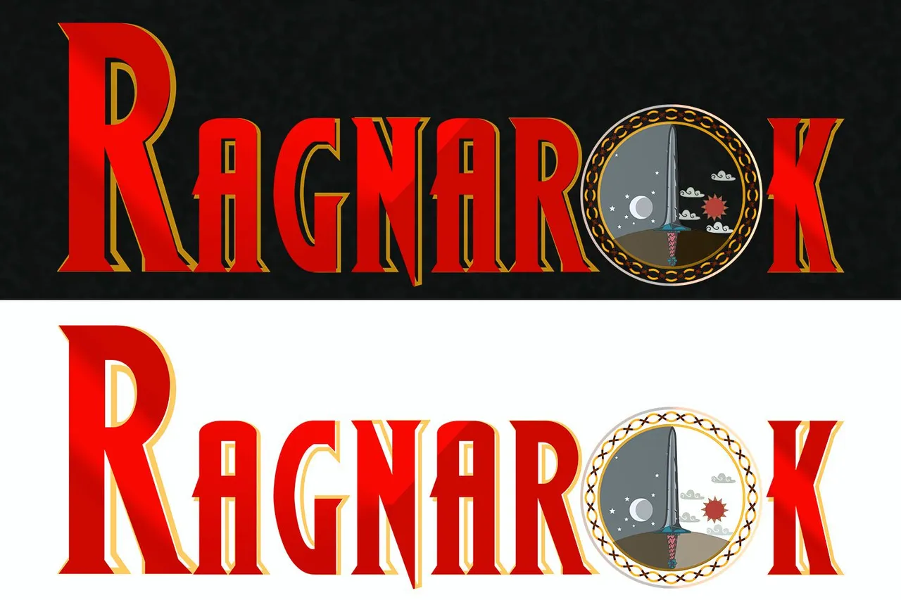
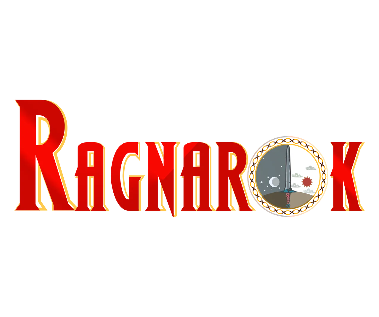
Greetings friends, how are you? today I bring to you my participation in the contest for the creation of a logo for Ragnarok, a game that undoubtedly generates me many expectations, I confess that I am anxiously awaiting its release, but for now I decided to make a proposal for its image, so below I present it to you, I hope you like it.
The design has been made in Adobe Illustrator and Adobe Photoshop, alternating between them, the font I made for the logo is called Wolfs Bane II and you can download it for free here
As part of the process I decided to make a logo type "isotype", so it can also be used as an icon of the game apart from the name, the idea is that it is quite functional, I'll show you the steps summarized in several images.
Process
The first thing was to make a vectorial circle in Adobe Illustrator, and add elements to form the isotype, for this I have taken into account the official statement of the game of Ragnarok made in the post of the logo contest: "The game's base theme is a giant universal conflict where all realms collide in a great war where the winners are decided every year. History repeats itself over and over for the rest of time." Source. In that sense I focused on staying within that context, and I got a result that in my point of view is quite satisfactory.
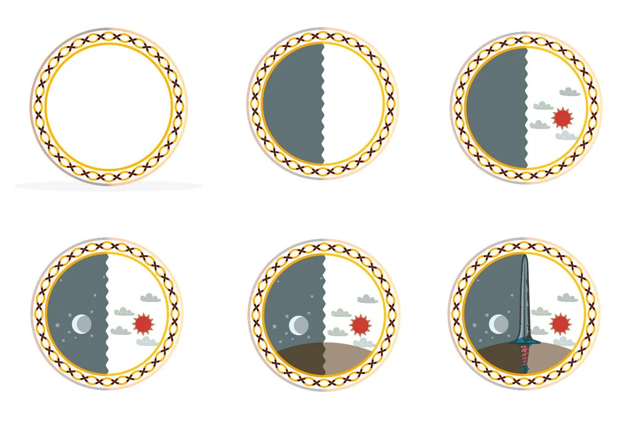
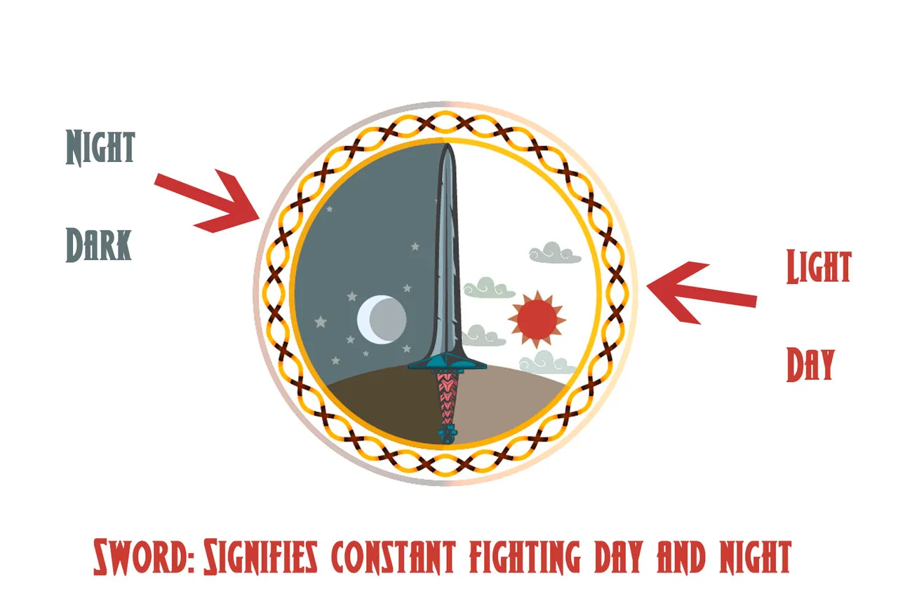
The circle represents an endless cycle, in which all ragnarok participants are subjected without any escape, so they must fight without rest, only victory will keep them alive.
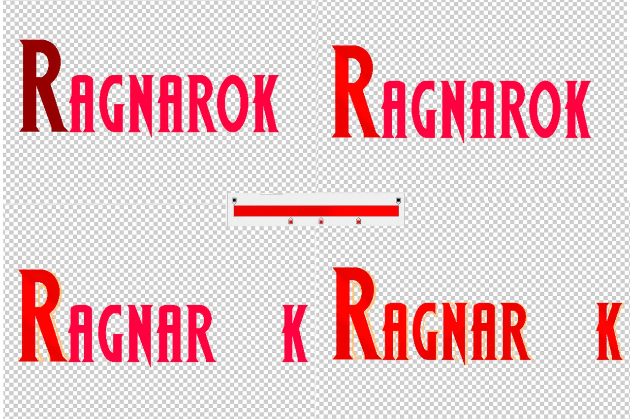
After finishing with the image, I proceeded to make the letters of the isotype, this time my mind was a little cloudy about the colors and other things, but little by little the ideas were flowing, and in the end I decided to combine the image with the text to obtain a harmonious result, which would be the final logo.
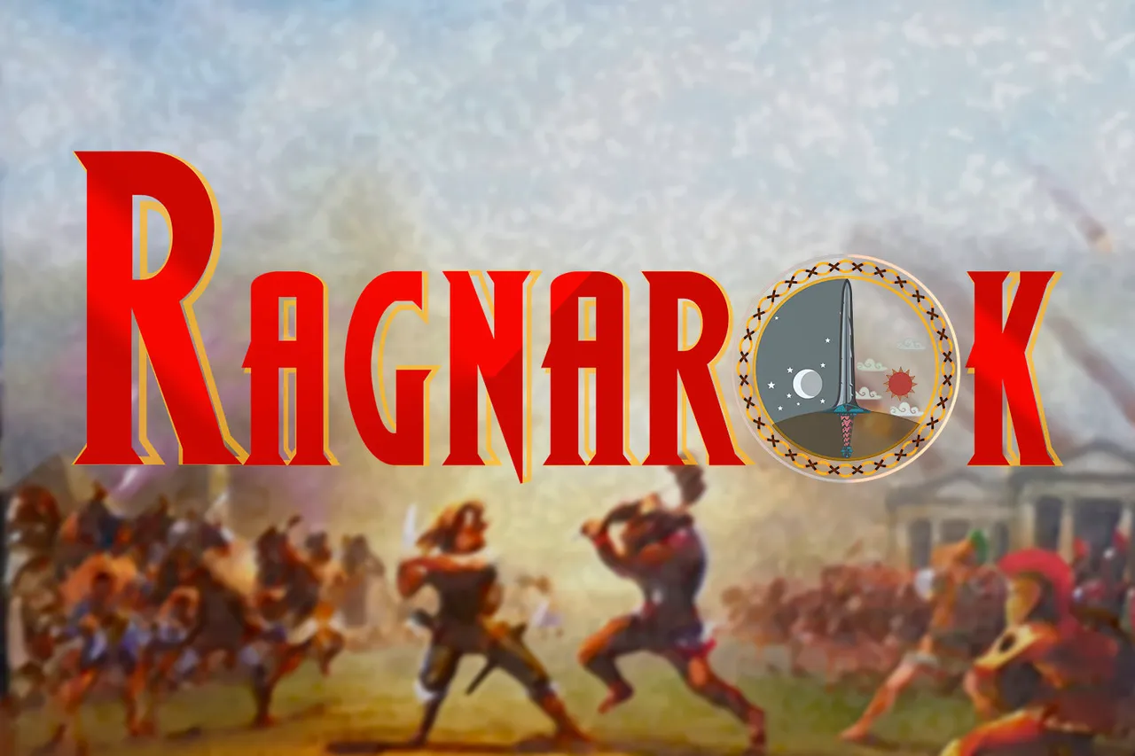
I hope you liked it, and I conclude with a contextual image:
Thank you very much for reading.
The design was made using free elements from Freepik

Saludos amigos, como se encuentran? el dia de hoy traigo para ustedes mi participacion en el concurso de la creacion de un logo para Ragnarok, un juego que sin duda alguna me genera muchas expectativas, les confieso que estoy esperando ansiosamente su lanzamiento, pero por ahora he decidido realizar una propuesta para su imagen, por lo que a continuacion se las presento, espero les guste.
El diseño lo he realizado en Adobe Illustrator y Adobe Photoshop, alternando entre ellos, la fuente que realize para el logo se llama Wolfs Bane II y puedes descargarla gratuitamente aqui
Como parte del proceso decidi realizar un logo tipo "isotipo", para que tambien pueda ser utilizado como icono del juego aparte del nombre, la idea es que sea bastante funcional, te voy a mostrar los pasos resumidos en varias imagenes.
Proceso
Lo primero fue realizar un circulo vectorial en Adobe Illustrator, e ir añadiendo elementos para asi conformar el isotipo, para ello he tomado en cuenta la declaracion oficial del juego de Ragnarok hecha en el post del logo contest: "The game's base theme is a giant universal conflict where all realms collide in a great war where the winners are decided every year. History repeats itself over and over for the rest of time." Source. En ese sentido me enfoque en no salirme de ese contexto,y obtuve un resultado que a mi punto de vista es bastante satisfactorio.
El circulo representa un ciclo interminable, en el cual todos los participantes de ragnarok estan sometidos sin escape alguno, por eso deben luchar sin descanso, solo la victoria los mantendra con vida.
Luego de terminar con la imagen, procedi a realizar las letras del isotipo, en esta ocasion mi mente estaba algo nublada en cuanto a los colores y otras cosas, pero poco a poco fueron fluyendo las ideas, y al final decidi combinar la imagen con el texto para obtener asi un resultado armonico, el cual seria el logo final.
Espero les haya gustado, y concluyo con una imagen contextual para variar:
Muchas gracias por leer.
El diseño lo he realizado utilizando elementos gratuitos de Freepik