
Bienvenidos mis queridos amigos amantes del arte y artista.
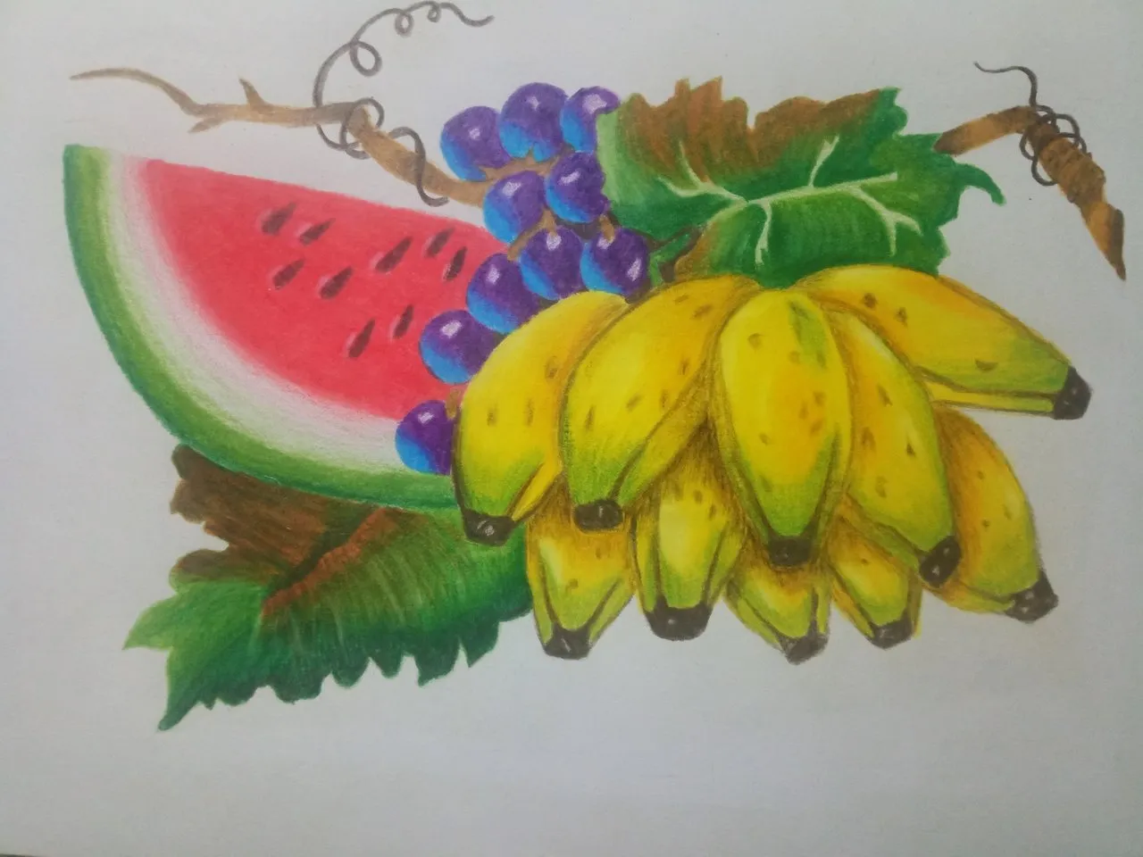
Hoy les vengo a presentar un dibujo que he realizado con colores marca Kores, el cual se trata de un frutal, he decidido hacer este dibujo como práctica para mejorar más mi técnica de dibujo a color, así que me pareció muy interesante hacer este dibujo porque posee muchos colores que vamos a tener que usar para elaborar nuestro dibujo.
Dicho frutal tiene unos cambures, uvas, patilla junto con flores y ramas, honestamente este es el dibujo más hermoso que he hecho con colores de esta marca.
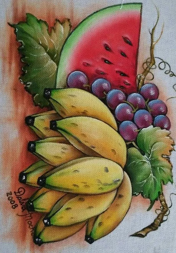
Al igual que en la mayoría de mis dibujos, las imágenes que utilizo en referencia son sacados de una gran página de ideas y diseños llamada Pinterest.
Welcome my dear friends, art lovers and artist.
Today I come to present a drawing that I have done with Kores colors, which is a fruit tree, I decided to do this drawing as a practice to improve my color drawing technique, so I found it very interesting to do this drawing because it has many colors that we will have to use to develop our drawing.
This fruit tree has some camburs, grapes, patilla along with flowers and branches, honestly this is the most beautiful drawing I have done with colors of this brand.
As in most of my drawings, the images I use in reference are taken from a great page of ideas and designs called Pinterest.
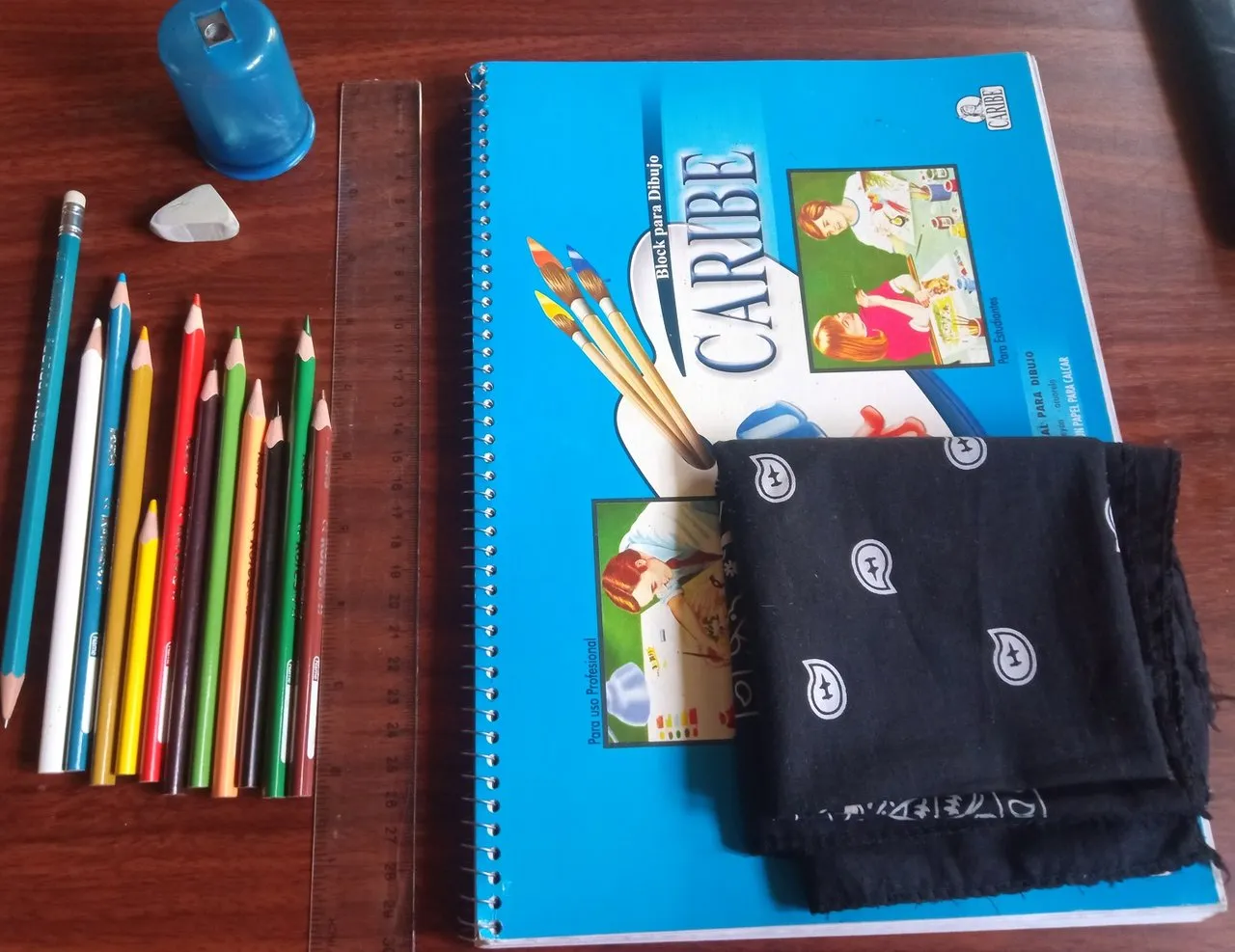
Los materiales que vamos a necesitar para elaborar nuestro dibujo son los siguientes:
*Un bloc de dibujo marca Caribe.
*Lápiz de grafito 2B.
*Sacapuntas con depósito.
*Borrador.
*Pañuelo.
*Regla.
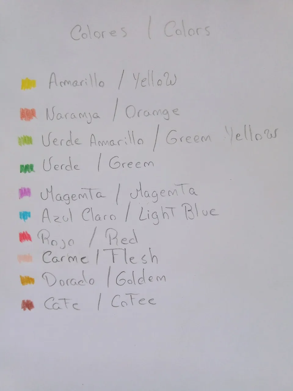
Colores como:
*Amarillo.
*Naranja.
*Verde amarillo.
*Verde.
*Magenta.
*Azul claro.
*Rojo.
*Carne.
*Dorado.
*Café.
The materials that we are going to need to elaborate our drawing are the following:
*A Caribe sketch pad.
*A 2B graphite pencil.
*Pencil sharpener with reservoir.
*Pencil eraser.
*Handkerchief.
*Ruler.
Colors such as:
*Yellow.
*Orange.
*Yellow green.
*Green.
*Magenta.
*Light blue.
*Red.
*Flesh.
*Gold.
*Coffee.
En esta publicación les estaré explicando como elabore mi dibujo a color, por lo que solamente mencionaré las técnicas que se deben usar para colorear bien nuestros dibujos, recuerden que la marca de colores que estoy usando son los Kores.
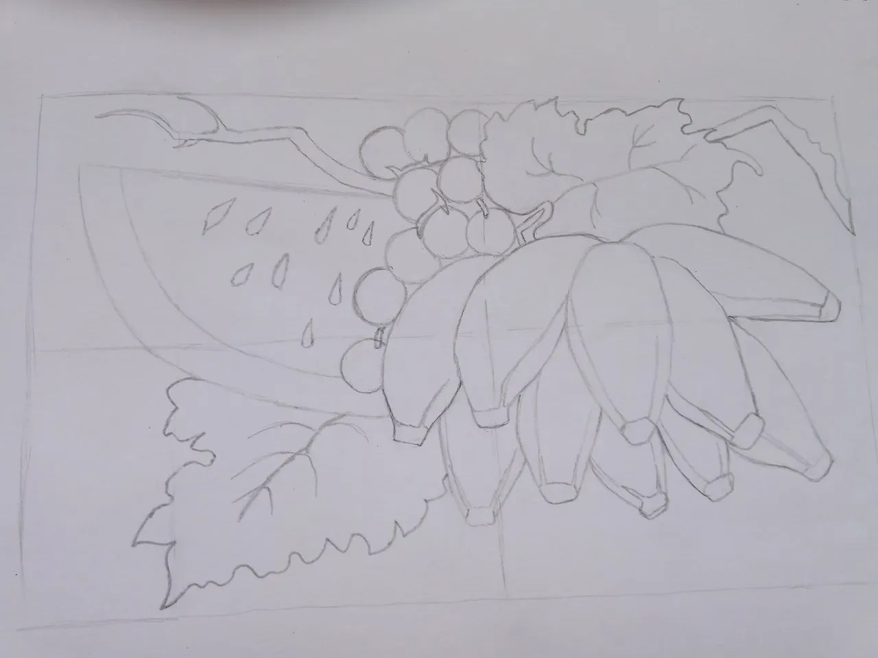
Podemos notar que ya nuestro dibujo está elaborado con la ayuda de nuestro lápiz de grafito 2B, Para poder hacer nuestro dibujo sin que nos quede desproporcionado, podemos trazar dos líneas, una vertical y otra horizontal, esto nos ayudara para hacer que nuestros dibujos queden perfectos.
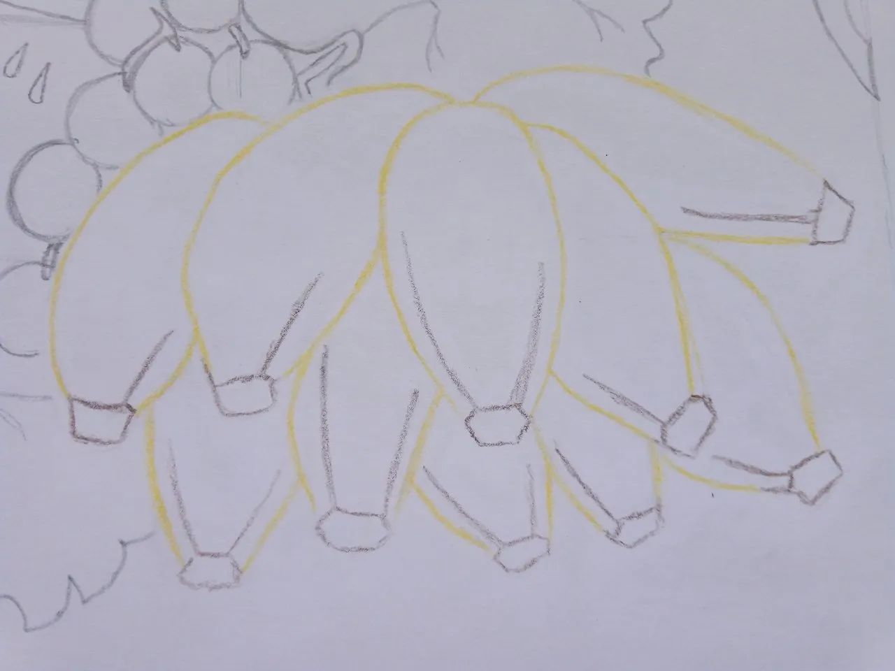
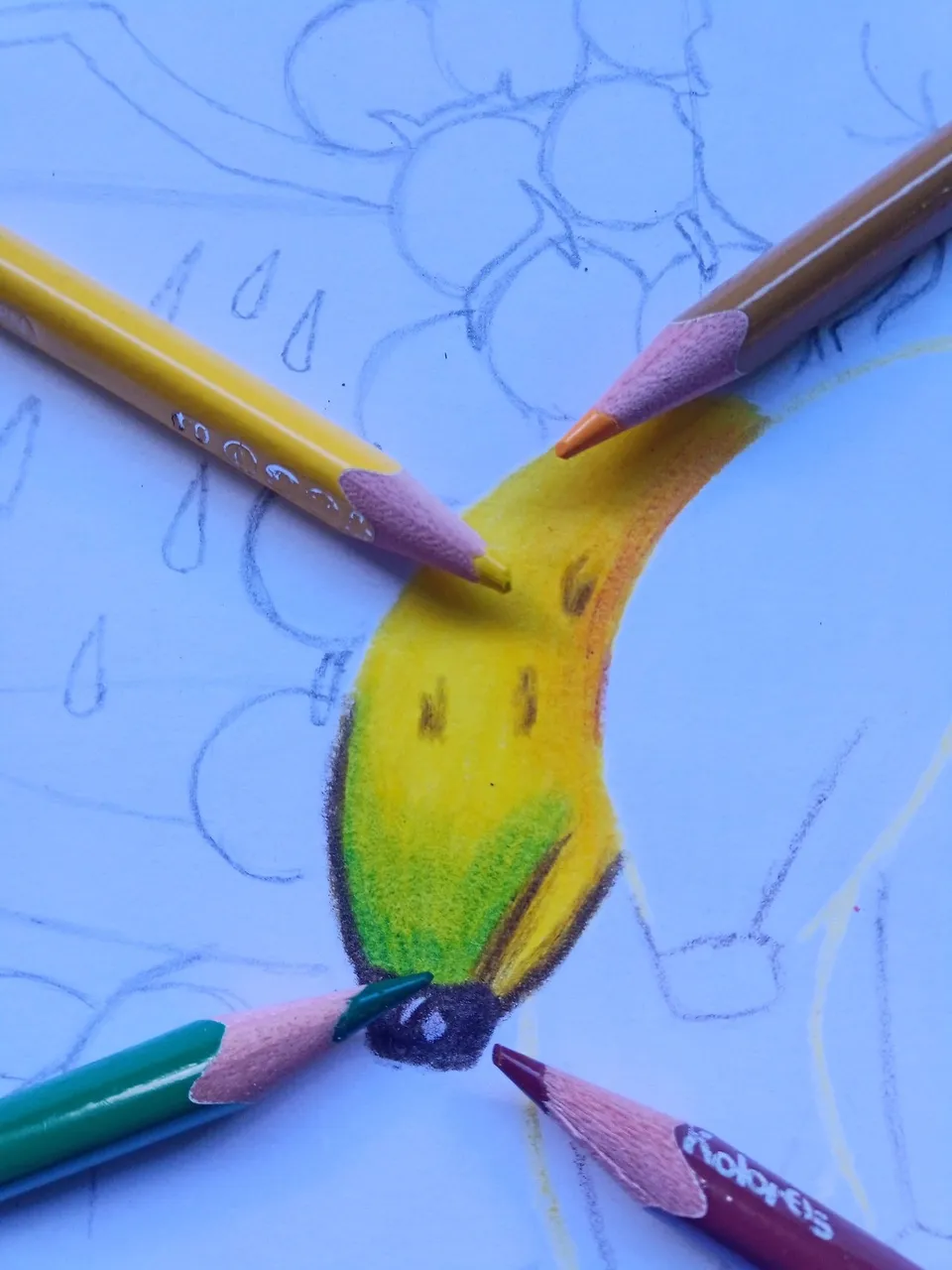
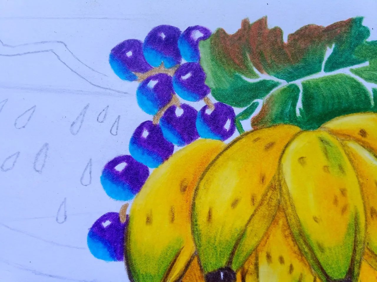
Después de tener el dibujo completo, comencé primero a colorear los cambures, ya que estos se encuentran al frente de todo el dibujo y me servirá de base para poder colorear el resto de las frutas y hojas.
Con la ayuda de un borrador comencé a borrar, pero no del todo, las líneas con la forma del cambur, luego con la ayuda del color amarillo comencé a trazar las líneas de la fruta, para la punta de estas utilicé el color marrón o bien el color café el cual viene siendo lo mismo, sabemos bien que en las puntas del cambur se encuentra esta gruesa y robusta concha que es cuando al momento de crecer esta fruta le salen una flor para que las abejas puedan polinizarla.
Aparte de esto, un dato que deben saber es que en el mundo artístico todo lo que se vea negro no es del todo negro, ya que este siempre viene siendo una mezcla de otros colores más intensos, como por ejemplo el marrón.
Una vez realizada las líneas con los colores, comencé a trabajar cambur por cambur al 100%, ya que si yo no lo hacía de esta manera me podía perder por colorear todos a la vez, así que primero le di una capa con el color amarillo al cambur, luego en la punta le agregue el color verde, ya que estos cambures siempre conservan este color, pero que casi ni se note.
In this publication I will be explaining how I made my color drawing, so I will only mention the techniques that should be used to color our drawings well, remember that the brand of colors I am using are the Kores.
We can notice that our drawing is already elaborated with the help of our graphite pencil 2B. In order to make our drawing without leaving it disproportionate, we can draw two lines, one vertical and the other horizontal, this will help us to make our drawings perfect.
After having the drawing complete, I started first to color the camburs, since these are at the front of the drawing and will serve as a base to color the rest of the fruits and leaves.
With the help of an eraser I began to erase, but not completely, the lines with the shape of the cambur, then with the help of the yellow color I began to trace the lines of the fruit, for the tip of these I used the brown color or the brown color which is the same, we know well that in the tips of the cambur is this thick and robust shell that is when at the moment of growing this fruit they leave a flower so that the bees can pollinate it.
Apart from this, a fact that you should know is that in the artistic world everything that looks black is not entirely black, since it is always a mixture of other more intense colors, such as brown.
Once I made the lines with the colors, I began to work 100% cambur by cambur, because if I did not do it this way I could get lost by coloring all at once, so first I gave a layer with the yellow color to the cambur, then in the tip I added the green color, since these camburs always conserve this color, but it is almost not even noticeable.
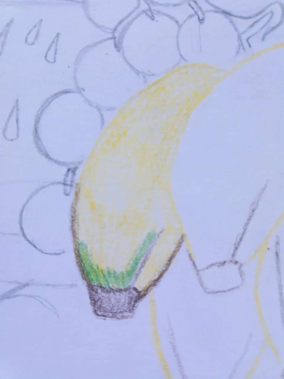
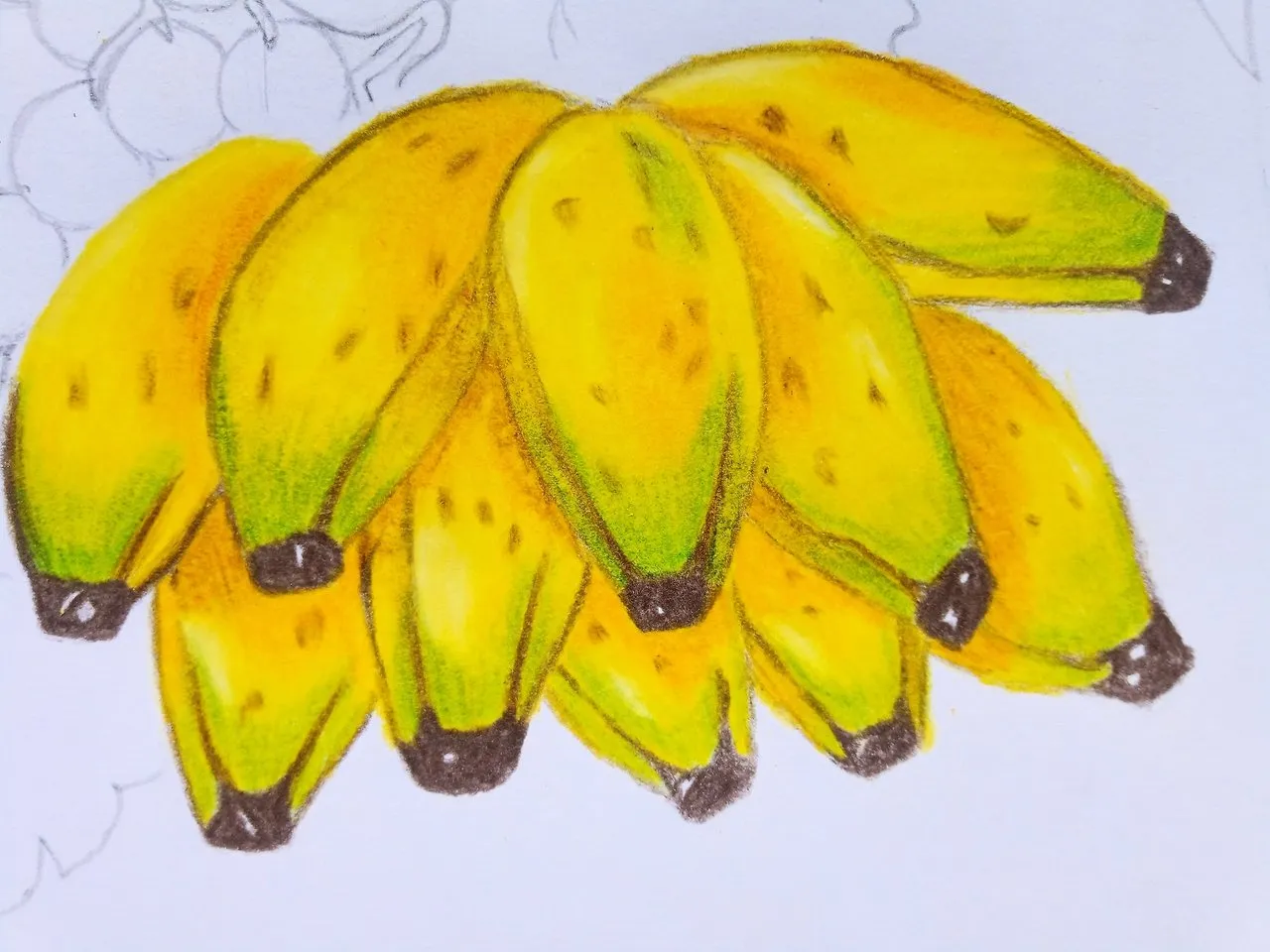
Más adelante comencé a afincar más el crayón en este cambur, luego de agregar las primeras capaz comencé a afincar el color amarillo en todo el cambur, luego sobre este le di por las puntas una capa más del color verde amarillo, utilice el marrón para darle un poco más de profundidad en algunas partes y algunas manchas del mismo cambur maduro, luego use el amarillo cromo para hacer que el amarillo no se vea solo, sino que tenga un poco más de volumen.
Después repetí el mismo proceso una y otra vez hasta haber realizado todo el dibujo, para agregar un poco de brillo sobre estos cambures, como extra de colores utilicé el color blanco, para poder lograr tener este brillo hay que afincar muy fuerte este crayón, como los poros de la hoja están totalmente llenos será un poco difícil agregar un color más, pero si afincamos muy fuerte nuestro color, podremos medio borrar el color que está debajo de esté con la ayuda del color blanco.
Al terminar de pintar todos los cambures comencé a trabajar con la hoja que se encuentra en la parte superior del cambur, el cual use la misma técnica de antes, con la ayuda del borrador medio borre las líneas que anteriormente había realizado con el lápiz de grafito y posteriormente use el color verde amarillo para realizar los bordes de dicha hoja.
Later I began to refine the crayon more in this cambur, after adding the first capable I began to refine the yellow color throughout the cambur, then on this I gave by the tips one more layer of yellow green color, use the brown to give a little more depth in some parts and some spots of the same ripe cambur, then use the chrome yellow to make the yellow is not seen alone, but to have a little more volume.
Then I repeated the same process over and over again until I had done the whole drawing, to add a little brightness on these camburs, as an extra color I used the white color, to achieve this brightness you have to sharpen this crayon very strong, as the pores of the leaf are completely filled will be a little difficult to add another color, but if we sharpen our color very strong, we can half erase the color that is underneath with the help of the white color.
When I finished painting all the camburs I started to work with the leaf that is on the top of the cambur, which I used the same technique as before, with the help of the eraser I erased the lines that I had previously made with the graphite pencil and then I used the yellow green color to make the edges of the leaf.
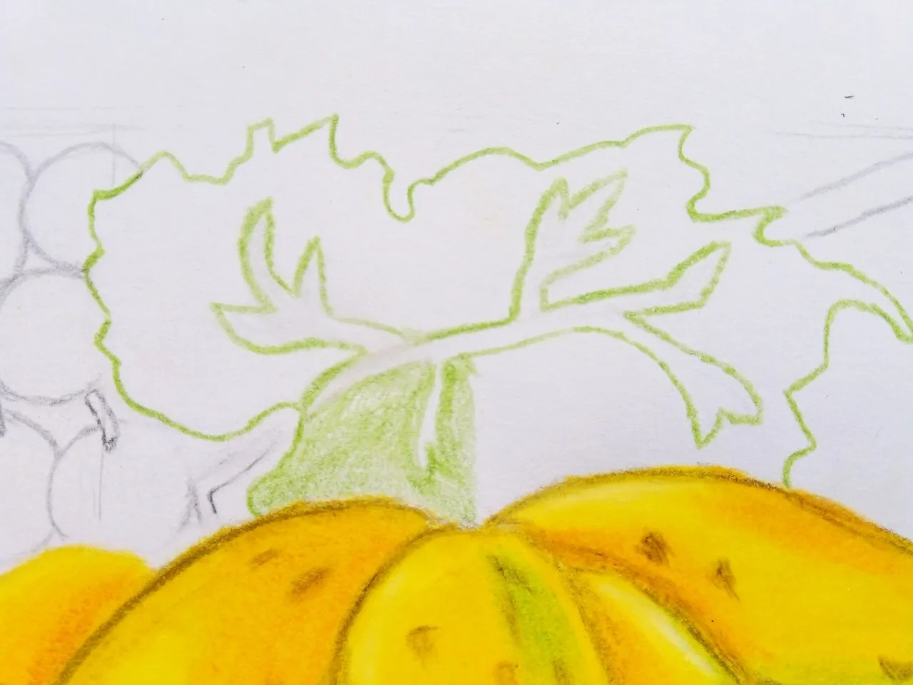
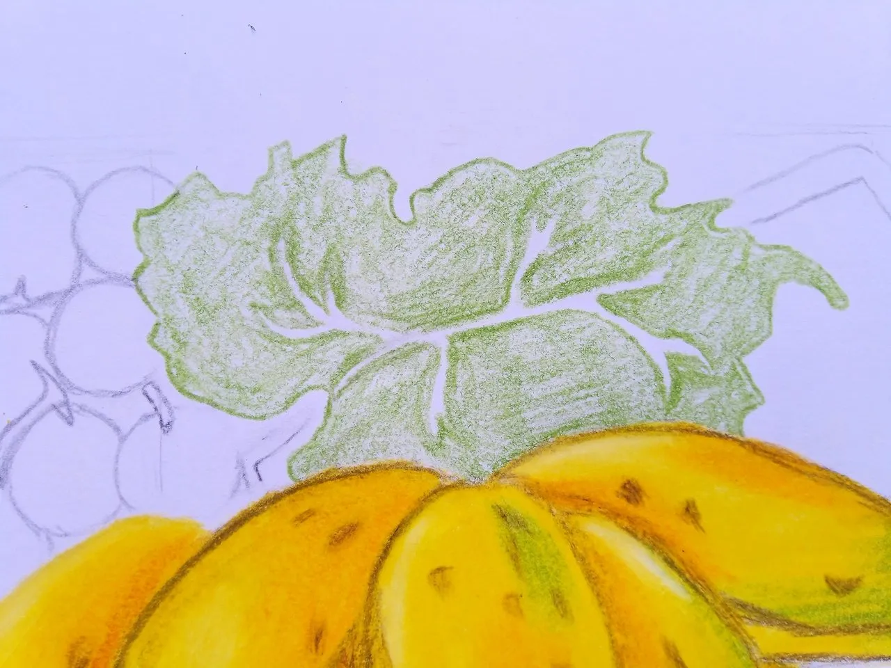
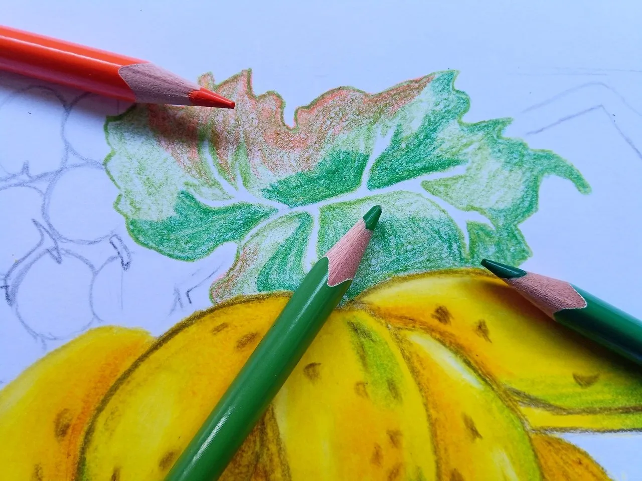
Luego procedí a colorear toda la hoja dejando un espacio en blanco, más adelante comencé a agregar otros colores como el verde y el anaranjado, si observamos bien nuestra imagen de referencia, podemos notar que la hoja se encuentra en proceso de secarse, por lo que en la parte superior de la hoja le agregué el color anaranjado, y para la parte inferior el color verde el mismo es un poco más fuerte que el verde amarillo.
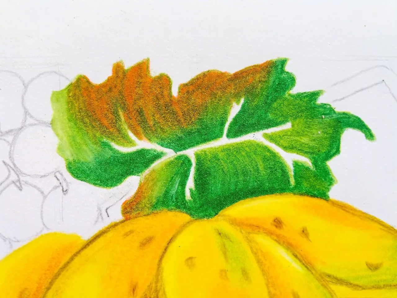
Por último le agregué el color verde amarillo una vez más, pero afincando muy fuertemente el crayón, podemos incluso pasarlo sobre los otros colores que anteriormente habíamos agregado.
Then I proceeded to color the entire leaf leaving a blank space, later I began to add other colors such as green and orange, if we observe well our reference image, we can notice that the leaf is in the process of drying, so in the upper part of the leaf I added the orange color, and for the lower part the green color is a little stronger than the yellow green.
Finally, I added the yellow green color once again, but with the crayon very strongly, we can even pass it over the other colors that we had previously added.
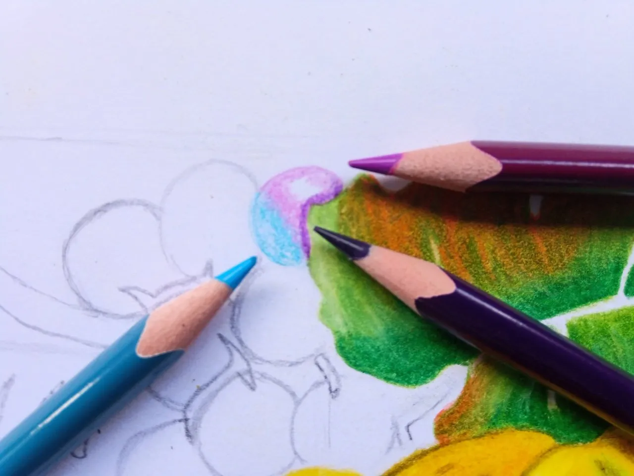
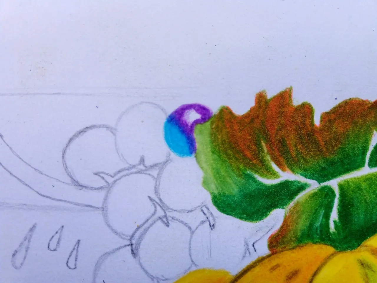
Después comencé a trabajar con las uvas, para esto comencé a usar el color magenta en la parte superior de la uva, en la parte inferior usé el color azul claro para posteriormente agregar el color morado.
Al agregar el color morado afincando el color al igual que el azul, podemos notar este efecto de iluminación, no es que las uvas sean de color azul, sino que este es el efecto de iluminación según nos presenta en la imagen de referencia, lo cual me gusto mucho este efecto, más adelante repetí el mismo proceso en cada una de las uvas.
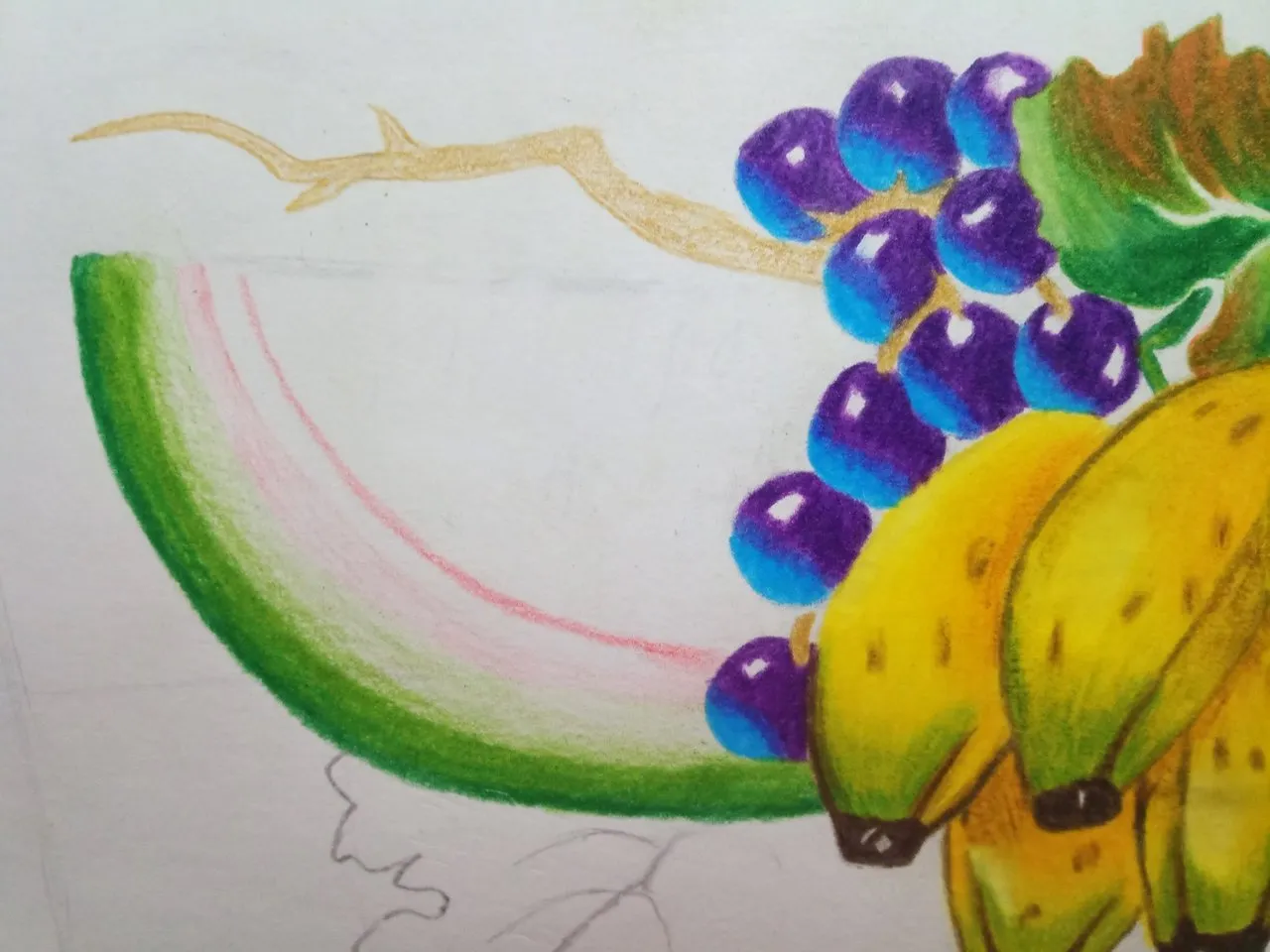
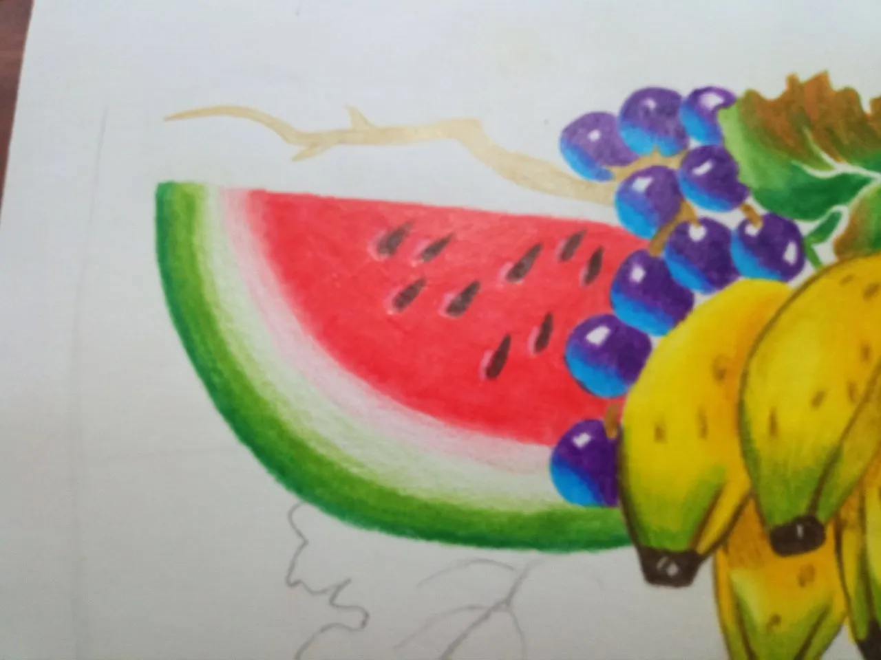
Ya podemos notar como nos está quedando nuestro dibujo, lo cual me encanto como ya me está quedando el dibujo, ahora para la parte de la patilla utilice el color verde amarillo, por la parte de los bordes use el color verde, sabemos bien que donde termina la patilla y el fruto que uno se come, vemos que el mismo no es ni color rojo ni verde, sino que casi ni se notan estos colores, para ello podemos hacer pequeños trazos sin afincar nuestros colores.
Para la parte superior de la patilla use el color rojo y sobre este el color carne para hacer que brillara, ya que el mismo no es del todo rojo a este nivel de dibujo en la que estoy amigos.
Para las semillas de la patilla use el color marrón con un pequeño toque de negro, luego use el color blanco para agregar un efecto de iluminación en estas partes de la patilla.
Por último, utilice el color ocre quemado para los palos, el mismo hice una mezcla de color café y ocre quemado para poder lograr esta mezcla de colores en nuestro dibujo, también coloreé la hoja que se encuentra en la parte inferior de la patilla, y de esta manera habremos terminado nuestro dibujo.
Recuerden para no es necesario ser un maestro para lograr ser un gran artista, palabras sabía de un buen amigo que quizás muchos conozcamos.
Las fotos fueron tomadas con la ayuda de mi teléfono Bison X Designed By Umidigi.
La imagen de referencia se encuentra en la parte inferior de este texto, debajo de ella podrán encontrar la fuente de la misma, el cual los llevara a la página que utilizo para encontrar las imágenes en referencia que uso para dibujar.
Y Así finaliza la publicación de hoy amigos, espero les sea de su agrado y que hayan aprendido algo nuevo el día de hoy con mi publicación, hasta la próxima.
Then I started to work with the grapes, for this I started to use the magenta color in the upper part of the grape, in the lower part I used the light blue color to later add the purple color.
By adding the purple color to the color as well as the blue, we can notice this lighting effect, it is not that the grapes are blue, but this is the lighting effect as presented in the reference image, which I really liked this effect, later I repeated the same process in each of the grapes.
Now we can see how our drawing is getting, which I love how the drawing is getting, now for the part of the sideburn use the yellow green color, for the part of the edges use the green color, we know well that where the sideburn ends and the fruit that one eats, we see that it is neither red nor green, but these colors are almost not noticeable, for this we can make small strokes without sharpening our colors.
For the upper part of the sideburn I used the red color and on this the flesh color to make it shine, since it is not quite red at this level of drawing in which I am friends.
For the seeds of the sideburn I used brown with a little touch of black, then I used white to add a lighting effect on these parts of the sideburn.
Finally, I used the color burnt ocher for the sticks, I made a mixture of brown and burnt ocher to achieve this mixture of colors in our drawing, I also colored the leaf that is at the bottom of the sideburn, and in this way we will have finished our drawing.
Remember that it is not necessary to be a master to be a great artist, words I knew from a good friend that maybe many of us know.
The pictures were taken with the help of my Bison X Designed By Umidigi phone.
The reference image is at the bottom of this text, below it you can find the source of it, which will take you to the page I use to find the reference images I use to draw.
And so ends today's publication friends, I hope you like it and that you have learned something new today with my publication, until next time.
Source / Fuente Castle of Castlevania
Source / Fuente Terra Blade of Terraria
Los separadores son de mi autoría, la imagen de referencia posee su fuente, las ediciones del GIF son creados por mí.
The separators are of my authorship, the reference image has its source, the GIF edits are created by me
Programas que utilicé para crear mi diseño es este:
This is the program I used to create my design:
Gif y portada cortesía de Canva
Gif and cover courtesy of Canva
Traducido por Deepl