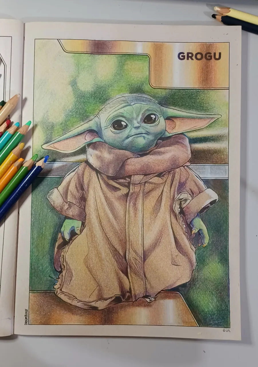
Hola queridos amigos de la comunidad!
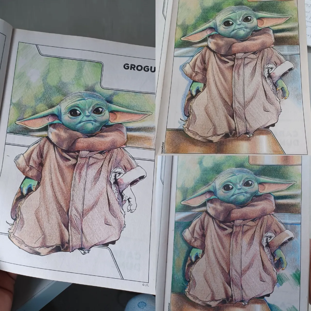
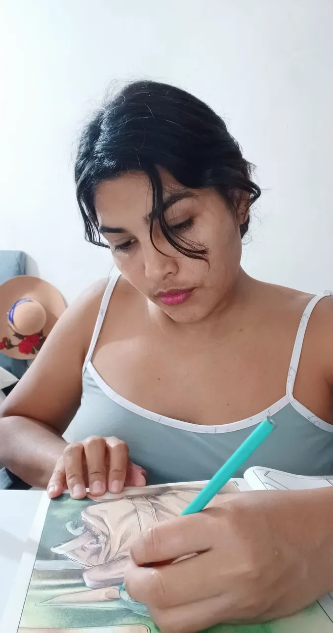
Espero sea un gran fin de semana para todos, el día de hoy he venido a compartir la segunda ilustración que coloreo de mi libro para colorear del el Mandaloriano que adquirí hace ya algún tiempo, pasaron los días y pensé que seria de esas compras que se quedan a acumular polvo entre mis otras cosas, sin embargo lo comencé hace poco y me ha ayudado mucho como terapia para aliviar el estrés y también para emplear mis colores que solo uso para cosas muy puntuales y por supuesto ejercitar mi técnica con ellos, el día de hoy les traigo una vez mas el paso a paso de este dibujo.
Hello dear friends of the community!
I hope you all have a great weekend. Today I'm here to share the second illustration I colored from my The Mandalorian coloring book, which I bought some time ago. Days went by and I thought it would be one of those purchases that would end up gathering dust among my other things, However, I started it recently, and it has helped me a lot as therapy to relieve stress and also to use my colors, which I only use for very specific things, and of course to practice my technique with them. Today, I bring you once again the step-by-step process of this drawing.
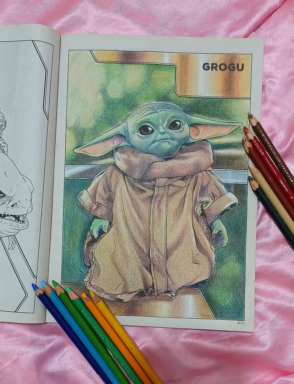
Las colores que estoy usando son mis Prismacolor Premier, que compre incluso antes de comenzar mi carrera en Artes, es decir que los poseo desde hace mas de 10 años y aun los conservo todos y casi íntegros salvo algunos pocos, la técnica que yo usualmente empleo es definir las diferentes zonas según el tono sea mas alto bajo o medio, luego que hago esta diferenciación comienzo a colocar la primera capa de color, en esta area comencé aplicando el color primario azul para definir las zonas medias y bajas.
The colors I am using are my Prismacolor Premier pencils, which I bought even before I began my career in art. That means I have had them for more than 10 years and still have all of them, almost intact except for a few. The technique I usually use is to define the different areas according to whether the tone is high, low, or medium. After making this distinction, I begin to apply the first layer of color. In this area, I started by applying the primary color blue to define the medium and low areas.
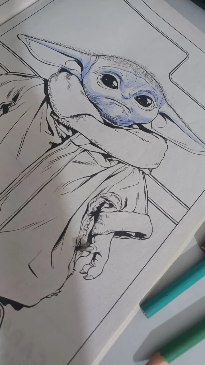
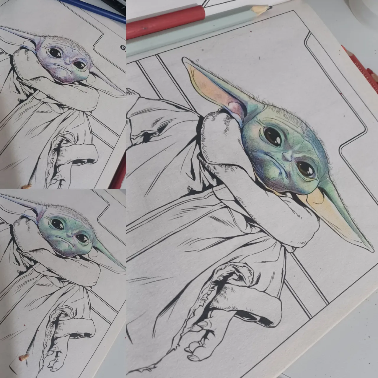
Luego uso el color rojos para una segunda capa, este color lo aplico solamente en la zonas donde el tono sera mas bajo, en todo momento el trazo de estas dos primeras capas la presión del lápiz es mínima, si comienzo ejerciendo mucha fuerza podría saturar el papel y luego no podre añadir mas tonos. la siguiente capa la hice en el color de la piel de Grogu, cuyo nombre y código es Light aqua PC992 este lo combine con el color True green PC910 estos aplicados con diferentes niveles de presión dependiendo de la zona a colorear. para las zonas donde el tono es mas alto use un tono amarillo con un nivel de presión mínimo.
Para colorear el interior de las orejitas, el tono base fue amarillo y luego aplique Rouge carmín PC926 para alcanzar el tono de la piel en esa área.
Then I use red for a second layer, applying this color only to the areas where the tone will be lower. At all times, the pressure of the pencil is minimal when applying these first two layers. If I start by applying too much pressure, I could saturate the paper and then I won't be able to add more tones. The next layer was done in the color of Grogu's skin, whose name and code is Light Aqua PC992. I combined this with the color True Green PC910, applying them with different levels of pressure depending on the area to be colored. For areas where the tone is higher, I used a yellow tone with minimal pressure.
To color the inside of the ears, the base tone was yellow, and then I applied Rouge carmine PC926 to achieve the skin tone in that area.
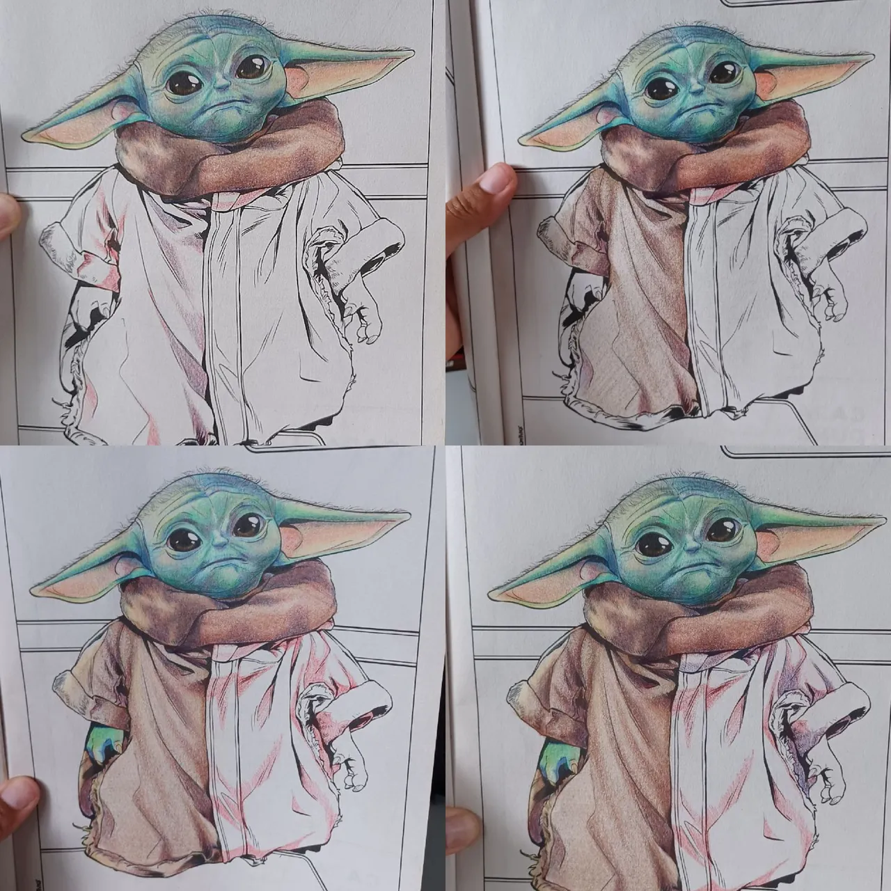
Luego procedí a colorear su ropa, en esta aplique el mismo proceso antes descrito, solo que cambie solo un poco el orden de las capas, como esta parte es marrón decidí comenzar con el color rojo definiendo en primer lugar las zonas mas oscuras e ir definiendo los pliegues de las telas de su chaqueta luego añadí el color azul en las áreas mas oscuras y luego coloree todo usando el color Light umber PC941 mezclado con Ginger root PC1084 con diferentes niveles de precio dependiendo si es una zona mas luminosa en las cuales combine con un poco de amarillo
Then I proceeded to color her clothes, applying the same process described above, but changing the order of the layers slightly. Since this part is brown, I decided to start with the color red, first defining the darkest areas and then defining the folds of the fabric of her jacket. I then added the color blue to the darkest areas and colored everything using the color Light umber PC941 mixed with Ginger root PC1084 with different levels of intensity depending on whether it was a brighter area, in which case I combined it with a little yellow.
Estuve buen rato pensando en si solo debía colorear la figura, pero no me parecía que luciera bien así que comencé a colorear también el fondo, en esta dibuje un paisaje natural borroso, solo algunas manchas de color verde y amarillo, para esa zona definí también las formas de estas manchas de color usando el color azul y rojo en las partas mas oscuras, luego las zonas mas luminosas con amarillo y sobre todo una capa de verde con la diferencia que en en esta parte deje zonas puras con el tono del papel.
I spent a long time thinking about whether I should just color the figure, but I didn't think it looked right, so I started coloring the background as well. In this one, I drew a blurry natural landscape, just a few spots of green and yellow. For that area, I also defined the shapes of these spots of color using blue and red in the darker parts, then the brighter areas with yellow and, above all, a layer of green, with the difference that in this part I left pure areas with the tone of the paper.
Para algunas áreas delimitadas en los bordes, decidí darle una textura diferente, como metálico dorado brillante, para el cual no repetiré el proceso solo indicare el orden en que los he colocado, rojo, azul y amarillo la única diferencia de en esta zona en que añadí color blanco en las zonas mas luminosas para completar el efecto brillante del material.
For some areas defined at the edges, I decided to give them a different texture, such as shiny gold metallic, for which I will not repeat the process. I will only indicate the order in which I placed them: red, blue, and yellow. The only difference in this area is that I added white to the brightest areas to complete the shiny effect of the material.
Espero que mi explicación de este proceso les haya sido útil, es el método que he aprendido a través de años de practicas tanto en la universidad como fuera de ella y ademas de sencilla se obtienen resultados bastante bonitos.
I hope my explanation of this process has been useful to you. It is the method I have learned through years of practice both at university and outside of it, and in addition to being simple, it produces quite beautiful results.
¡Muchas gracias por leer!
¡Hasta la próxima!
Thank you very much for reading!
See you next time!