Definitely, here is my list:
I don't mean to offend anyone, but if you can' take the critique as an artist then you probably picked the wrong path.
The first 4 pieces are equally good, so any of them could take the top 3. I would put naga at number 4 just because this artist was highlighted many times before.
1 . @h-t-t @h-t-t/splinterlands-art-contest-week-163-harklaw
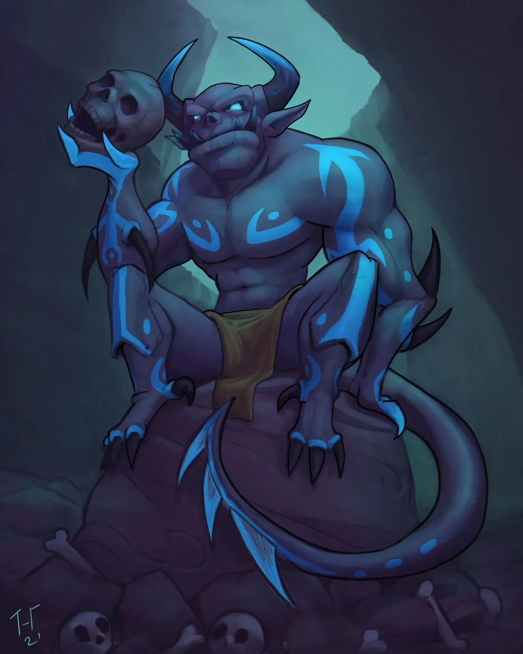
Besides the lack of stronger shadows, everything looks amazing here. Colour palette, scene, idea - 5/5. Plus it's a newcomer, I bet a highlight and a reward would definitely motivate this person to show more of his art in the future.
2 . @berien @berien/splinterlands-art-contest-week-163

I am not gonna go into details as they were picked as winners, but in my opinion, this should be in the top 3. Reasons: Original, high quality.
3 . @artgraf @artgraf/splinterlands-art-contest-week-163-goblin-sorcerer
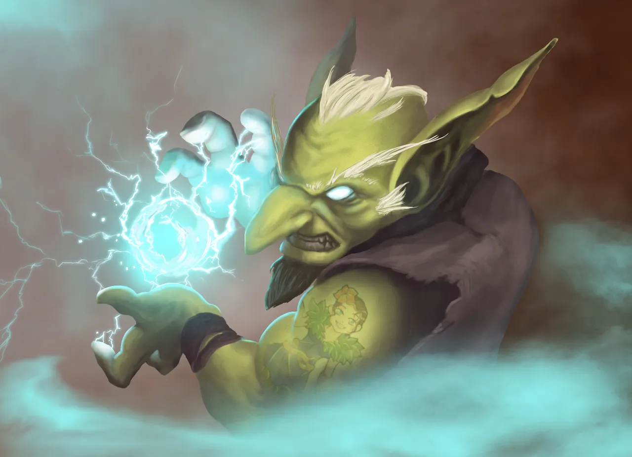
We agree on this one.
4 . @japex1226 @japex1226/splinterlands-art-contest-week-163-naga-warrior

Once again, I have seen this artist many times before taking the top positions, that's why he is moved from top 3 to position number 4.
In my opinion, the first 3 positions should always be the highest quality pieces, position 4 equally good, but maybe not as original. 5 & 6 good quality, but maybe lacking originality, or in some other aspects.
The last one should be the place for people that are trying hard, but the art is not as good as the rest.
5 . @darksonata @darksonata/splinterlands-art-contest-week-163-champion-s-footsteps
Simple, but stands out from the rest.
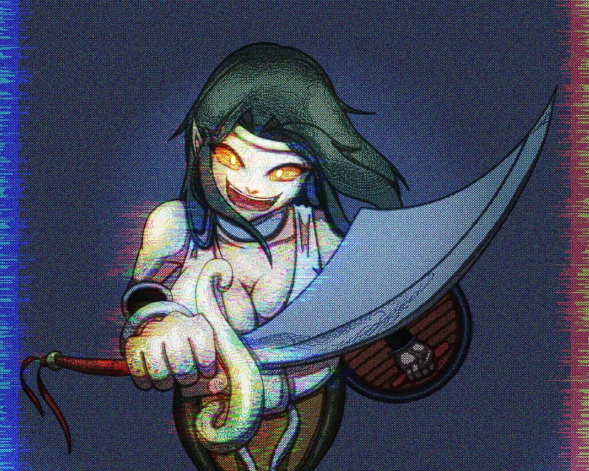
6 . @ryoudo @ryoudo/splinterlands-art-contest-week-163-elven-cutthroat

This one is lacking something, maybe the contrast between light and shadows is too strong, but still a good piece.
7 . @vrezyy @vrezyy/splinterlands-art-contest-week-163-naga-warrior
I noticed that it was posted too late? If that's the case then
@collectorofchaos @collectorofchaos/skeleton-warrior-splinterlands-art-contest

Cute and simple, yet it maintains the quality.
Now for the artwork that was dropped from your list :
Number 1 - He got highlighted last week with the same style entry, looks low quality and it's not original at all, we have seen similar renders many times before, I wouldn't even put that in the top 7.
Number 2. It's not as bad as others but still looks messy, the colors are awful, the contrast is just too strong.
Number 7. Looks crappy, like it was made in 2001. He was highlighted some time ago with a similar render. The scenery looks almost the same, I wouldn't even be surprised if that was a premade asset that got downloaded.
@castleberry I think you don't take into consideration a few things like:
- Was this artist listed before? (How often? Maybe it's time to give a chance to someone else)
- How long it could take to make the particular artwork (how much effort was needed)
- Is it original? Or is it just the same style and almost a copy of the previous work or maybe a copy aka " inspired" by something other than the game?
- The quality of the artworks (or the lack of quality)
- Does it really deserve the top 3 position?
Here is a good quote: "Artwork will be judged using the following criteria: uniqueness/originality, professional quality (neatness and craft), aesthetic quality (design, composition, color/tones), concept, selection and application of materials, and complexity/level of digital technology used."
A perfect example of "level of digital technology used" is your 7th pick, it's just outdated.
Nothing personal, neither to You or the artists, but as someone else mentioned before at this point it's more of a giveaway than a contest.
I would also kindly ask @rowell and @telumen to add anything I missed since I noticed their disappointment with how the contest it run.
RE: Splinterlands Art Contest! // Week 164 // 10 Booster Pack Prize!