¡Hola! / ¡Hi!
Decidí realizar mi segundo post como un "mini tutorial muy básico". / I decided to make my second post as a "very basic mini tutorial".
Agradezco a Luis Aular por haberme delegado Hive Power, sin el no hubiese podido publicar ♥
/ I thank Luis Aular for having delegated Hive Power to me, without him I would not have been able to publish ♥

Bueno, primero que nada uso como programa de edición #AdobePhotoshopCS6, mis diseños son básicos aunque si he realizado varios muy bonitos y elaborados.. Comencemos...
/ Well, first of all I use #AdobePhotoshopCS6 as an editing program, my designs are basic although I have made several very nice and elaborate ones. Let's start...

/ I downloaded the elements from Google images, it really is super simple

/ This is the foil size that works for the cover, Photoshop delivers a white foil, to make it black there are 2 options:
- Utilizar la herramienta bote de pintura/Use the paint bucket tool
- Dar doble clic a este candadito, lo cual creará una nueva capa llamada Capa 0, presionar la tecla Control + i e inmediatamente va a invertir el color de la capa(de blanco a negro)
/ Double click this lock, which will create a new layer called Layer 0, press the key Control + i and it will immediately invert the color of the layer (from white to black)

Aclarado ese punto seguimos. / Clarified that point continue.

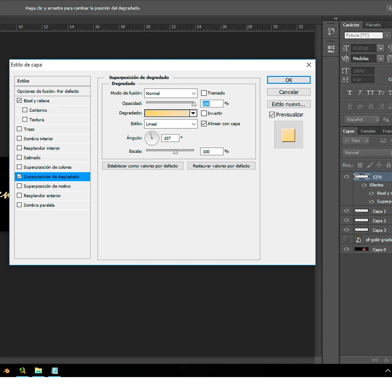
Realicé el logo de Hive en 2 pasos: - Primero descargué el logotipo en PNG, eliminé la tipografía y procedí a usar las 'Opciones de Fusión'. Ya dentro de las opciones marqué la casilla de Bisel y relieve y la de Superposición de Degradado, #f5d276 y #e7ddb9 usando estos códigos de color llegue al tono que quería para el dorado del logo.
/ I made the Hive logo in 2 steps: / First I downloaded the logo in PNG, I removed the typography and proceeded to use the 'Blending Options'. Once inside the options I checked the Bevel and Emboss box and the Gradient Overlay box, #f5d276 and #e7ddb9 using these color codes to get the tone I wanted for the gold of the logo.
- Para la tipografía use la herramienta de Máscara de texto horizontal sobre un fondo de lámina dorada.
/ For typography use the Horizontal Text Mask tool on a gold foil background.

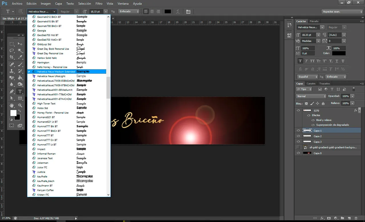
Usando la fuente Helvetica Neue Medium Extended / Using the font Helvetica Neue Medium Extended
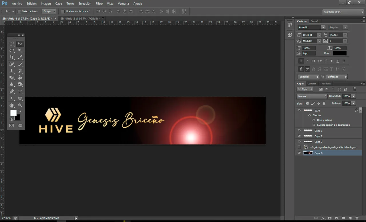
Quedó justo así, para sacar el texto en dorado sólo presioné Control + C y Control + V y oculté la capa del dorado y ya tenemos nuestro HIVE en dorado.
/ It was just like this, to get the text in gold I only pressed Control + C and Control + V and I hid the gold layer and we already have our HIVE in gold.

Apliqué la misma técnica para mi nombre pero cambié la tipografía.
/ I applied the same technique for my name but changed the font.

En este caso usé adelia pero como esta tipografía no maneja la letra Ñ la virgulilla tuve que sacarla de Arial con la misma técnica de la máscara de texto sobre el fondo de lámina dorada.
/ In this case I used adelia but since this typeface does not use the letter Ñ, the tilde had to be removed from Arial with the same technique as the text mask on the gold foil background.
Una vez oculta la capa dorada queda ubicar los elementos, para ellos posicionar y dar clic a la capa a trabajar y presionar la letra V automáticamente el programa selecciona la herramienta de Mover, la podemos usar con el mouse o también con las flechas del teclado si requerimos mejor precisión aunque es un poco más tardado.
/ Once the golden layer is hidden, it remains to locate the elements, for them to position and click on the layer to work and press the letter V automatically the program selects the Move tool, we can use it with the mouse or also with the keyboard arrows if we require better precision, although it takes a little longer.

Ahora a trabajar el destello, clickeamos la Capa 0, con las opciones de arriba nos posicionamos donde dice Filtros y bajamos hasta donde dice Interpretar, la primera opción es Destello, damos clic y en seguida nos abre un menú donde vamos a escoger dónde colocar nuestro destello.
/ Now to work on the flash, we click the Layer 0, with the options above we position ourselves where it says Filters and go down to where it says Interpret, the first option is Flash, we click and immediately a menu opens where we are going to choose where to place our flash.
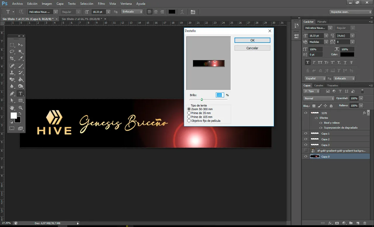
Podemos aumentar o disminuir el brillo y escoger el tipo de lente para estilizar nuestro destello, yo decidí no mover nada aparte de la posición del efecto.
/ We can increase or decrease the brightness and choose the type of lens to style our flash, I decided not to move anything apart from the position of the effect.

Y así tenemos nuestra portada básica. / And so we have our basic cover. Para guardarla pueden hacerlo desde la opción de Archivo en la parte de arriba y seleccionar Guardar como, allí tienen que escoger el tipo de archivo, yo escogí JPG pero para mayor resolución pueden guardarlo en PNG, o pueden usar el teclado presionando Control + Alt + S y hacer el procedimiento de escoger el tipo de archivo.
/ To save it you can do it from the File option at the top and select Save as, there you have to choose the type of file, I chose JPG but for higher resolution you can save it in PNG, or you can use the keyboard by pressing Control + Alt + S and go through the procedure of choosing the file type.No olviden guardar su proyecto ante cada cambio, esto se logra solo presionando Control + S, esto para prevenir las perdidas en el archivo si llega a existir alguna falla en el programa o en mi caso alguna falla eléctrica😐
Do not forget to save your project before each change, this is achieved only by pressing Control + S, this to prevent losses in the file if there is any failure in the program or in my case an electrical failure
Gracias por leerme
Thanks for reading me
- Fuentes por: DaFont
- Traduccion por: Google Translator de Opera
- Primero descargué el logotipo en PNG, eliminé la tipografía y procedí a usar las 'Opciones de Fusión'. Ya dentro de las opciones marqué la casilla de Bisel y relieve y la de Superposición de Degradado, #f5d276 y #e7ddb9 usando estos códigos de color llegue al tono que quería para el dorado del logo.