One feature that I haven't seen available at https://hive-engine.com or https://steem-engine.com is how to view historical market price charts for a token. Ironically, while working on this post, I started seeing the candlestick plots on Steem Engine. Nonetheless, the APIs have a history/marketHistory endpoint that provides daily price summaries (thanks @dalz for this info).
Since I often want to visualize historical price data, I created a Python Jupyter notebook on Google Colab. The user can choose any token symbol, and the notebook does the rest.
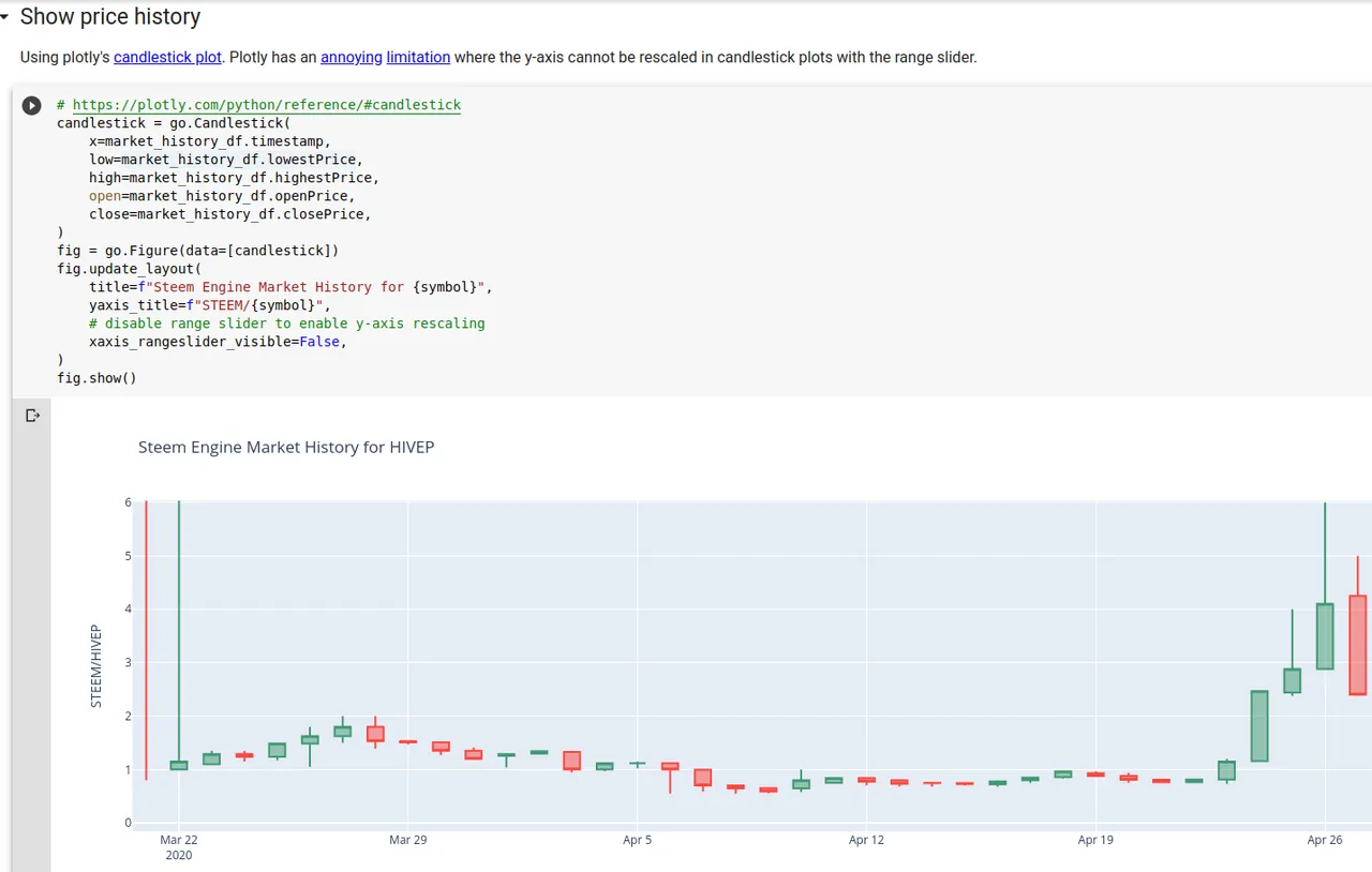
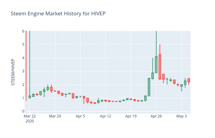
Since the figures are created using Plotly, they're interactive. For example, you can zoom in to reduce the y-axis to trading following the initial HIVEP volatility.
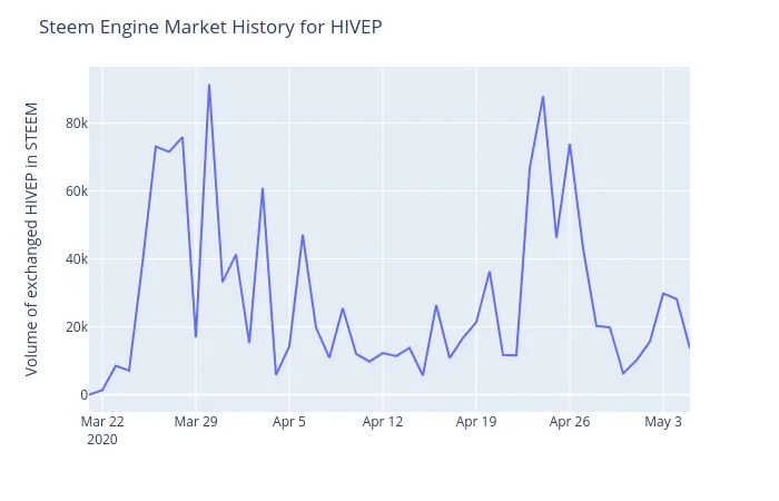
We can also plot daily volume:
Looking forward to anyone building off this code and reusing the notebook, so I released it under the open CC BY License!
Python code
Programming in Python is lot's of fun, since you can accomplish a lot with little code. For example, here's a snippet of just the code to retrieve the market history data and transform it into a dataframe (tabular data structure) and convert the dates to a more human-friendly encoding.
symbol = "HIVEP"
url = "https://api.steem-engine.com/history/marketHistory"
response = requests.get(url, params=dict(symbol=symbol))
response.raise_for_status()
market_history_df = pandas.json_normalize(response.json())
market_history_df.timestamp = pandas.to_datetime(market_history_df.timestamp, unit="s")