Raven, una de mis personajes favoritas, debido a que comparto una característica con ella es que es muy seria en diversos temas y a veces suelo ser un poco como ella.
Sin embargo, esta chica mitad demonio, cautivo con su historia, el cual solía ver casi todos los días en Cartoon Network en aquellos días en que no todo el contenido era para niños.
Es así como el trasfondo de una personalidad reprimida porque cargaba con el peso de mantener a su padre encerrado para evitar la destrucción del mundo y perder a sus amigos, nos dio una de las historias más icónicas de los tiempos.
Sin embargo, esta serie fue cancelada y dejada en el olvido para ser remplazada por una versión un poco más... Comerciable para los niños.
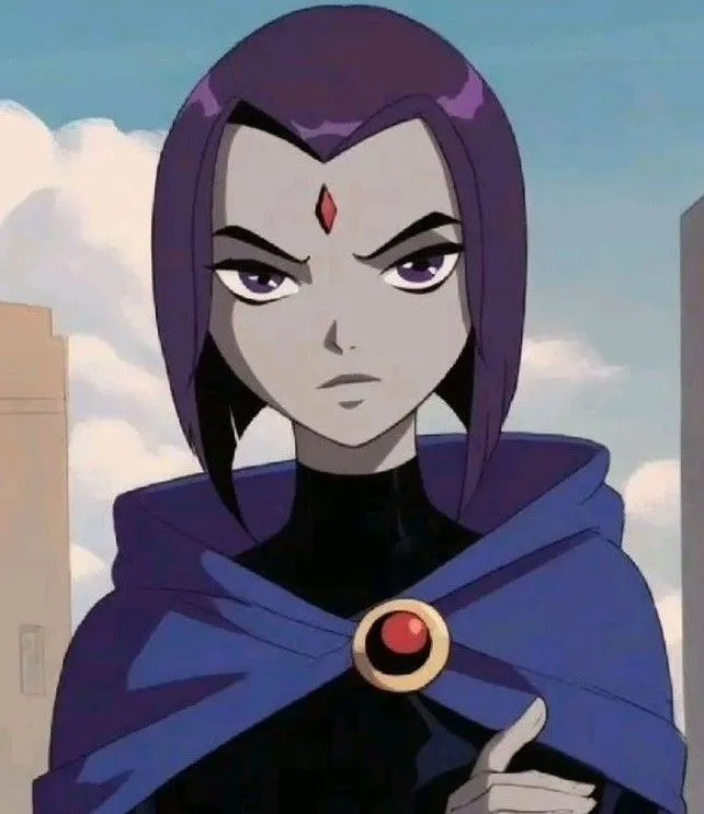

Guiándonos de la imagen referencial, el personaje que es una chica que usa una paleta de colores muy suaves y variadas con un estilo muy oscuro y tono de piel gris.
Armando el bosquejo de este personaje me decidí en hacer algo de estilo más como de retrato, para explorar ese lado artístico y darle un toque de realismo.
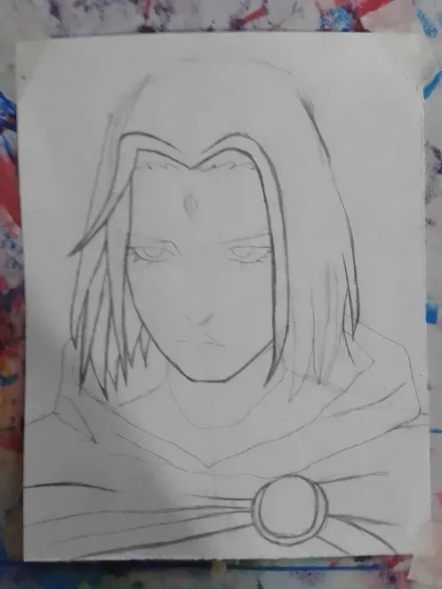
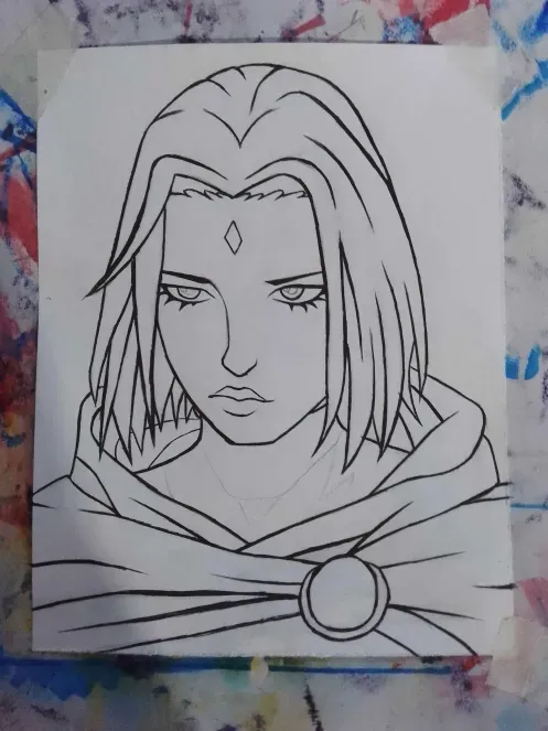
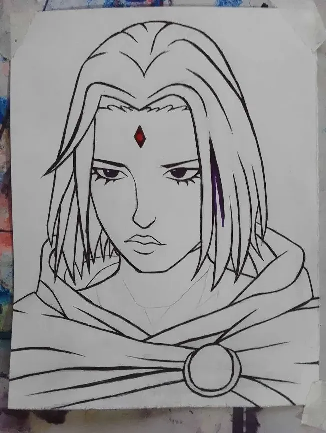
En este paso vamos a delinear todo muy bien con tinta china y marcador negro como base de coloreado para algunas partes oscuras y tratando de variar entre líneas oscuras y gruesas y líneas super delgadas.
 |  |
|---|
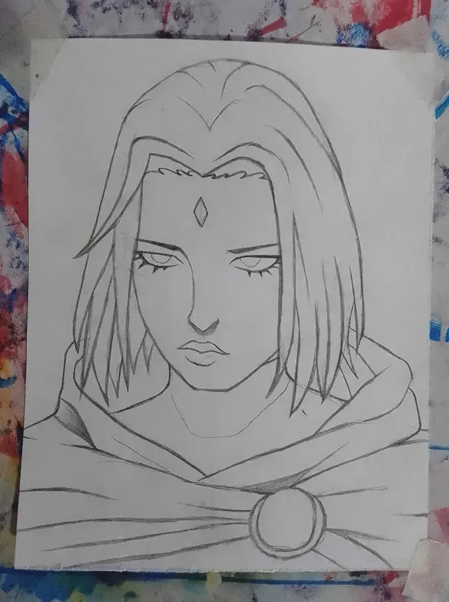
Como pueden apreciar aquí ya he terminado el boceto y dejo las sombras con grafito para poder marcarlas luego con tinta o marcador, aunque recomiendo borrar para que no afecte al marcador.
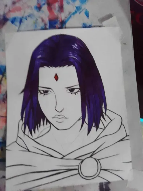
Una vez terminado el boceto, borramos todo para poder pintar y que el color no se nos manche, en esta oportunidad voy a utilizar colores.
COLOREANDO
Al momento de colorear siempre empiezo por el color base, el cual estoy acostumbrado a que sea un tono muy claro para luego ir oscureciendo donde podrían ir las sombras del mismo color y así sucesivamente.
Para el tono de la piel usaré carboncillo como suelen hacer normalmente los artistas en retrato y para el cabello lo usaré para agregar sombras.
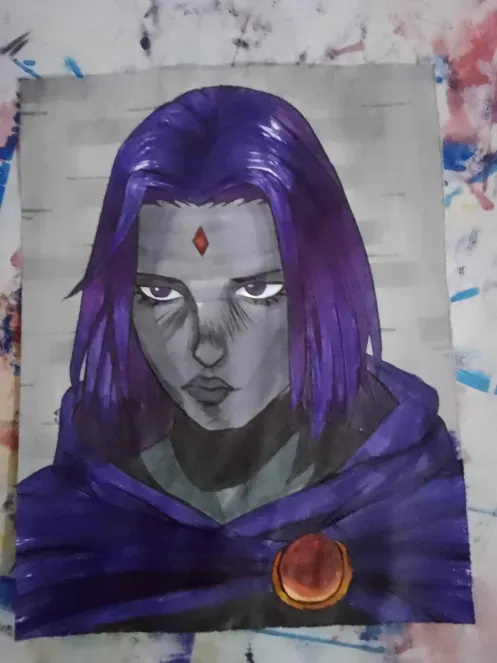
Ahora que estoy usando tinta china veo que al momento de borrar todo me queda mucho más pulido, claro hay que tener mucho cuidado para no manchar y que no se corra la tinta.
 |  |  |
|---|
La transparencia se logra con blanco y pasando un color muy suave y luego degradar con blanco, un color que no solemos usar, pero da unos resultados muy buenos.
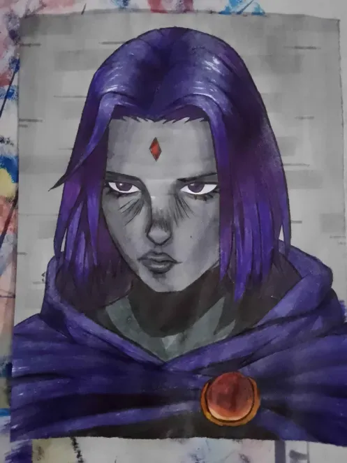
Ya terminado el diseño he de decir, que no me convence las ojeras que le agregue tratando de dar realismo, ¿pero ustedes que opinan?
.................................................................
F U L L // A R T
.................................................................
Considera unirte a nuestro trail de curación en HIVEVOTE haciendo clic en la imagen inferior, Les agradecemos todo el apoyo.
A todos los artistas ahí afuera en HIVE, si alguna vez se sienten solos y perdidos, únanse al canal de Discord de Bokura No Digital World
! [ENGLISH VERSION GENERATED BY GOOGLE TRANSLATE]
Raven, one of my favorite characters, because I share a characteristic with her: she's very serious about various topics, and sometimes I tend to be a bit like her.
However, this half-demon girl captivated me with her story, which I used to watch almost every day on Cartoon Network back in the days when not all content was for children.
This is how the backstory of a repressed personality, burdened by the burden of keeping her father locked away to prevent the destruction of the world and the loss of her friends, gave us one of the most iconic stories of all time.
However, this series was canceled and forgotten, to be replaced by a slightly more... marketable version for children.
Using the reference image as a guide, the character is a girl who uses a very soft and varied color palette with a very dark style and gray skin tone.
When putting together the sketch for this character, I decided to do something more portrait-like, to explore that artistic side and give it a touch of realism.
In this step we are going to outline everything very well with India ink and black marker as a coloring base for some dark parts and trying to vary between dark and thick lines and super thin lines.
| |
|---|
As you can see here, I've finished the sketch and left the shadows in graphite so I can mark them later with ink or marker, although I recommend erasing so it doesn't affect the marker.
Once the sketch is finished, we erase everything so we can paint and avoid smudging the color. This time, I'm going to use colors.
COLORING
When coloring, I always start with the base color, which I'm used to using as a very light shade, then darken where the shadows of the same color might go, and so on.
For the skin tone, I'll use charcoal, as portrait artists typically do, and for the hair, I'll use it to add shadows.
Now that I'm using India ink, I see that when I erase everything, it looks much more polished. Of course, you have to be very careful not to smudge or run the ink.
| | |
|---|
Transparency is achieved by using white and a very light color, then blending with white, a color we don't usually use, but it gives very good results.
Once the design is finished, I have to say I'm not convinced by the dark circles I added in an attempt to give it realism, but what do you think?
.................................................................
F U L L // A R T
.................................................................
Grateful to all of you who are also part of my life. 💖
Well, from here I say goodbye, I hope you like my work like I do every day that I see and know that there are people dedicated to commenting on me and giving me encouragement to continue.
