A few weeks back Bitcoin reached a new all-time high of 123k. The questions that keeps emerging, is this the top, how much we have left from this cycle, is this time different?
Let’s take a look at some charts from the cycles and see can we drawn some conclusions. After all history doesn’t repeat itself but for sure it rhymes.

A lot of the market participants keep asking the question, is this time different? Some have already declared it to be so, having in mind all the institutional investors that are now in the game. Bitcoin is no longer in the hands of retail. It’s the big boys who push the price up and down.
Furthermore, the miners are now having less impact on the price. The main driver behind the cycles is the number of new Bitcoins that is entering in circulation and the halving’s that cut that in half. But as each new halving happens, its importance is fading away. It’s one thing to cut the inflation from say 20% to 10%, as it was in the first cycles, and not from 1% to say 0.5%. The effects are totally different.
This said, I still remain skeptical of all the theses, and to find the answer to the question, will this time be different, we just need to wait and see. If history rhymes, we should have a strong move up in the last half of the year, and if we are a bit more flexible up to the next three months in the following year. So in the next six to nine months, we will see if Bitcoin behaved differently than the previous cycles.
As reminder here are the periods for Bitcoin cycles between halving’s, that happened in 2012, 2016, 2020 and 2024.
- First cycle from Dec 28, 2012 to July 7, 2016
- Second cycle from July 8, 2016 to May 11, 2020
- Third cycle from May 12, 2020 to Apr 19, 2024
- Fourth cycle from Apr 20, 2024 till now
The first years from 2009 to 2012 are discounted.
BTC Price During Cycles
Here is the chart for the Bitcoin price, split in cycles with number of days after each halving.
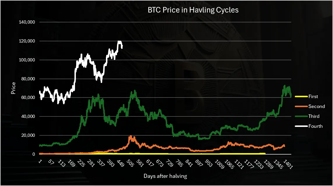
This chart is in absolute numbers for the price and as we can see the first cycle in yellow is almost nonvisible. Still, we can draw some conclusions even from here.
The peak in the second and the third cycle happened somewhere around 540 days after the halving. That is somewhere around a year and a half after the halving. Adjusted for this cycle that is somewhere in October 2025. But we can notice also that the third cycle had somewhat of double top and is a bit weird, while the second one had a clear blow of the top peak in one go. Also, this last one cycle we reached a new ATH for the first time before the halving. The current cycle has an eerie similarity with the third cycle with double top. Hope it doesn’t continue to mimic it 😊.
Log Scale Price Chart
When we put the cycle prices on a log scale, we get this.
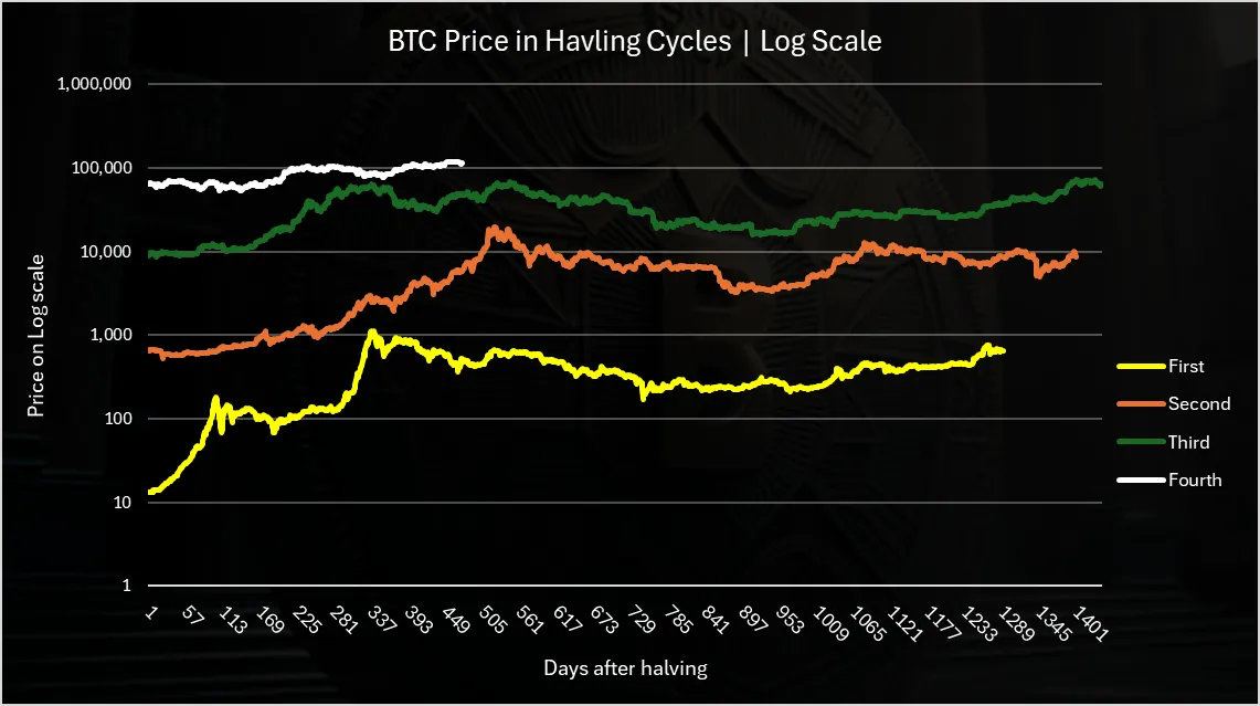
Much better visibility here, especially for the first cycle.
Again, we can see similarities, but obviously each cycle is slightly different. The first cycle had a very early peak, somewhere around one year after the halving. The second one had a top year and a half after the halving, while the third one had double top, the first time a year after the halving and the second time year and a half after the halving.
What is for sure from this chart is that the top has been in the range of one year to a year and half after the halving. One year was in April 2025, while another year and a half is in October 2025.
Price Adjusted Chart (Scaled)
One more what to look at cycles is simply by adjusting the previous price with a coefficient for better visibility to the current price.
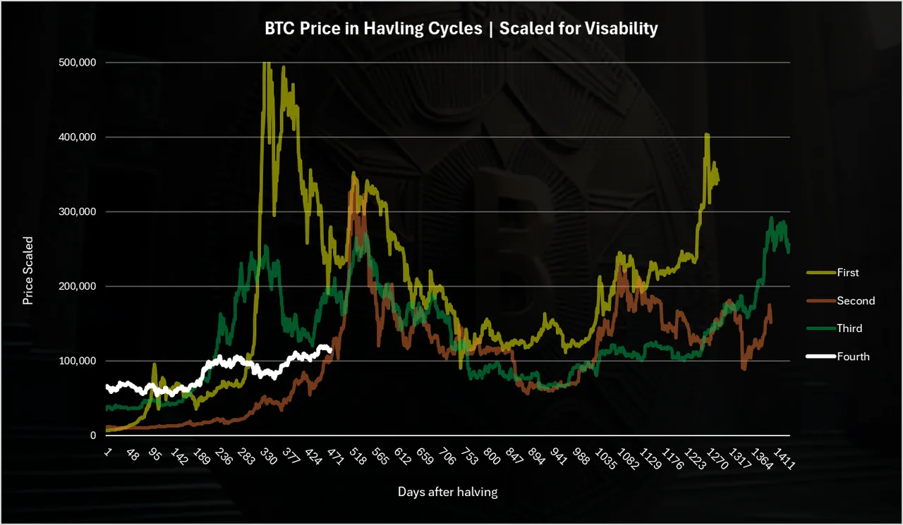
The first cycle is with a 528 factor, the second one with 17.6 and the third one with 4. These are price multipliers. Don’t take the price for actual for the previous cycles, apart from the last cycle in red.
From here we can see the top overlaps somewhere around the 540 days after the halving. We can also see the massive growth in price in the first halving that acts as an outlier on the chart. There is also another spike for the first halving around the 1.5 year mark after the halving. This is giving the more weight on the 1.5 year mark.
As for the current cycle (the white line), we can see that is just now touching the period when the price went parabolic in the previous cycles. Just around these days the price starts to rise and goes up for a few months, reaching its top.
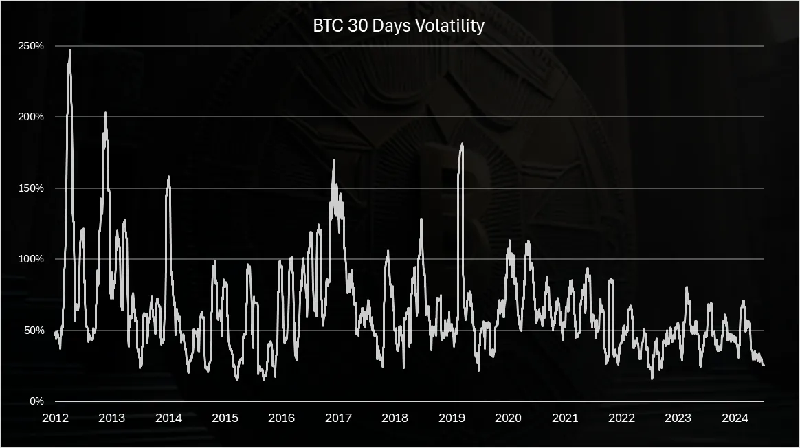
Volatility
Volatility is one of the key metrics for Bitcoin. It’s volatile and many say it will remain volatile. It is why the big returns. Not everyone can stomach its volatility, but the ones who do are greatly rewarded. Let’s see how this metric is doing trough the cycles.
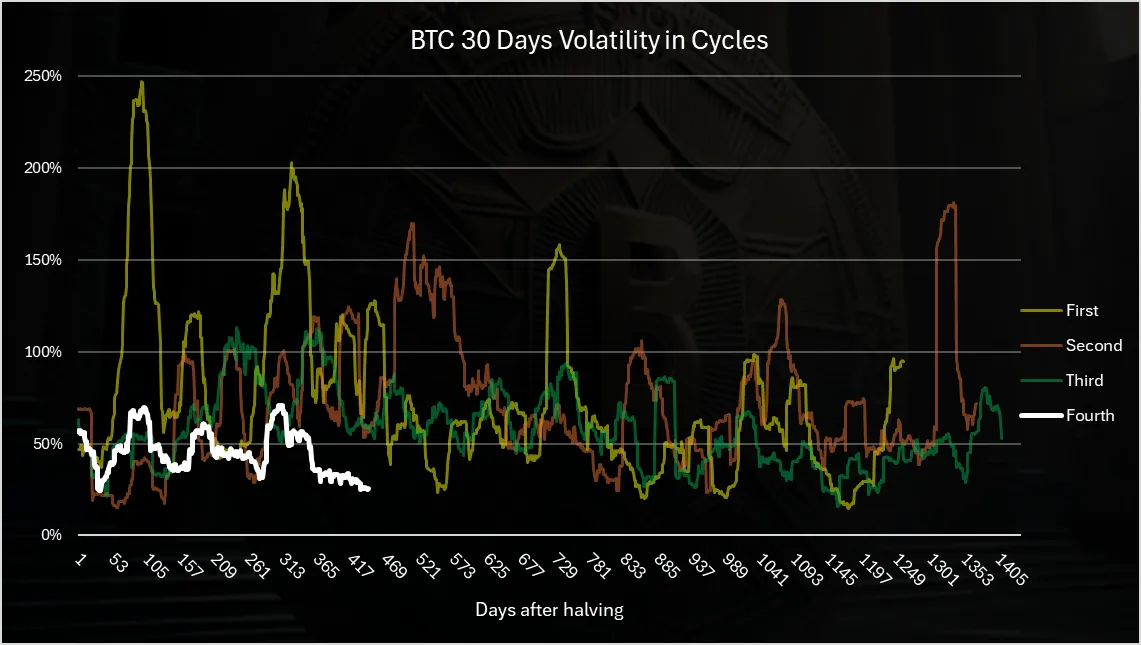
This is a 30 days volatility chart. There are others one like 90, 180 etc, but this one is usually the standard for the industry, and overall they re similar.
Here we can obviously see that the volatility is going down. In the first cycle the volatile was the highest, up to 250% and a lot of times to 150%. In the second cycle it reached 150% on a few occasions, and in the third cycle in was in the range of 50% to 100%.
In the last cycle that we are in, in the first 400 days, it is around the 50% mark, and it has even dipped to 30% in the last months. So overall the volatility is going down, and Bitcoin is not as volatile as in the past.
When we continuously plot the volatility, without the breaks in the cycles we have this:
Here again we can clearly see the drop in the volatile. although there were some spikes back in 2018 and 2020. This happens usually on the way down. In 2020 the spike is due to the Covid drop in price.
As for the previous we can see that in the last years Bitcoin volatility has been around 50%. With this kind of volatility, the pullback for Bitcoin is also around 50%, that is much less then the previous cycles, of 70% and 80% corrections. Although on occasion we do have higher volatility then 50% even now, so stronger pullbacks are still in play.
Possible Scenarios
Always think in multiple scenarios and try to be prepared the best you can. We can obviously not be prepared ideally but still don’t get caught totally out of guard.
These are totally my speculations please don’t take them as a financial advice.
Scenario 1
The most probable one. Bitcoin do has a cycle like behavior, but just with less volatility and smaller ups and downs. What this means in the next six to nine months, Bitcoin reaches an all-time high somewhere in the range of 140k to 180k, and then somewhere at the end of 2026, beginning of 2027 it drops for about 50% to 60% correction, somewhere in the range of 70k to 90k, depending on the ATH reached.
Scenario 2
Bitcoin keeps the volatility as previously. We do get a much higher blow of top, Bitcoin goes to a price target of 250k to 300k at the end of the year and then pulls back to a range between 60k to 80k. This represents a sharp movement upwards and also a big correction in the range of 70% to 80% as previously.
Scenario 3
This time is different. No cycles, just small ups and downs, going higher each year by a small percentage. Small in terms of Bitcoin volatility standards. The yearly growth on average should be between 30% to 50%, and the corrections around 30%.
In Summary
Bitcoin cycles are clear and visible from all the charts. The momentum to go sharply up is in the next six to nine months. The overall trend is less volatility, smaller ups and downs. But Bitcoin is no doubt in a different category now than in any of the prior cycles. It has a two trillion market cap, it is an institutional asset with a lot of big investors. It is also a macro asset now. The global macro economy and events impact it much more. The tariff war was an example of this, when Bitcoin dropped from 100k to 74k. Global events can drive the BTC price a lot.
All the best
@dalz