Wouldn't it be nice if we had a tool that can easily answer that? One that shows a dashboard with charts with the evolution, overall and per asset, preferably.
I really like @keychain's portfolio view, even if it's only a snapshot and not showing the evolution in time of the valuation of the assets. And you can't pick what tokens to be on the portfolio view, as far as I know.
With the question in the title in mind, I started developing my own tool. No charts, no evolution... yet. Sorry!
But you can choose what Hive Engine tokens to have a snapshot of and you can save the output to a file (by redirecting it).
I just ran it with the default settings ,which are my account and this list of tokens: SWAP.HIVE, SPS, DEC, LEO and this is how the output looks like:
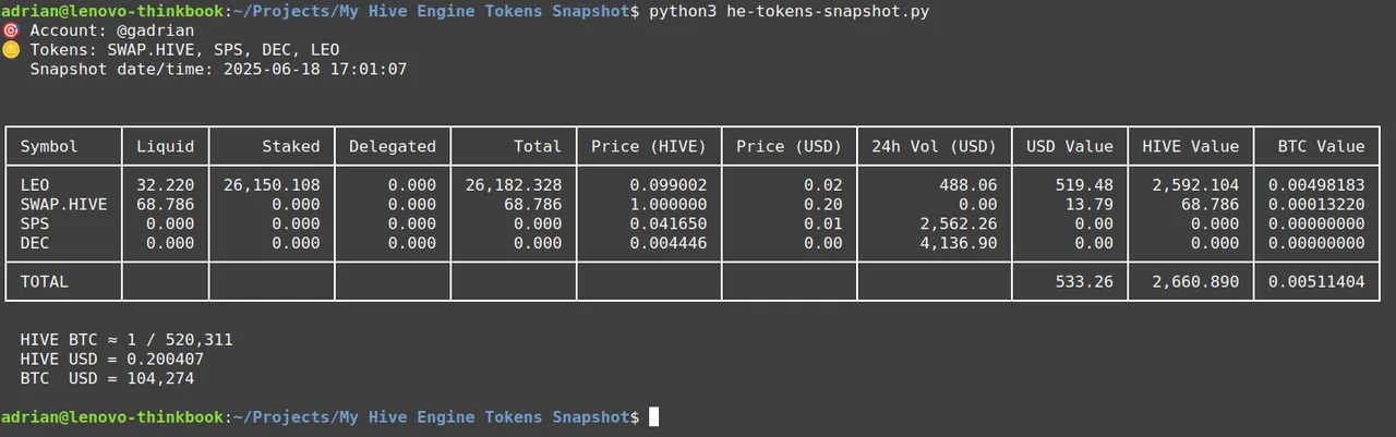
Not very pretty yet, but useful, in my opinion.
If one would run this, say, quarterly, for their account(s) and the list of HE tokens of choice, this could be quite a helper.
I won't get into where to find and how to use the script, it's is explained at large here.
But it could be only the beginning for this tool... I only included HE tokens, because their value is difficult to track over time (in my opinion), but my next priority is to look into diesel pools and if I can add them, then HIVE and HBD in their various forms, and then maybe look if it's worth extending/rewriting it to take regular snapshots and make some charts.
For a change, snapshots are account-centric (useful for a dashboard, knowing how the value of your holdings changed in time) and not token-centric (useful for an airdrop, paying dividends, etc.).
Please share your thoughts, ideas, etc. Not sure if or when I'll be able to include, but I'll take them into account.
Using various AI models to help out.