RAGNAROK LOGO DESIGN PRESENTATION
Reproduction and distribution of these logo presentations without permission, complete ownership rights and access of the artisan and creator is prohibited.
See below the two logo design options.
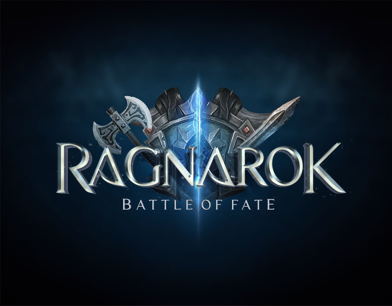
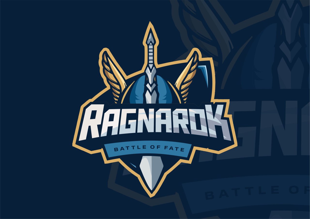
LOGO 1
LOGO 2
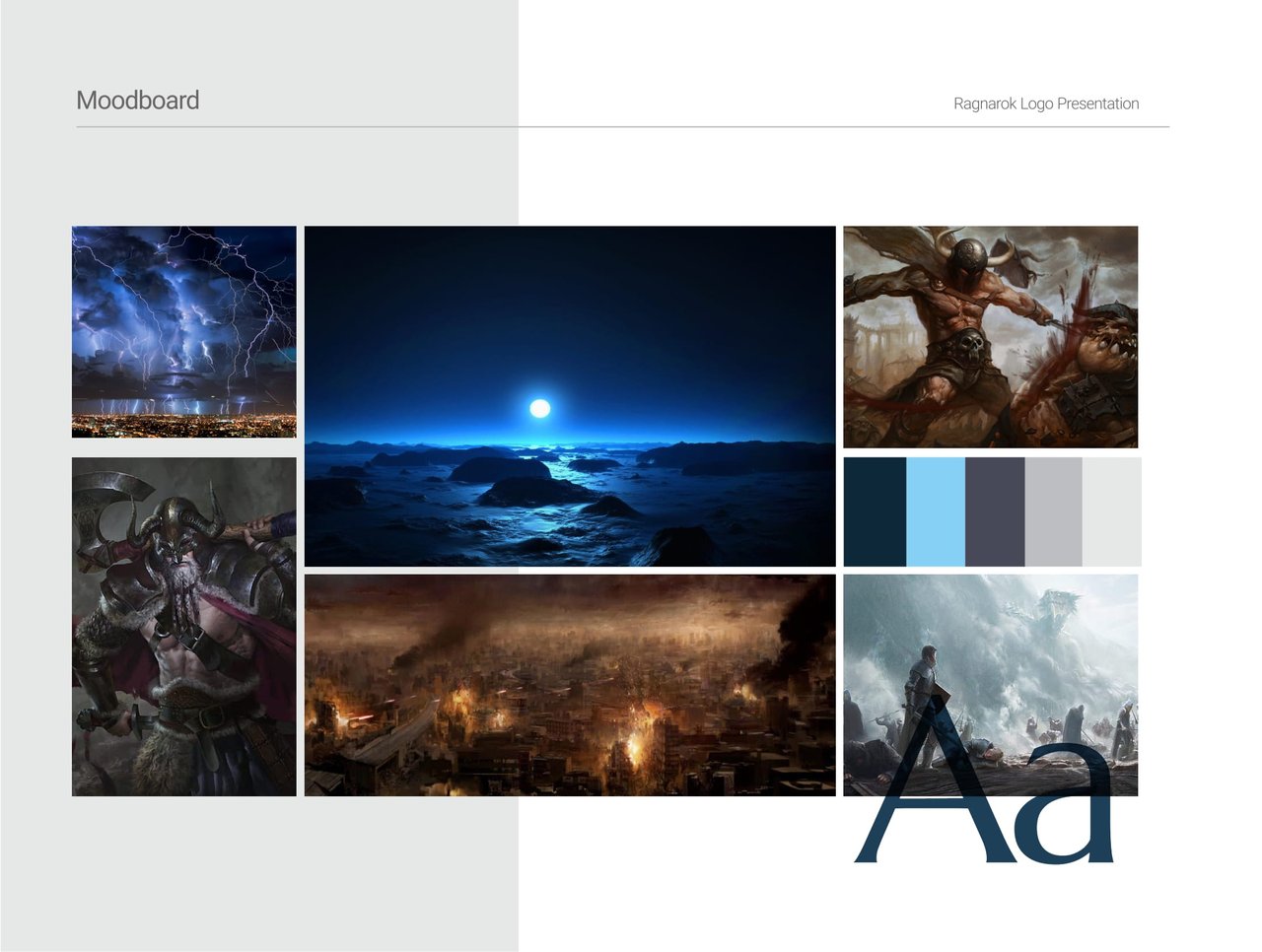
MOOD BOARD LOGO PRESENTATION 1
This logo design was made with FATE. Welcome to my inspiration.
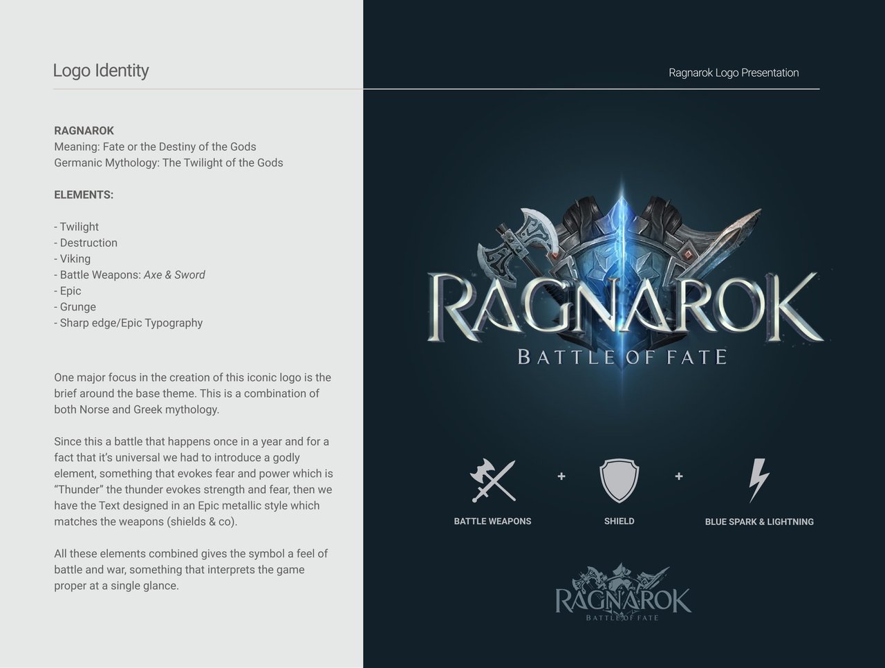
Logo Identity
RAGNAROK
Meaning: Fate or the Destiny of the Gods
Germanic Mythology: The Twilight of the Gods.
ELEMENTS
- Twilight
- Destruction
- Viking
- Battle Weapons: Axe & Sword
- Epic
- Grunge
- Sharp edge/Epic Typography
One major focus in the creation of this iconic logo is the brief around the base theme. This is a combination of both Norse and Greek Mythology.
Since this is a battle that happens once in a year and for a fact that it's universal we had to introduce a godly element, something that evokes feat and power which is "Thunder". The under evokes strength and fear, then we have the Text designed in an Epic metallic style which matches the weapons(Shields and Co).
All these elements combined give the symbol a feel of battle and war, something that interprets the game properly at a single glance.
LOGO DESIGN PRESENTATION 2
This logo design was made with FATE. Welcome to my inspiration.
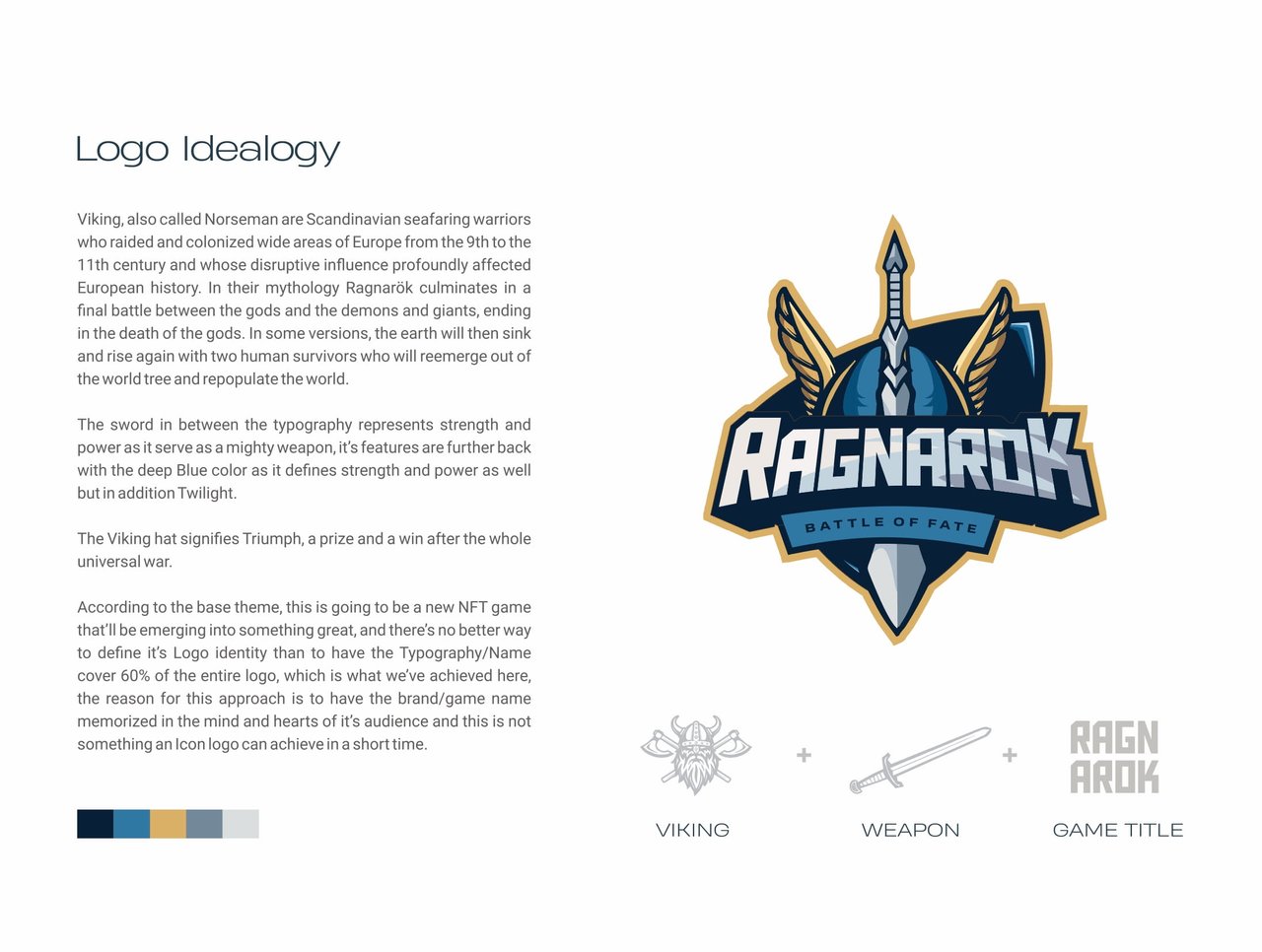
Logo Ideology
Vikings, also called Norsemen are Scandinavian seafaring warriors who raided and colonized wide areas of Europe from the 9th to the 11th century and whose disruptive influence profoundly affe3ected European history. In their mythology Ragnarok culminates in a final battle between the gods and the demons and giants, ending in the death of the gods. In some versions, the earth will then sink and rise again with two human survivors who will reemerge out of the world tree and repopulate the world.
The sword in between the typography represents strength and power as it serves as a mighty weapon, its features are further back with the deep blue colour as it defines strength and power as well but in addition Twilight.
The Viking hat signifies Triump, a prize and a win after the whole universal war.
According to the base theme, this is going to be a new NFT game that'll be emerging into something great and there's no better way to define its logo identity than to have the Typography/Name cover 60% of the entire ogo, which is what we've achieved here. The reason for this approach is to have the brand/game name memorized in the mind and hearts of its audience and this is not something an icon logo can achieve in a short time.
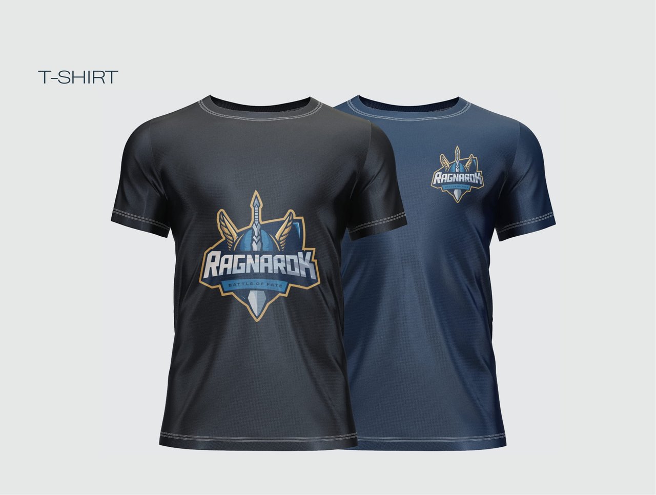
BONUS