Hail to the Hive!
As I was sifting through my Cornwall trip photos I came across a few that required being shown in colour but at the same time I can never resist the dark side and love a bit of black and white action so I had a bit of a play.
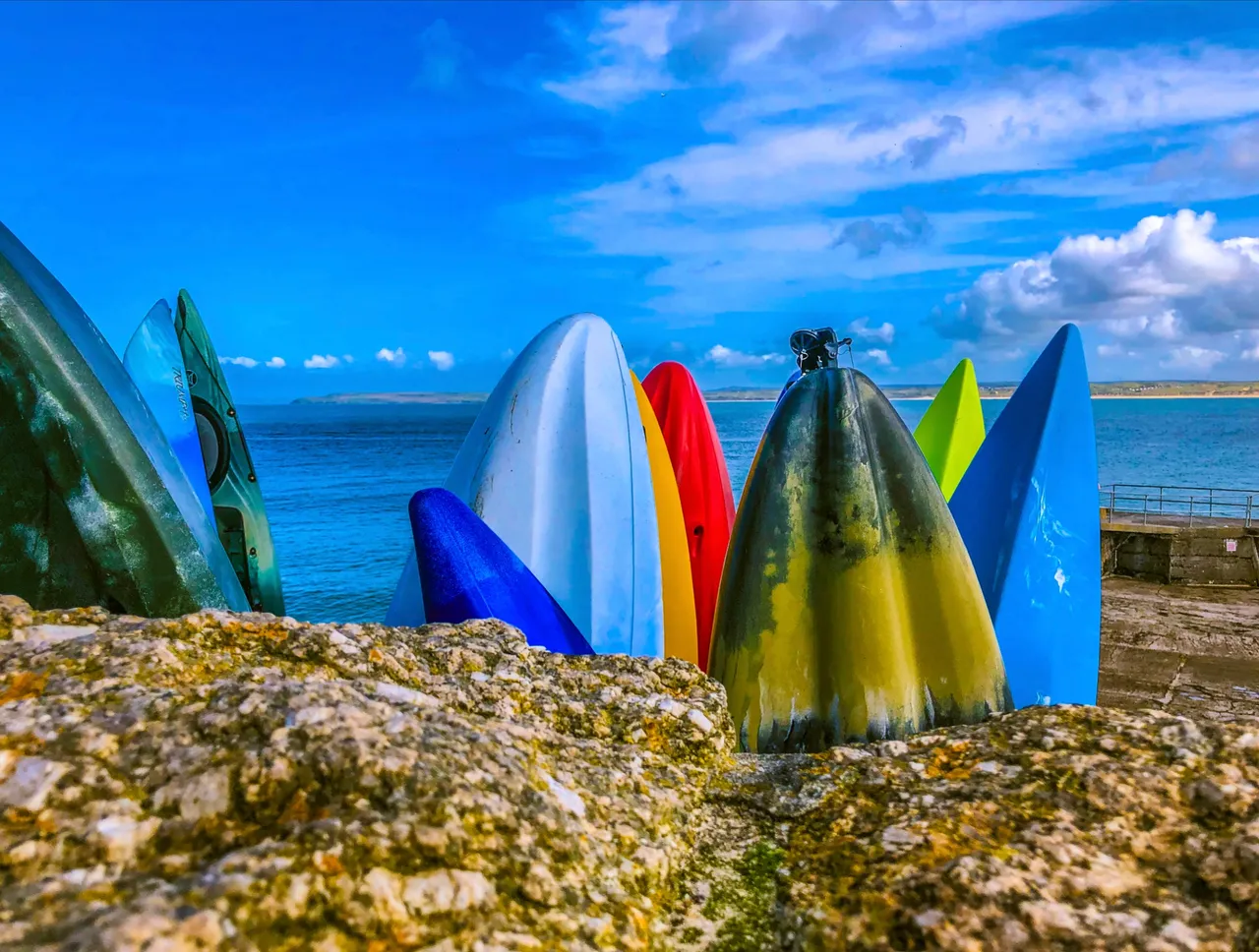
First up was these bunch of Kayak rentals poking up from behind a rock wall with the sea in the background. Lovely in colour…..
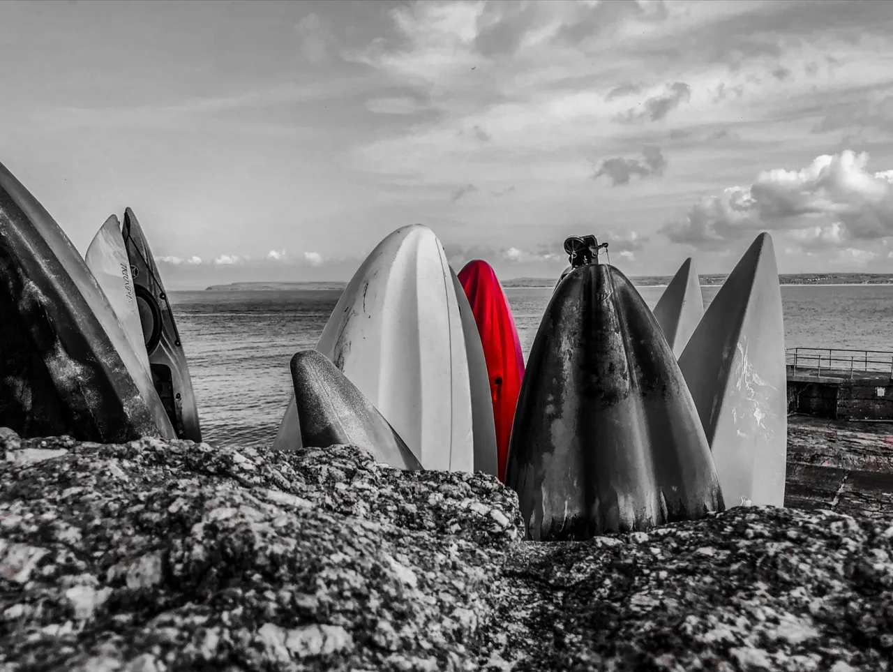
Nice with a cheeky splash colour.
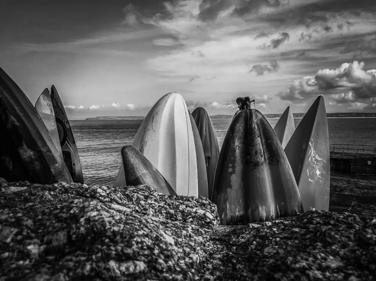
And actually pretty bloody good in monochrome. Hard to decide which I prefer really, hence showing all three.
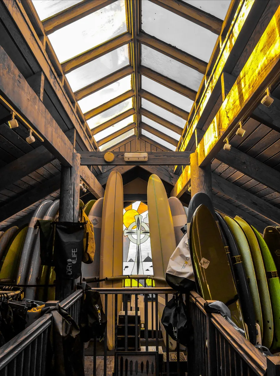
He same applied to this litle surf shop I went in for a nose about. It seems to be a converted church of some description and had a stained glass window. Splash colour with yellow works beautifully.
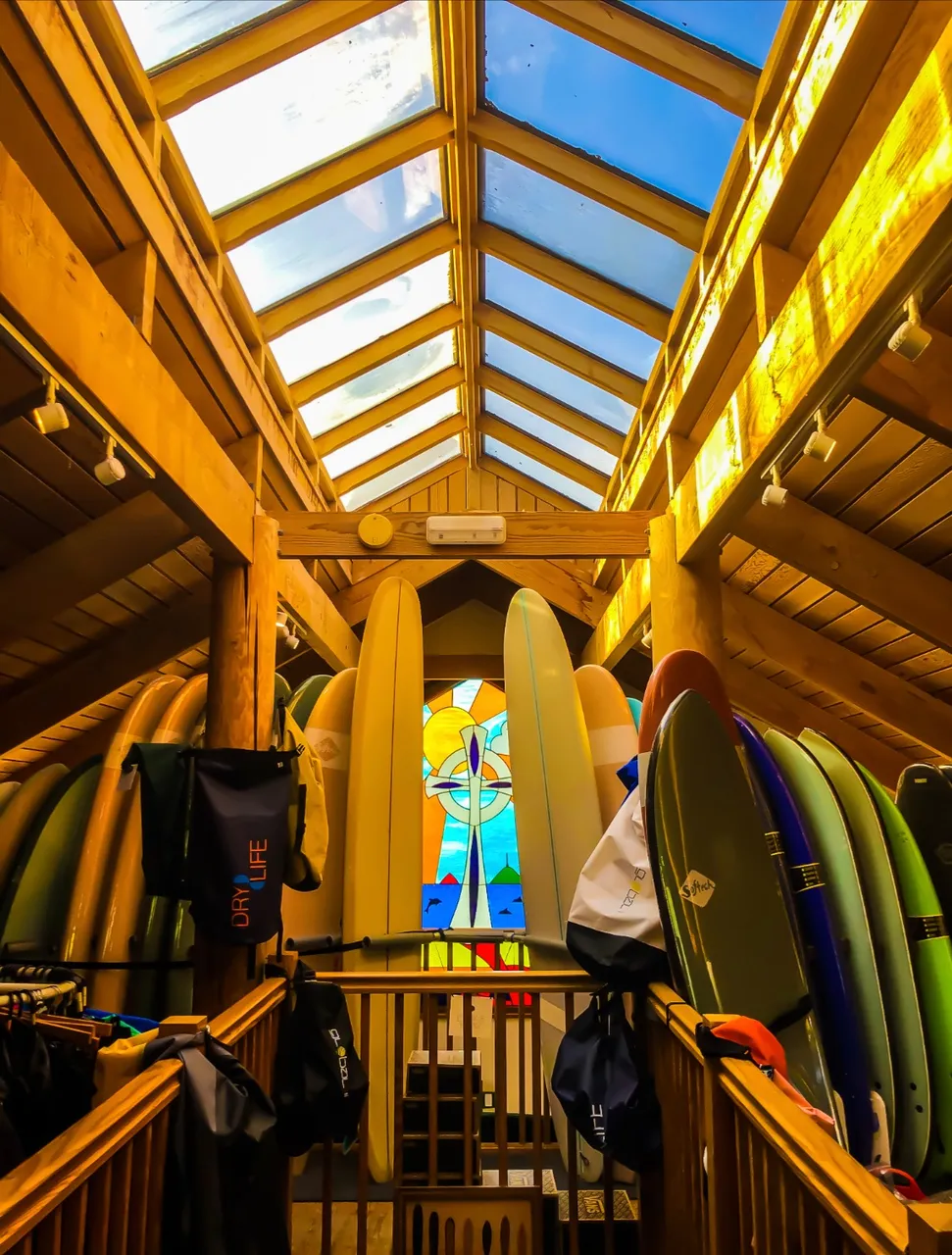
Colour looks nice and warm but weirdly , for me, not as cool.
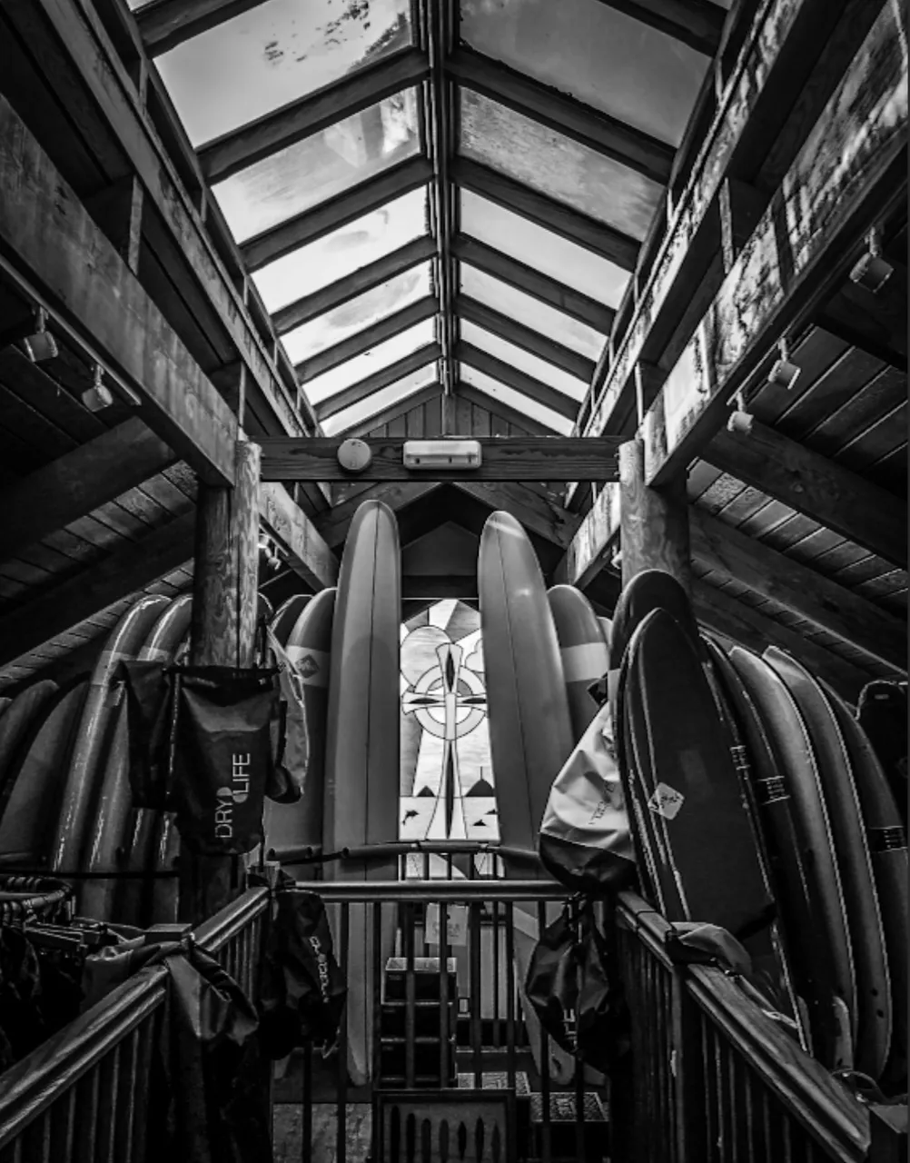
And weirdly black and white rocks. Really odd, you’d never have thought that when in there taking the shots.
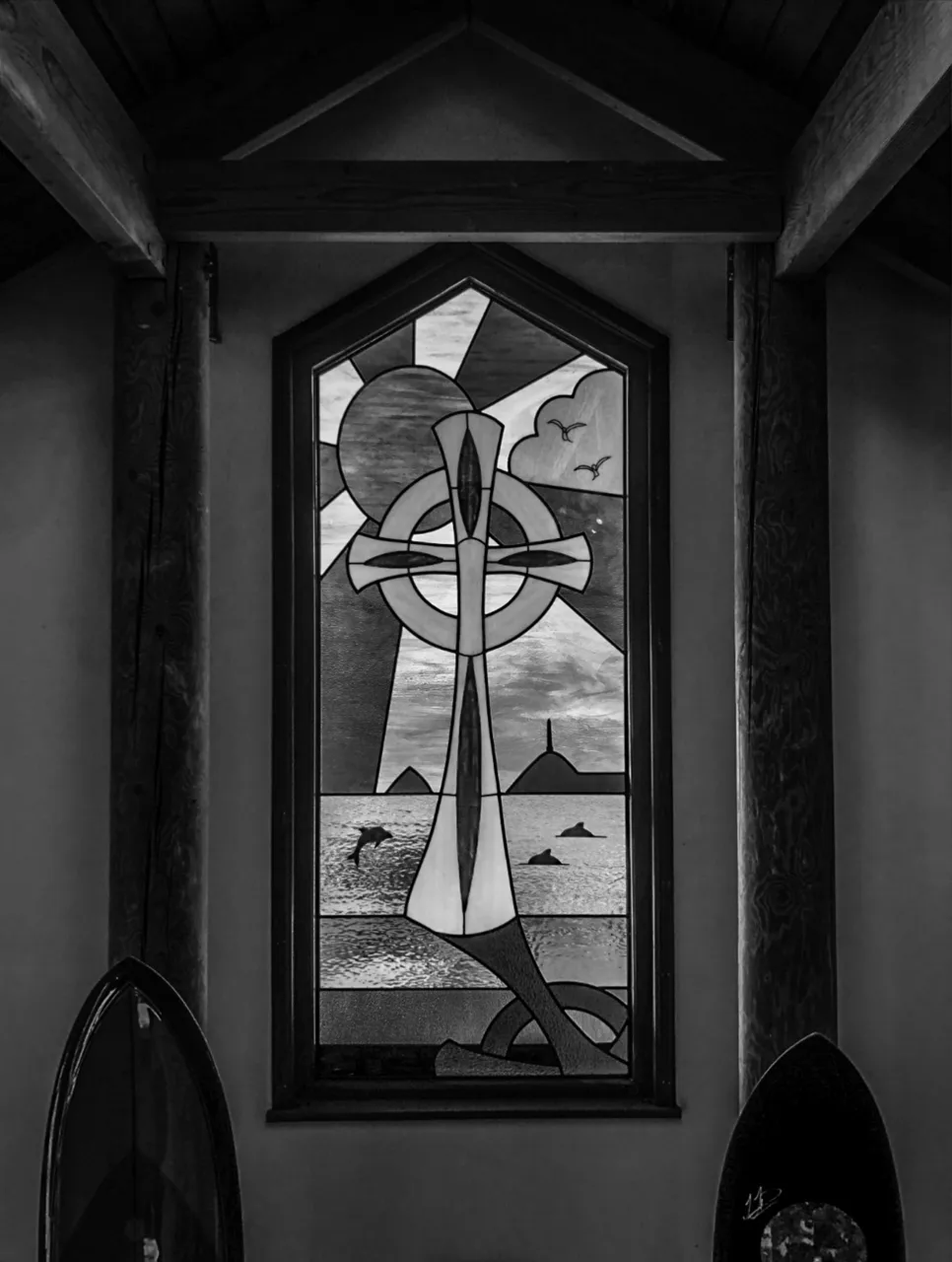
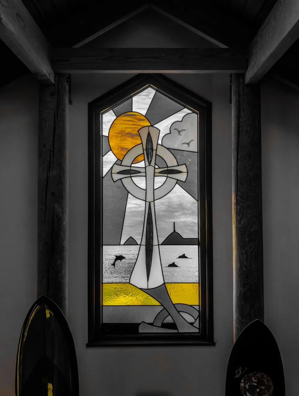
And then the closer shots of the stained glass window. Black and white loses a little , I think, in this shot.
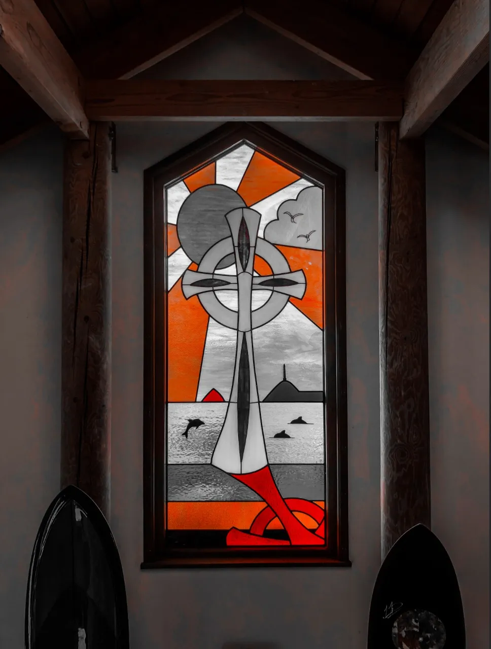
Splash colour works well.
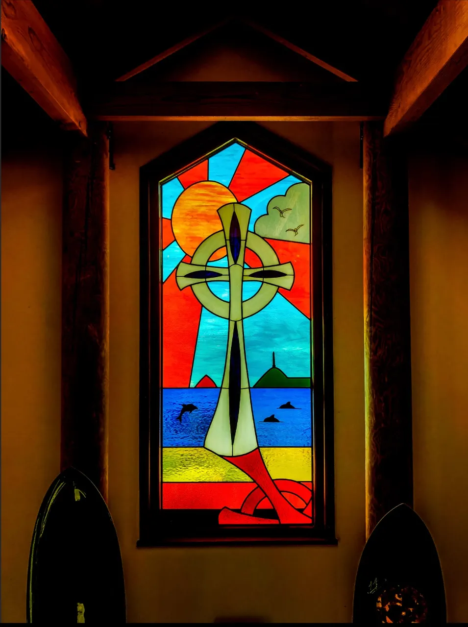
As does colour, but then you would kind of expect colour to work with stained glass really wouldn’t you?
And a different splash colour also works extremely well. I somehow love the splash colours singling out different aspects of the stained glass. Can’t really put my finger on why it works for me but it just does.
Any thoughts and feedback are always welcome. I had fun messing about with these on a slow day at work in a very dull environment so they brightened my day as much after as when I was there taking them.
Let me know which you like and why, always interested to get some feedback.