Do visitors to the POB site know that there's an option to sign up and why they should consider signing up? I feel that value proposition isn't communicated clearly.
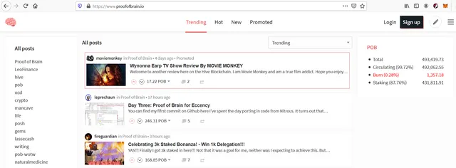
Here's what they see when they are on the front page:

Looking at this, why would anyone sign up unless they've already done their homework on what Hive / POB is? So they read an article and then they bounce off to some other site.
How Other Sites Do It
The one that I think does it best is Publish0x. Here's their welcome notification for users not logged in:

"Join us for exclusives and extra $ bonuses"
Short and simple but it conveys the message clearly that there are benefits to join and that you should consider if you want '$'.
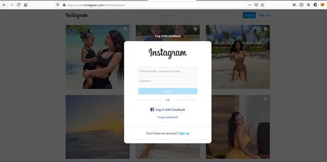
The big social media sites do it differently by forcing you to sign up in order to continue viewing their content. I don't think that will work for a niche site like Hive/POB at this point but stylistically, i like their banners better:

Idea
So my idea is to have it stylistically like Instagram, where the screen darkens and a pop-up emerges. But instead of forcing users to sign up, it will encourage them to by stating that:
- It is free to sign up
- Earn curation rewards for spotting good articles
- Earn author rewards on articles that they write
The user can always choose to ignore the banner and continue browsing without signing up.
This banner will appear on the first page that a visitor who is not signed in will see. So if they visit a particular post via a tweet, then it will appear on that post.
On a side note, copy pasting images from the clipboard has been disabled on the pob front end? Hope the images show up, i'm using imgbb for hosting.