Hello all,
It is almost 2 months into my internship journey in UI/UX designs. We are gradually being eased into the design proper after a series of theoretical build-ups. I showed off my first 2 designs in this post and if you ask me now, I will tell you those designs reek of that of a total noob. I actually laughed at myself for self-sabotage. I have learned a lot more within a week interval.
Someone that is not a UI/UX designer might not see anything wrong in those designs but a mid-level designer would see a chunk of the faults from afar. Of course, I knew it was an amateurish design, just did not know they were that bad until I knew better.
Anyway, below is my latest tryout on a hero page for an e-commerce platform
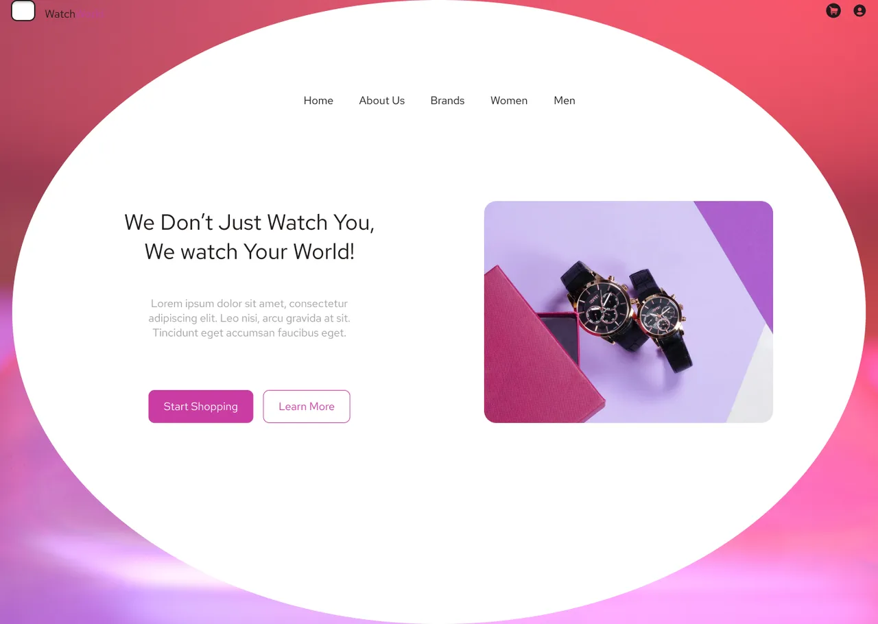
For the first time, I actually put my creativity into this design and it came out decent. I said decent because even my mentors were surprised to see this from someone that made those earlier designs. I got to understand that what can make you stand out as a designer is creativity. When you are creative, originality comes easy and just a few minute scribbles can win you a noble price :).
Anyway, I just felt like updating you guys with my journey. I have been successfully promoted to stage 4 of the program and a huge task is currently at hand for me to submit by tomorrow and another one on Wednesday.
Let me know what you think of the designs above. I hope I am going with this minimalist approach the right way. If I am going to be working for @joerhino on his soon-to-be-launched website in the nearest future, I'd better sharpen my skills quite well because international ratings are like gold in this industry.
You can view and play the original file on Figma here