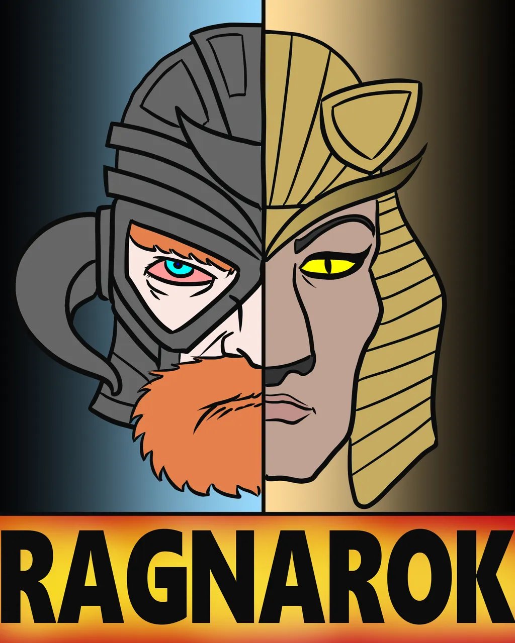
Here's a new entry for the Ragnarok Logo Contest hosted by @ragnarok.game over here: @ragnarok.game/ragnarok-logo-contest

I think that v6 was my best work but I wanted to try something a bit simpler. Cleaner lines and shapes. Something that hopefully would also look good as a thumbnail.
Also, I was watching tutorial videos on YouTube on using vector layers which I've never done for my comics in the past, but after trying out some time-saving tips, I think drawing with vectors may actually save me time on my regular comics. Maybe I'll try out the next Kickman page using the new technique. Anyway, here's the timelapse video of the drawing process: