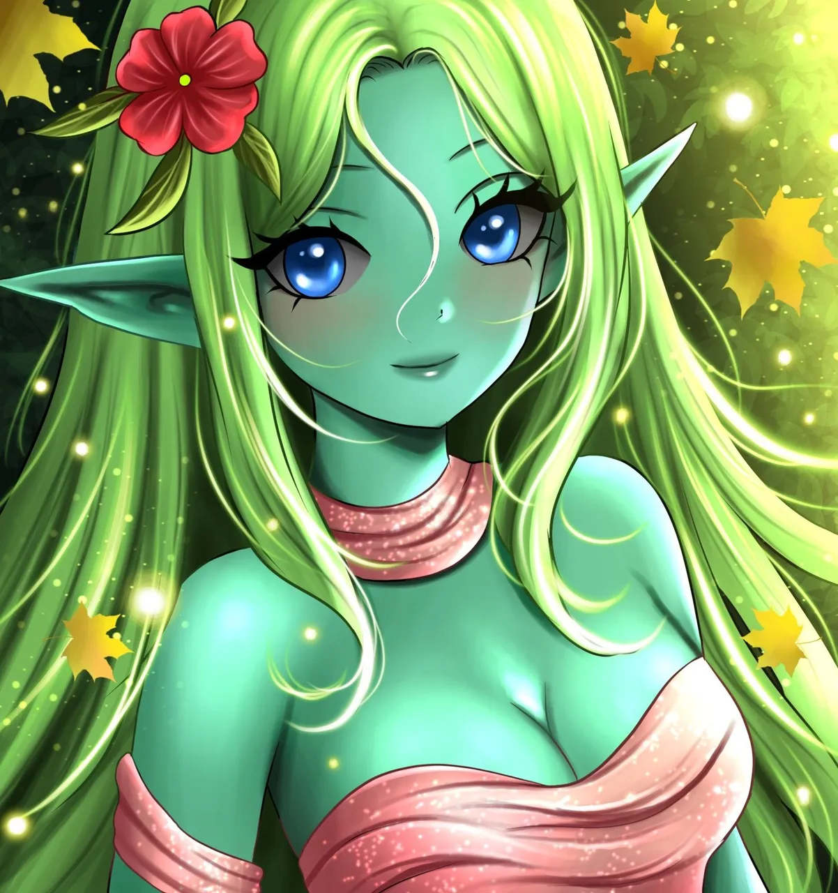
Hey there, people. I hope you're having a lovely time. It's that time of the week for me again, which is my Splinterlands Art Contest entry submission.
This week, I decided to draw the Wood Nymph. As with my recent trend of drawing, I wanted to draw her to look charming and elegant, and what better place to find elegance than Mother Nature's habitat.
Anyway, this is it for the overview of this piece. I'll list out all the important adjustments I made in the process of this drawing below.
The Process
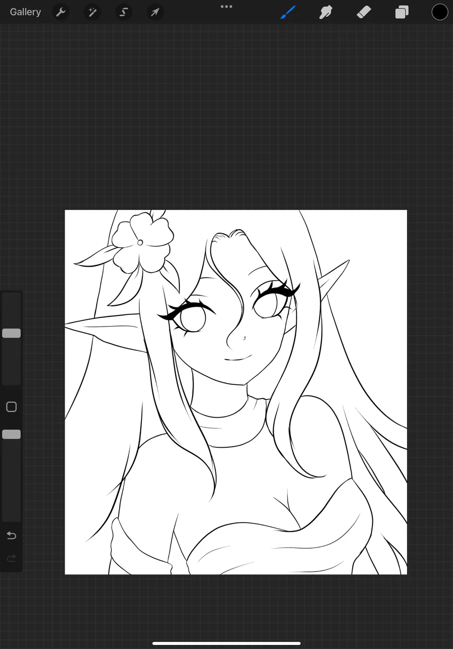
I fired off my drawing process by adding in the flat colors like usual, right after being done with the line art. The color palette was quite straightforward - tons of green alongside her clothes and one big red flower on her head.
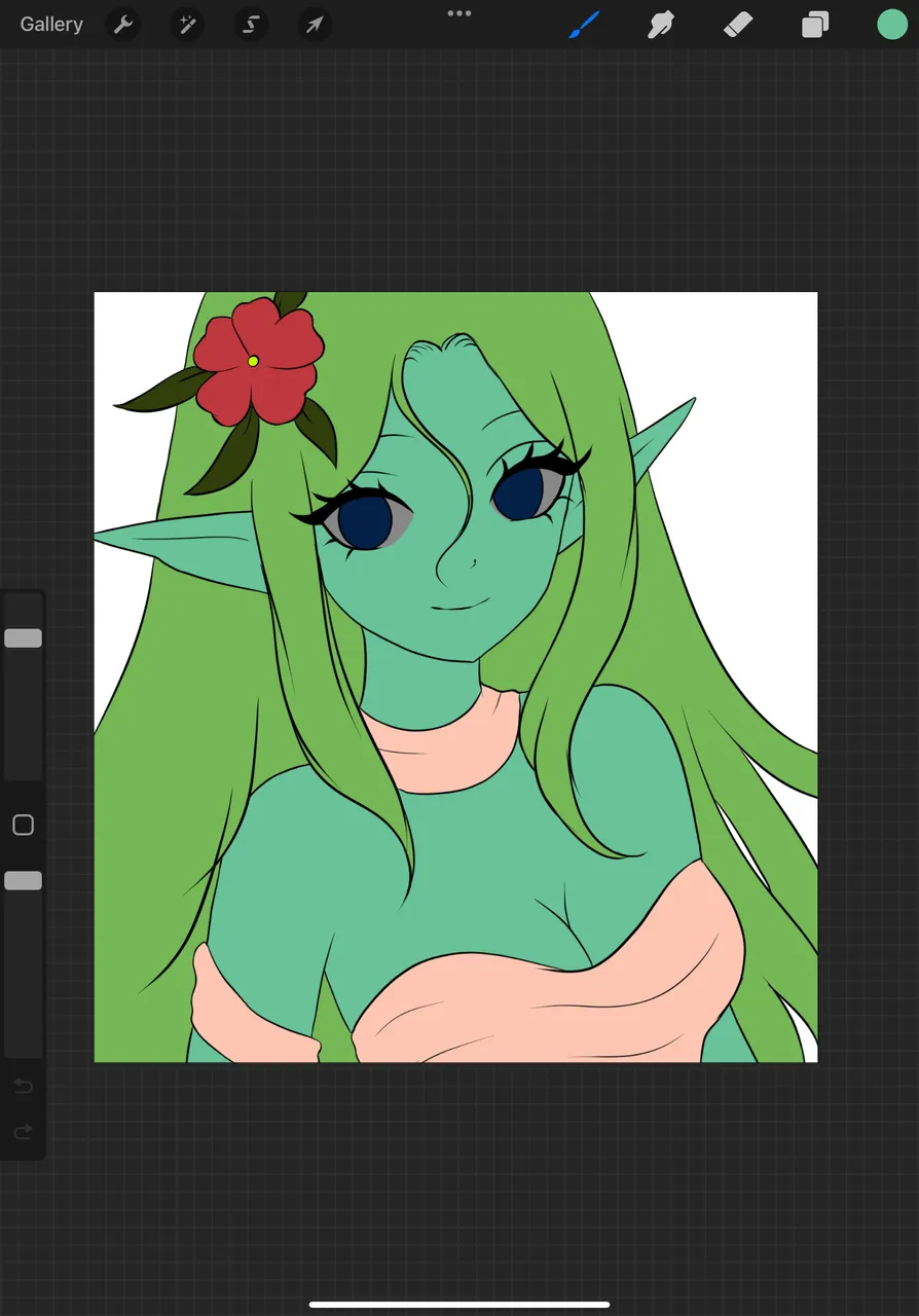
Next up was the background. Since she used up all the brightness, I needed to make some contrast and went with a pretty dark shade of green to add some initial background coloring.
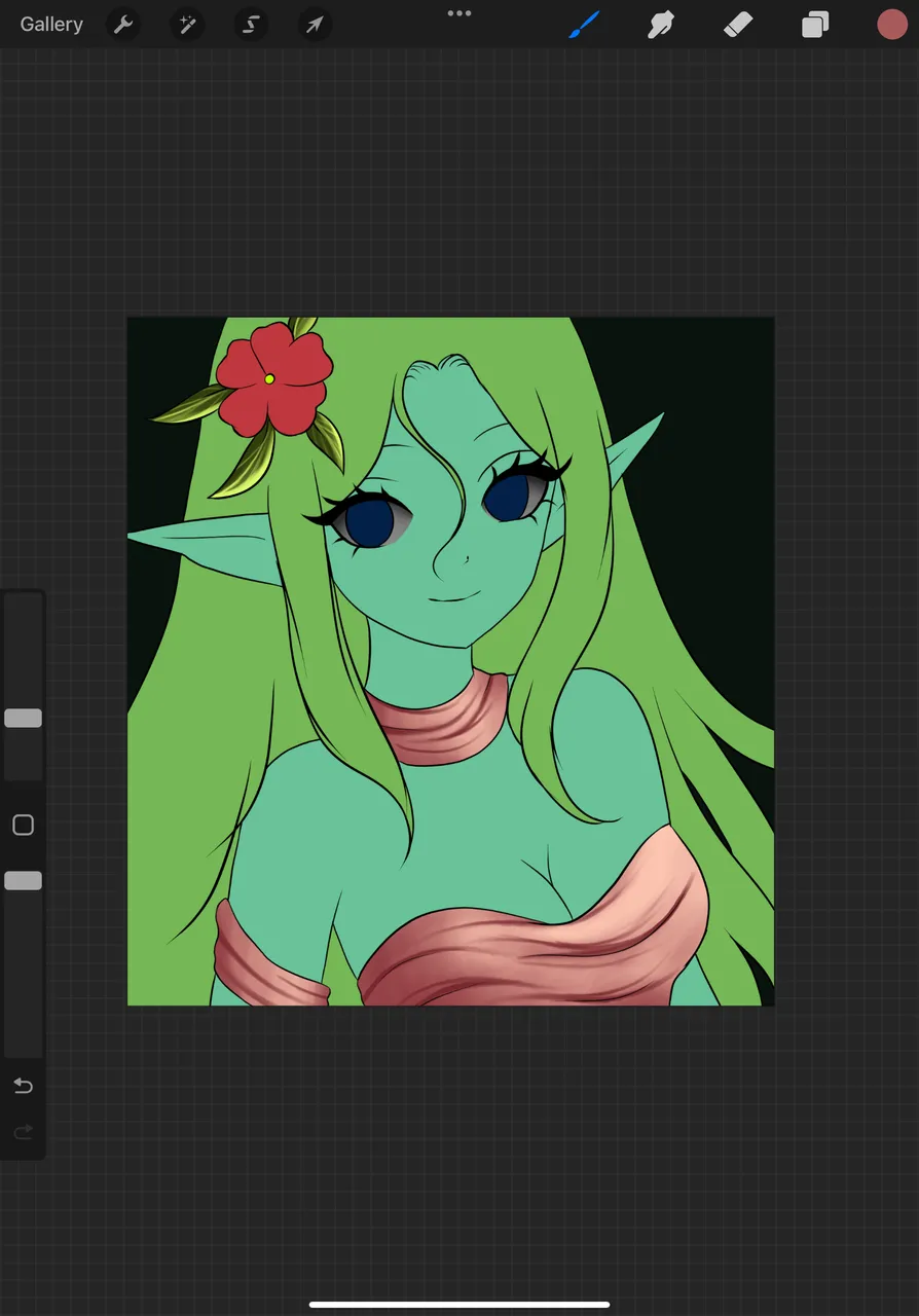
Now all initial flat colors were set, and what was off-putting was the odd contrast between my character and her background, so I started adding in the dark shades to her, mainly her hair, to bring out the strands of hair and more details of the portrait.
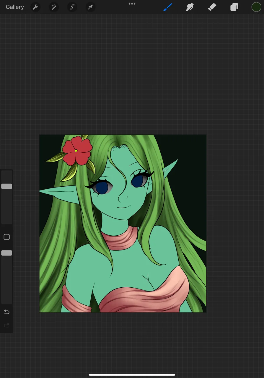
Now that I was done with the initial addition of details, it was time for a general overview. And at first glance, my drawing was devoid of any soul, and it was pretty obvious what was causing that - the eyes. Hence I went to add the glows to her eyes to bring out her charm, and while I was at it, I added the highlights to different places - again, mainly her hair (since that's what covers a big portion of the drawing and has the most impact in the overall final quality of it) and her clothes (which weren't dark at all, but I felt likek a little bit more light could help - maybe it was the dark background forcing me to add more contrast to the piece).
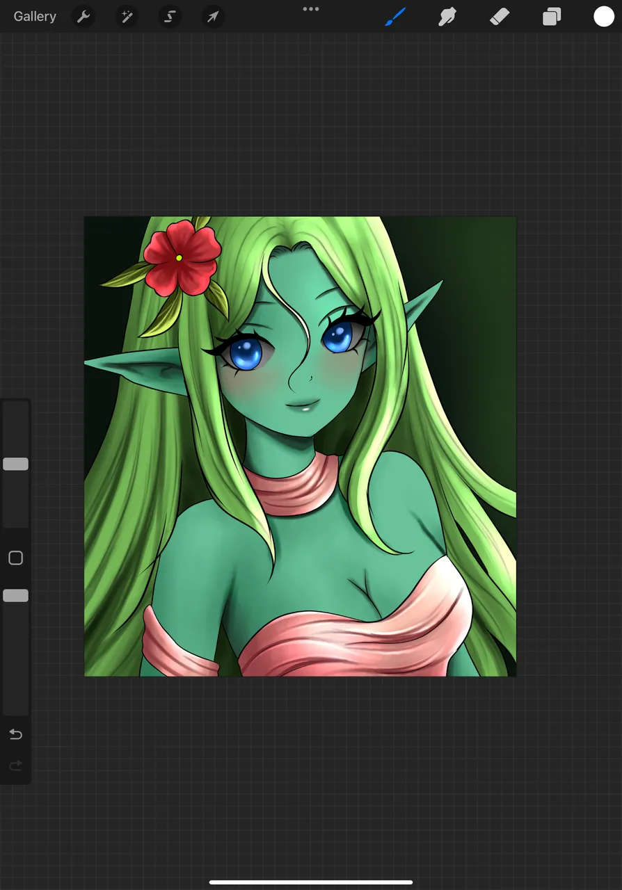
Contrary to my usual approach, I put off hair highlighting (the white strands) until the very end of my coloring process. And even then, I was quite satisfied with how her hair turned out, even without a single strand of white highlight - I usually add a bunch in and around my character's hair to make them look more vibrant. But this time the white ones weren't as needed, and I only sufficed to use a lighter hue of green and little white to highlight the ends of her hair strands.
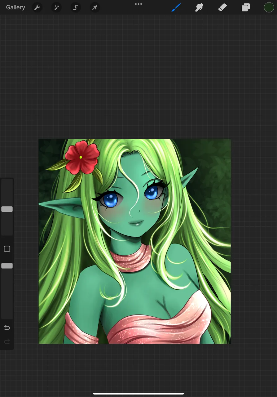
I also decided what I wanted to use for the background - the color was there, but what it would be was up for debate. I settled for a lush background of bushes and the green color from the background bushes wasn't too harsh on the light green used in her hair, so I kept it that way.
The Result
Since she's a Nature type character, I finished off the piece by adding some falling leaves in the background. I also added some glows around the painting that look just like fireflies - it looked beautiful, and fireflies are what you see out in nature at night, so I kept them as they fit the piece well.

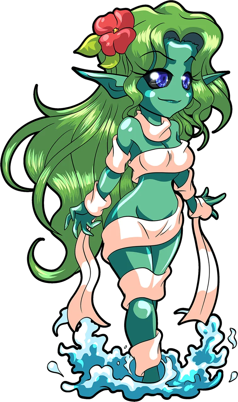
Original Game Art
And here's the original art for those wondering.
That's it! Let me know what you think about this piece in the comments. Looking forward to hearing your thoughts and opinions down below. I'll see you all around and in next week's contest. Good luck to those of you participating, and cheers~~~