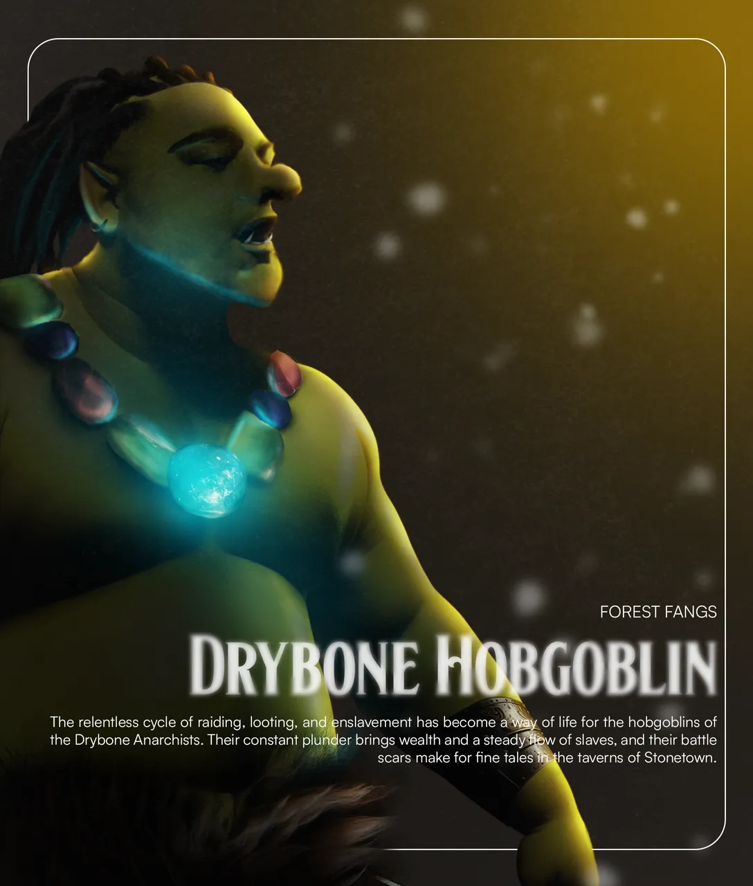
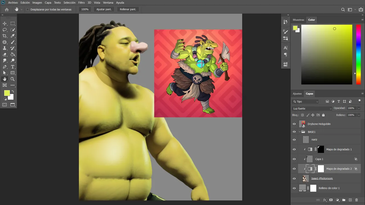
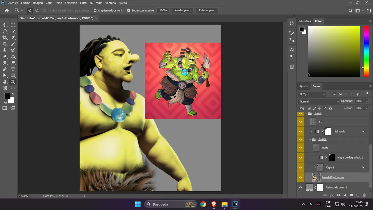
Hello friends from Alien Art and Splinterlands. This week I'm back in the contest, focusing on composition to keep practicing. I've made orcs before, but never one this detailed—worthy of a magazine cover. The blue glow of the necklace stands out with the orange background light, blending nicely with the green tones. As always, I invite you to check out the creation steps.
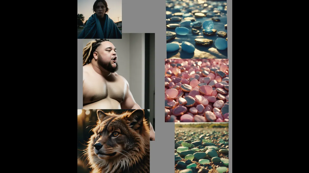
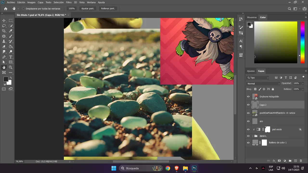
The first image you'll see below is part of a set of AI-generated images I used to cut and fit into the rest of the character's body.
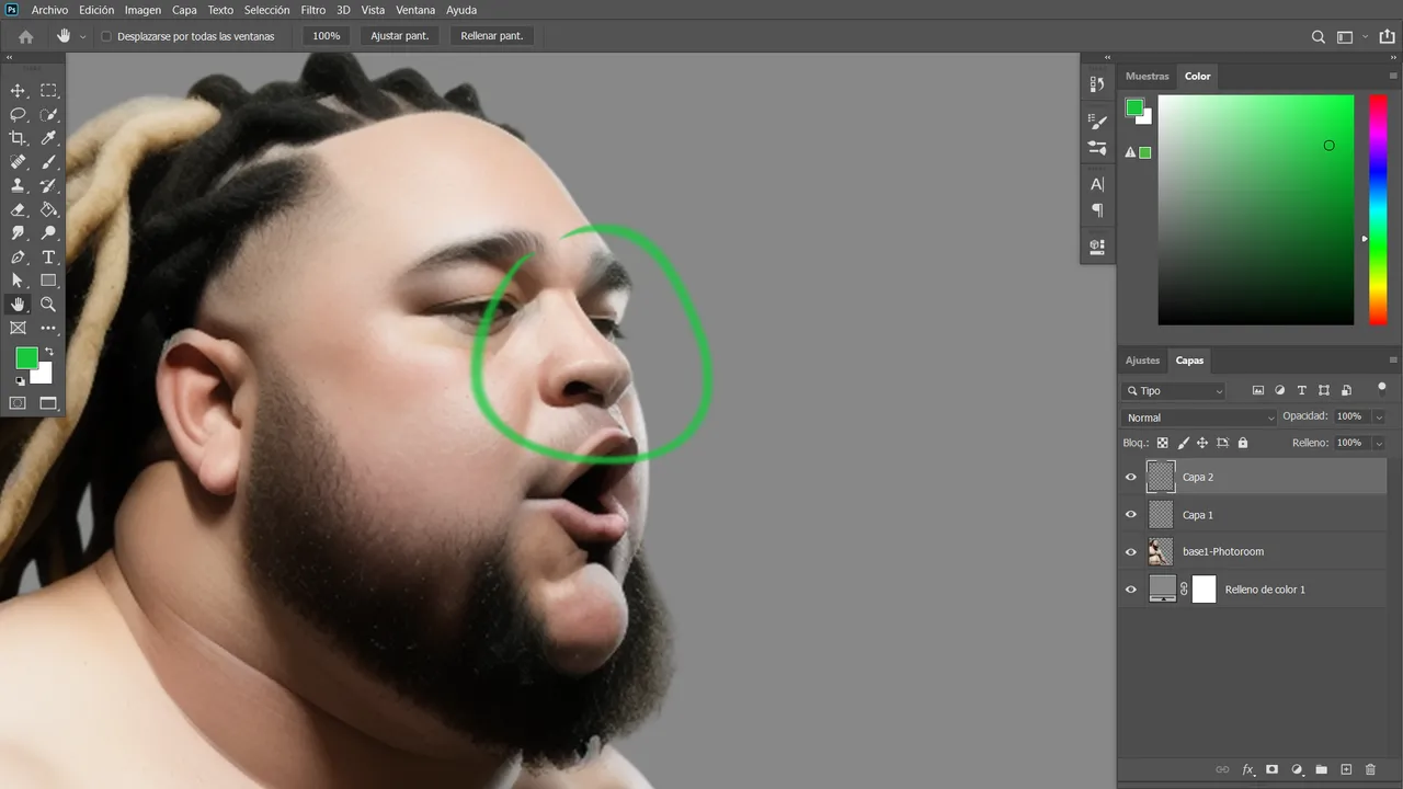
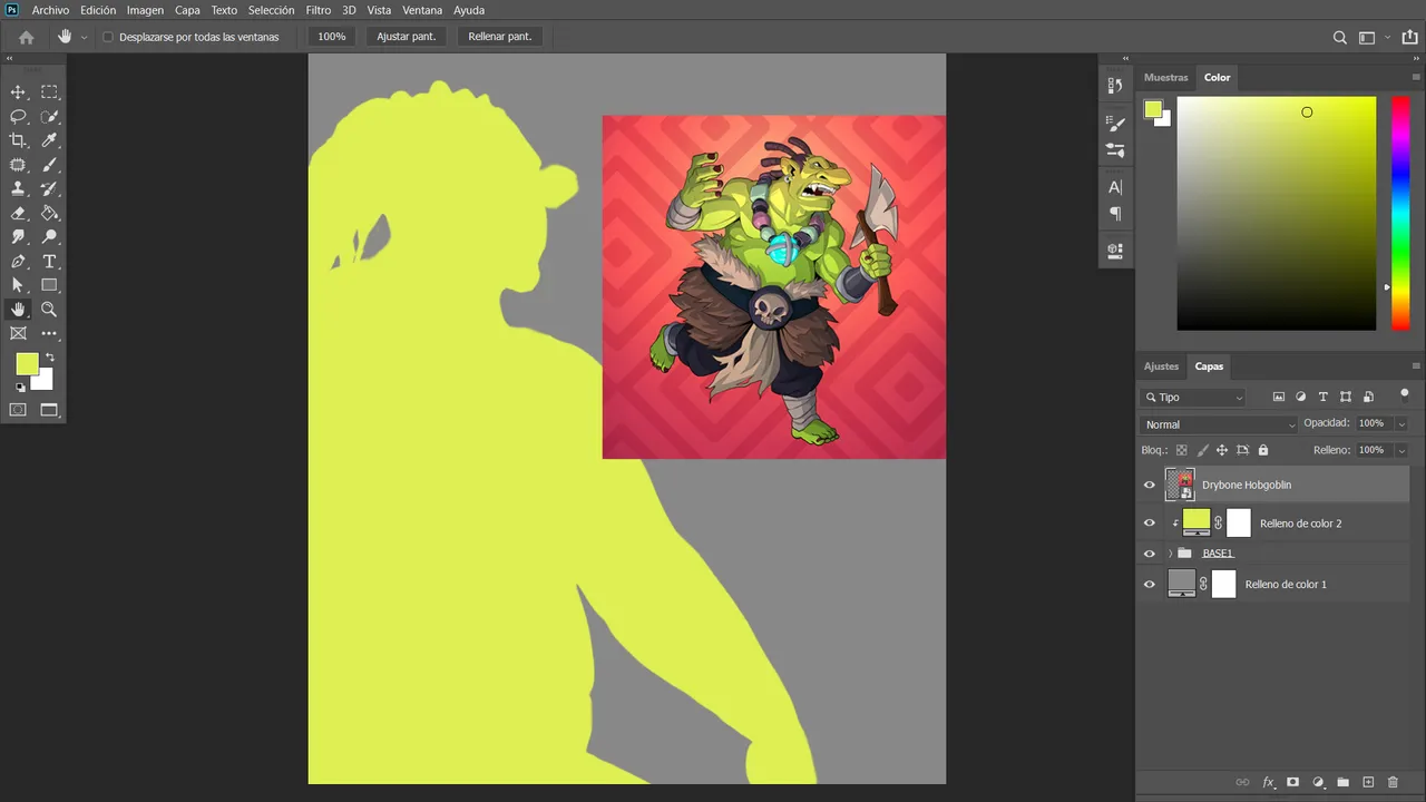
To start, once I had the base elements, I moved on to the essential part: shaping the nose. After spending a few minutes adjusting its position, I continued with the character’s signature green color.
(A key detail: I corrected and completely removed the beard using patches, since the character doesn’t have one).
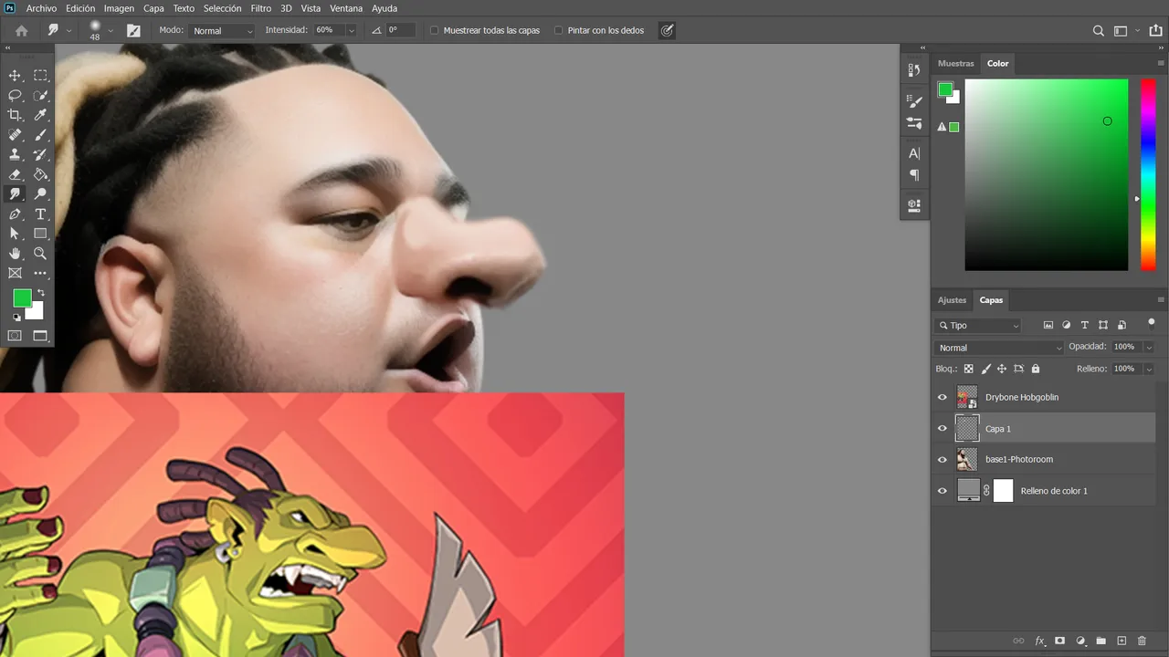
For the green gradient, I used tones ranging from dark green to a more yellowish hue. This really helps enhance the depth with highlights and shadows.
In this part of the design, I started with a solid base color, then added the rest of the tones using additional layers. This largely depends on your design style, since in RGB mode, some shadows made purely with black may not look appealing. They often look better when using a combination of light and dark greens instead.
.
For the necklace, I started by generating pastel-colored stones, matching the color palette of the illustration. I placed them one by one, in order, and carefully cut each one out.
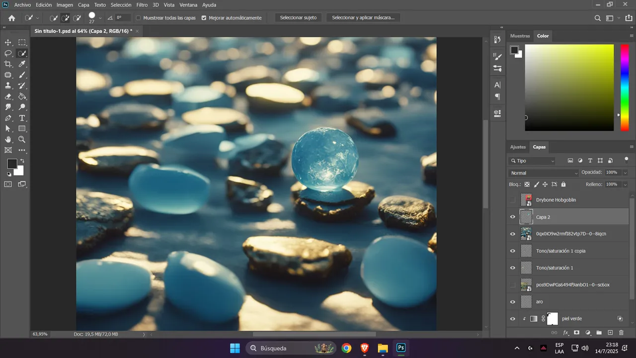
Then I added perspective to the necklace and created depth using shadows from the light coming from above. The blue sphere was cut out and positioned strategically, as it would serve as the main focal point of the design.
After cutting out the stones from AI-generated images, I used a color converter to give them the signature dark purple tone. The assembly was done step by step, with the final task being to match the necklace's perspective.
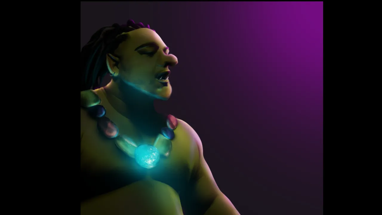
Imagining the direction of the character’s light is essential to make all the elements stand out. In this design, the light comes from behind, and the shadows help blend the blue glow with the orange that frames the rest of the scene.
I would’ve loved to create the axe, as it would have added a lot to the design. Unfortunately, I didn’t have enough time, but I promise I’ll create it someday even better.
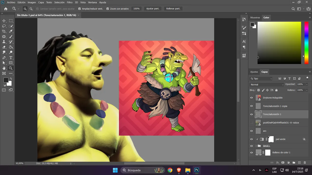
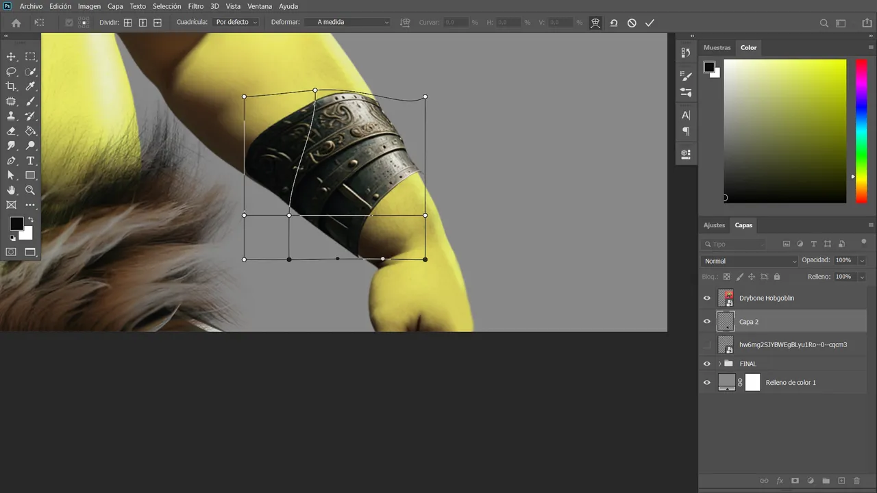
The bracelet was taken from a generated image and, using a distortion effect, I adjusted it to fit the character's wrist.
With the design complete and the overall composition finished, I moved on to the lighting and shadow phase. To enhance the details, I used a glowing light blue tone to illuminate each part of the stones, simulating how the light would bounce off them—just as it does on the character's chin. I originally placed a contrasting light in the background, but in the end, I decided to stick with the orange tone, as it created a more harmonious feel.

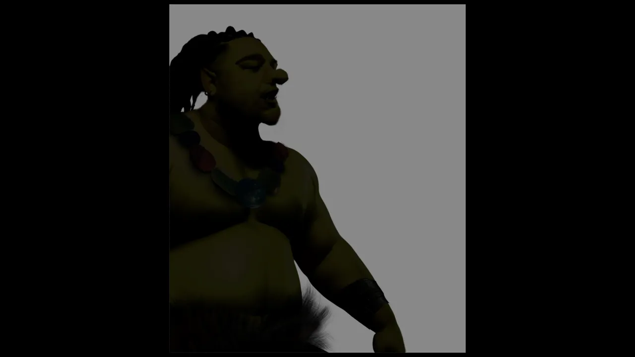
If you remember the previous steps about light, shadows, and color use, you'll see how the contrast between tones naturally comes through. Initially, I worked with blue and violet, but I felt they were a bit too saturated—and the violet could’ve been lighter, closer to pink.
So I chose to keep the orange background, which, combined with the blue, green, and orange tones, creates a harmonious fusion in the image.
The text, added as a detail, is white and helps draw the viewer's eye. (Or at least that’s what I hope you’ll tell me!)