para complementar esta temática, traeré un mini tutorial que explica de manera sencilla cómo realizar diseños con efectos líquidos.
El objetivo es animarte a practicar y lograr resultados sorprendentes.
¡Espero que disfruten de esta propuesta! ¡Gracias por su apoyo y participación en la comunidad!
Hello community!
Additionally, to complement this theme, I will bring a mini tutorial that explains in a simple way how to make designs with liquid effects.
The goal is to encourage you to practice and achieve amazing results.
I hope you enjoy this proposal! Thank you for your support and participation in the community!

PASOS /STEPS
DESCARGA Y PRACTICA
download and practice
1
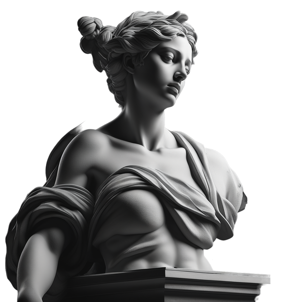
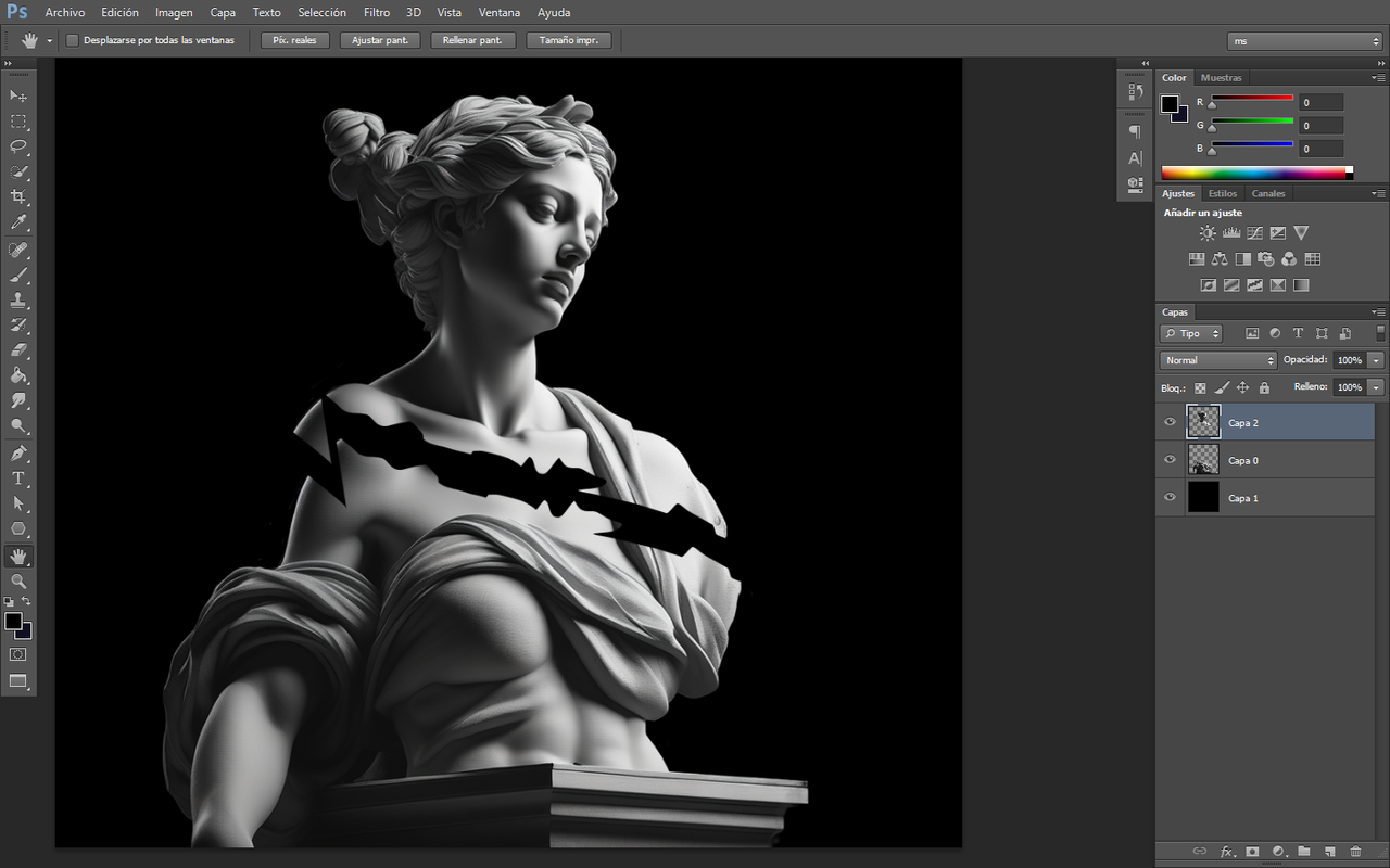
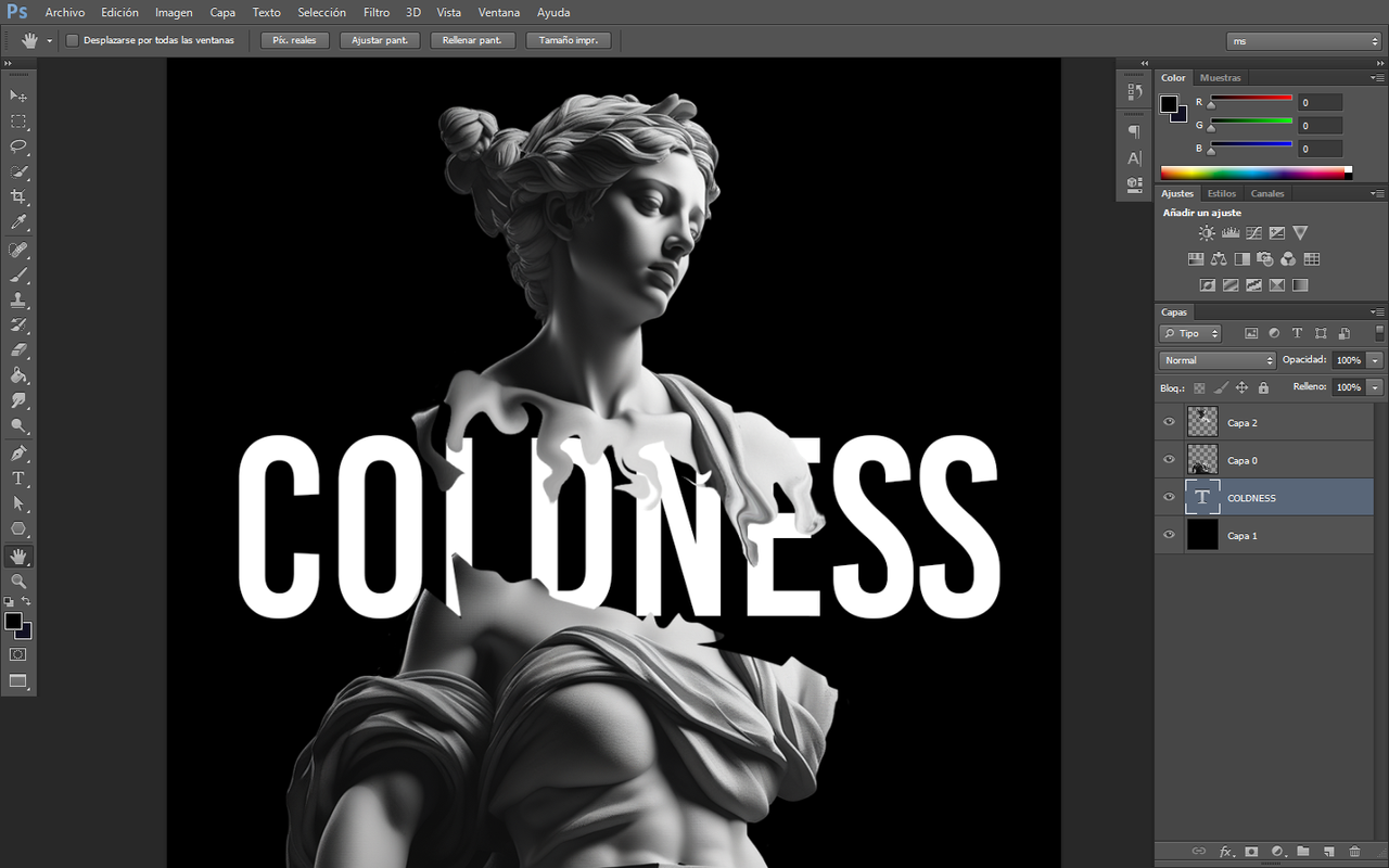
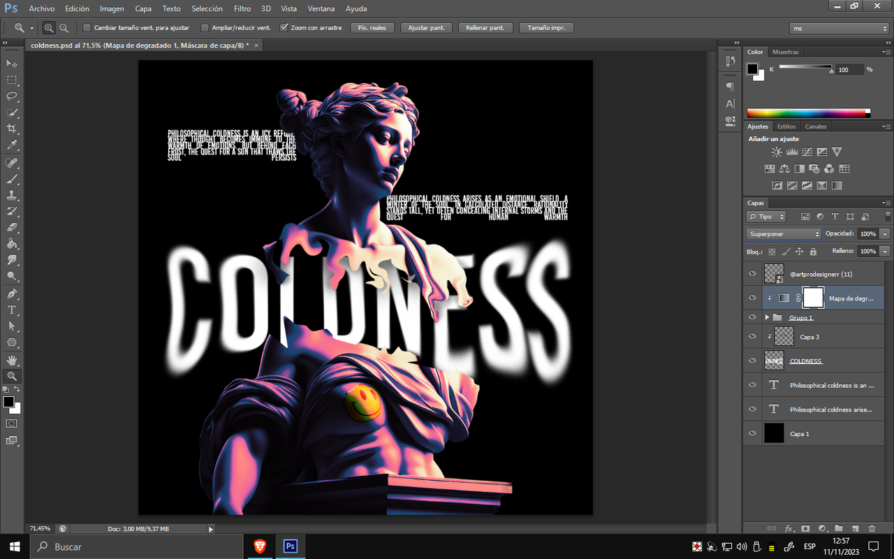
Para comenzar, una vez que hayamos descargado el objeto, vamos a realizar un corte utilizando cualquier herramienta con la que nos sintamos cómodos. A continuación, aplicaremos un efecto de quebradura utilizando nuestra creatividad. Después de realizar el corte, procedemos a separar las partes en capas. Pueden estar en la misma capa, aunque aconsejo separarlas para facilitar la aplicación de efectos de profundidad más adelante
To start, once we have downloaded the object, we are going to make a cut using any tool we are familiar with. Next, we'll apply a shattering effect using our creativity. After making the cut, we proceed to separate the parts into layers. They can be in the same layer, although I recommend separating them to facilitate the application of depth effects later on.
2
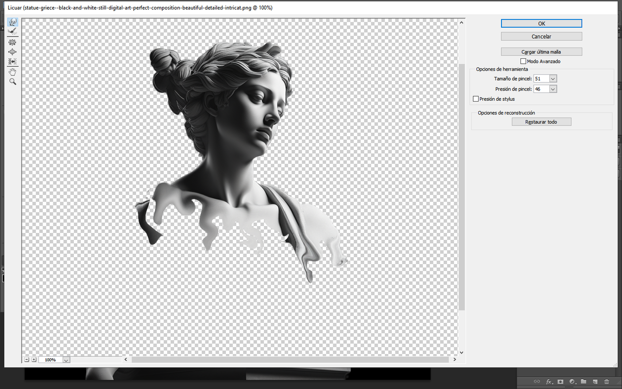
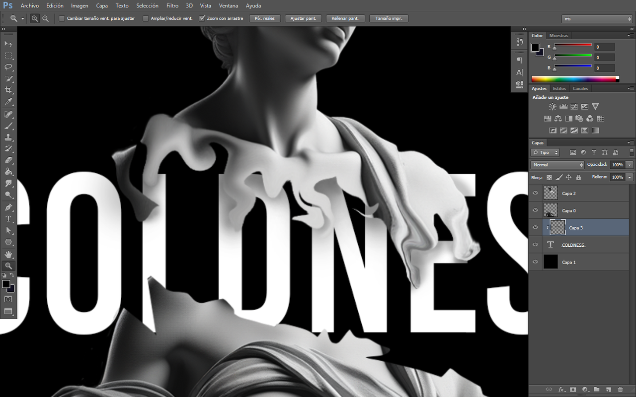
Luego, nos dirigimos a la sección de filtros y hacemos clic en "LICUAR". A partir de ahí, procedemos a nuestro gusto para dar el efecto deseado, ajustando el tamaño del pincel y la presión del efecto, ya sea agrandándolo o reduciéndolo.
Next, we navigate to the filters section and click on "LIQUIFY". From there, we proceed according to our preferences to achieve the desired effect, adjusting the brush size and pressure, either enlarging or reducing it.
3
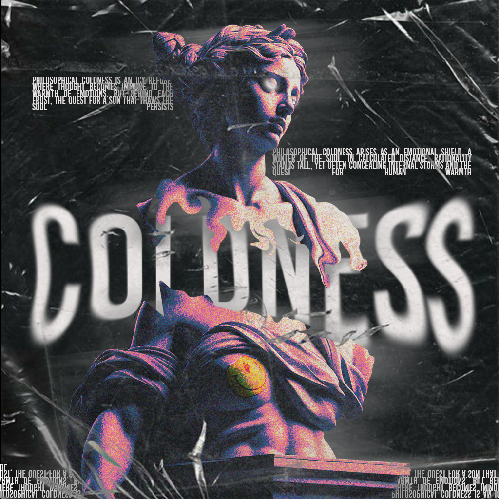
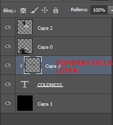
Un buen diseño, a veces, no necesita estar tan cargado. Para agregar estilo al diseño, colocamos un texto detrás de la siguiente manera y procedemos a darle sombra con algún pincel de baja opacidad sobre una capa que crearemos encima del TEXTO ELEGIDO. Después, procedemos a darle sombras. Te dejo una captura al final de este paso para que veas cómo va con respecto a la sombra.
A good design sometimes doesn't need to be overly complicated. To add style to the design, we place text behind in the following way and proceed to give it a shadow with a low-opacity brush on a layer we'll create on top of the CHOSEN TEXT. Then, we proceed to add shadows. I've attached a screenshot at the end of this step for you to see how it's coming along with respect to the shadow.
4
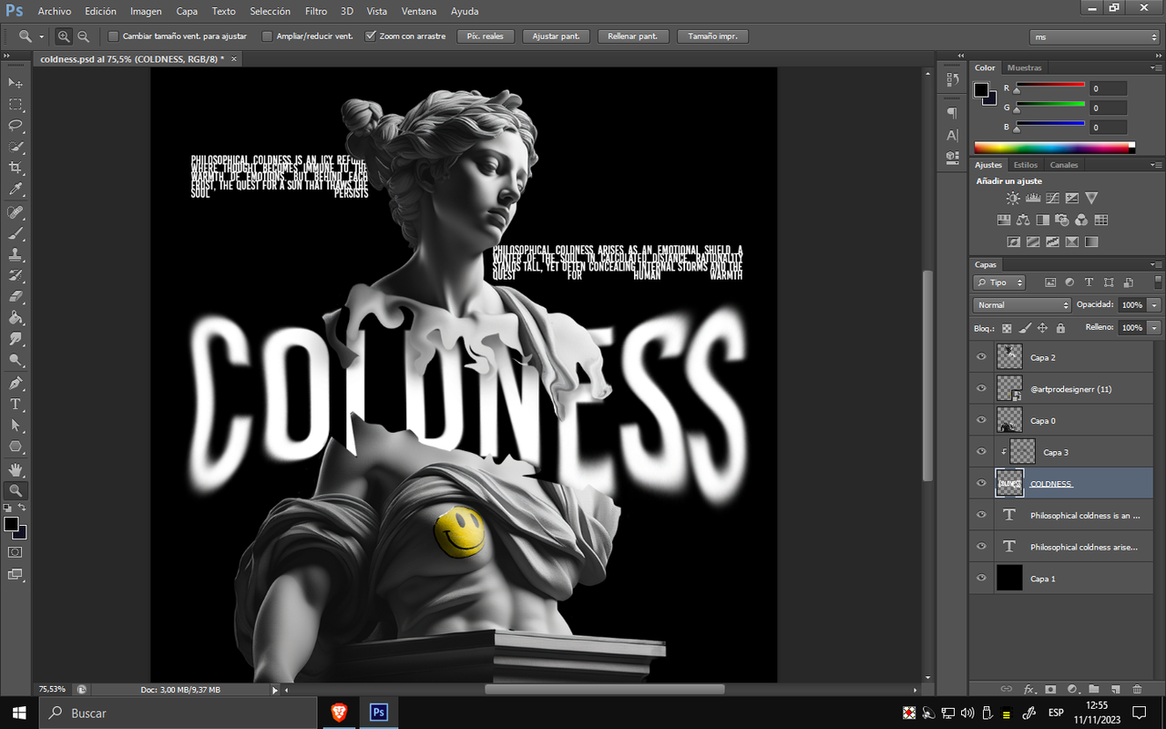
Para el último paso, colocamos textos que funcionarán como relleno (pero que están relacionados con la temática).
Agregamos algunos colores degradados por encima a elección y aplicamos efectos con la herramienta DEDO. Ahora podemos considerar que el diseño está finalizado: es simple, rápido y práctico en el momento. Sin embargo, requiere práctica para lograrlo en poco tiempo. Tómate el tiempo necesario, práctica si estás interesado en el diseño, y podrás lograr muchas cosas.
¡Te dejo un saludo y nos veremos en el próximo DESIGN LIQUID!
For the final step, we place texts that will serve as filler (but are related to the theme).
We add some gradient colors on top as chosen and apply effects with the FINGER tool. Now we can consider the design to be finished: it's simple, fast, and practical in the moment. However, it requires practice to achieve it quickly. Take your time, practice if you're interested in design, and you'll be able to accomplish many things. I leave you with a greeting, and we'll see you in the next DESIGN LIQUID!
Tools Used
Photoshop
WACOM CTL 472