Hey, everyone! Welcome back to the fifth tutorial in our ggplot series. In a previous tutorial, I showed you how to change the scatter plot point colors in the plots that you make using the R programming language. But what if you want to change the background color? In today's video, I'm going to show you how to do it!
Getting Started
As usual, you will want to make sure that you have both the tidyverse and palmerpenguins packages downloaded and installed to your system.
#tidyverse contains plotting functions
install.packages('tidyverse')
library(tidyverse)

#contains the dataset we will use
install.packages("palmerpenguins")
library(palmerpenguins)
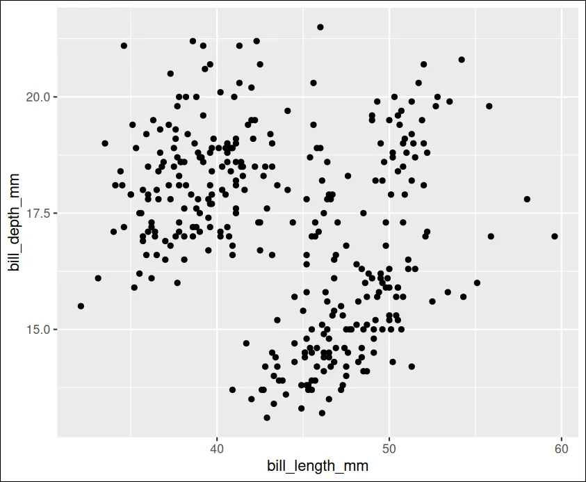
Once you have both the tidyverse and palmerpenguins packages pulled into your workspace, you can create a basic scatter plot using the code below. This will create a boring plot that looks a bit like this. It isn't much, but its a good starting point!
ggplot(data = penguins, aes(x = bill_length_mm, y = bill_depth_mm))+
  geom_point()
Making it Fancy
Changing the background color in R might seem to be a simple task. However, it's important to remember that there are two different backgrounds we have to adjust. As the image shows, plots in the R programming language are composed of both a panel background and a plot background. We need to change both of them to get the desired effect. Notice how the "panel" argument is the green area but that the plot background is black.
ggplot(data = penguins, aes(x = bill_length_mm, y = bill_depth_mm))+
  geom_point()+theme(

    plot.background = element_rect(color = "black", fill = "black"),
    panel.background = element_rect(color = "green", fill = "green"),
    panel.grid = element_line(color ="white"),
    axis.text.x = element_text(color = "white"),
    axis.title.x = element_text(color = "white"),
    axis.text.y = element_text(color = "white"),
    axis.title.y = element_text(color = "white")


  )
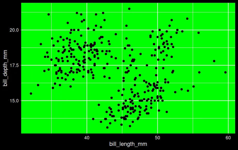
Although it might initially seem frustrating to have to change both the panel background and the plot background, this is actually a benefit because it allows you to demonstrate contrast between the two areas of the chart. If you wanted the entire background to be a solid color, you would just set the plot background and the panel background the same color.
Potential Issues
By default, R uses black labels for the x and y axis and for the index increments. This can be a problem if you're using a dark background. In order to ensure that your audience can see the labels, you might want to change them using the axis.text command and the axis.title command. Refer back to the sample code above to see how I have changed both of these to the color white. If you want a different color, you can simply copy and paste my sample code and change out the color to suit your preferences.
Summary
As always, I sincerely appreciate you taking the time to read me a tutorial and I hope you found it useful. If anything is unclear, feel free to watch the embedded YouTube video or leave a comment. Cheers!