If you're anything like me, then you know it can be difficult to find color combinations that work well together. Thankfully, the R programming language has a powerful package that can automatically customize your charts using themes that are appropriate for publication in academic settings. In today's post, I'm going to show you to use the "ggsci" package to easily create stunning plots with colors that go well together.
Getting Started
To get started, you will need to install both the tidyverse and palmerpenguins package then pull them into your library using the library command. Please note that the Palmer Penguins package is just the sample dataset that we're using for this example. If you have your own data, you won’t need palmerpenguins.
install.packages('tidyverse')
install.packages("palmerpenguins")

library(tidyverse)
library(palmerpenguins)
A Simple Plot
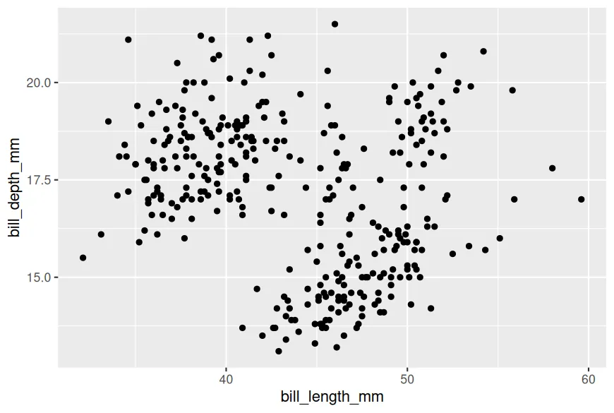
Now let's start off by creating a simple scatter plot with the sample data.
ggplot(data = penguins,
       mapping = aes(x = bill_length_mm, y = bill_depth_mm))+
  geom_point()
At this point, you should have a basic graph that looks something like this.
Default Color Theme
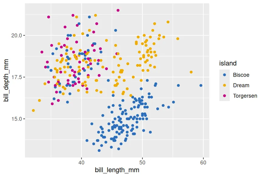
Notice that our penguins dataframe has a factor variable called “island.” This is a categorical variable that lists which of three islands the penguin came from. To add color, all we have to do is change the color within the ggplot aesthetic to the factor variable.
ggplot(data = penguins,
       mapping = aes(x = bill_length_mm, y = bill_depth_mm,
                     colour = island))
Running this code is a good start because it changes the color of each observation according to the island that it came from. However, there are some issues. The biggest problem is that this doesn't give us a lot of room for customization.

ggsci Can Do Better
To start incorporating some predesigned color palettes, we will want to install and then pull the ggsci package into our library using the following commands.
install.packages('ggsci')
library('ggsci')
Once we have pulled those packages into our workspace, we can start using the color palettes simply by adding the scale_color_bmj command to colorize our chart in a style that is influnced by the British Journal of Medicine
ggplot(data = penguins, aes(x = bill_length_mm, y = bill_depth_mm, color = island))+
  geom_point()+
  scale_color_bmj()
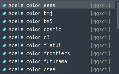
To use other themes, we just replace “bmj” with the theme we are looking for. You can find the full list of options in the official documentation.
Summary
One of my favorite things about the ggsci package is how easy it is to use. Consequently, there's not a lot more to cover in this tutorial. Always, I appreciate you reading and I hope you enjoy the rest of your day.