Hey there!
How are you all? I know I've been away for a while, but there's a good reason for it. I've been fully immersed in honing my skills in certain data analysis tools but now I'm back and excited to share what I've gained during my time away.
Through this project that took me around three months of research and time, I hope to target the right audience and grow in this field by finding good opportunities.
If you're someone who loves to play around with numbers or are inclined towards research...then this is the post for you.

In the end, I will also be attaching a link to my LinkedIn profile for a video and I hope we can also connect over there.
Using data sourced from the World Bank Datahub and executed on Tableau, I've uncovered some fascinating insights that I can't wait to share with you all...
PROJECT OVERVIEW
The dietary cost and affordability measures of the 'Food Prices for Nutrition' Datahub are based on cost-effective combinations of locally available foods designed to meet the dietary needs of the average adult. These indicators assess cost and affordability at three levels of dietary quality: a healthy diet, a nutrient-adequate diet, and an energy-sufficient diet, all for the year 2021.
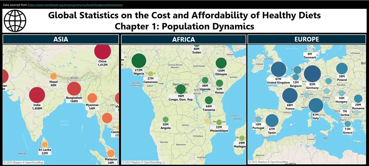
The approach involved analyzing world averages, progressively narrowing down to continent-wise comparisons based on Top 20 Countries (population-size wise) from each continent, and eventually branching out to country-level comparative analyses wherever possible.
KEY FINDINGS
- In 2021, the global weighted average daily cost of a healthy diet (CoHD) was $3.46 per person per day (pppd)
- Largest continent-wise populations: China (Asia - 1,412M), Nigeria (Africa 213M), and Germany (Europe - 83M), correlating with cost and affordability measures
- The Maximum Cost of a Healthy Diet (CoHD pppd) ranges from ($1.95) in the United Kingdom to an astonishing ($7.03) in Jamaica.
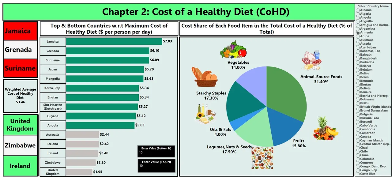
In India, the cost share of each food group in the total CoHD was as follows: (Vegetables: 20.82%), (Animal-Source Foods: 31.63%), (Fruits: 17.82%), (Legumes, Nuts & Seeds: 10.31%), (Starchy Staples: 14.41%) & (Oils & Fats: 5.01%)
The most expensive food group overall, was animal-sourced foods, priced on average at ($0.87) for the daily quantity needed in a healthy diet.
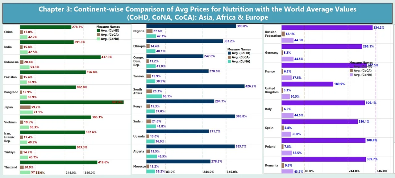
Based on the Top 10 Countries sampled from each continent on the basis of population size, it was concluded that if the world average (CoHD) was $3.46, then among all three continents, Nigeria (Africa, $3.90) showed the greatest upward deviation in its Avg(CoHD) prices with a difference of almost 44.0%.
Similarly, based on the above sampling, it was concluded that if the world average (Cost of an Energy Sufficient Diet, CoCA) was $2.44, then among all three continents, Germany (Europe, $5.2) displayed the greatest downward deviation in its Avg(CoCA) prices, indicating how cost-effective it is, to source, the energy-fulfilling but nutrient inadequate starchy staples.
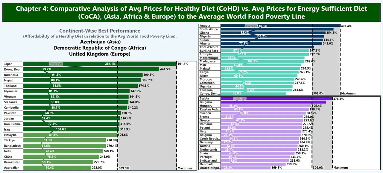
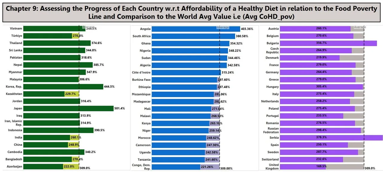
The Average Affordability of Food i.e. (Ratio of Cost to the World Food Poverty Line, CoHD_pov) is ($3.09)
- The continent-wise best performers w.r.t Affordability of a Healthy Diet in relation to the Avg (CoHD_pov) include: Azerbaijan-Asia ($2.22), Democratic Republic of Congo-Africa ($2.21) & United Kingdom-Europe ($1.69)
- Based on Top 20 countries sampled from each continent, in Asia, 13 countries fall in the category of "Above World Average of Avg(CoHD_pov)", 7 countries from Africa and only 2 such countries from Europe fall into the same category.
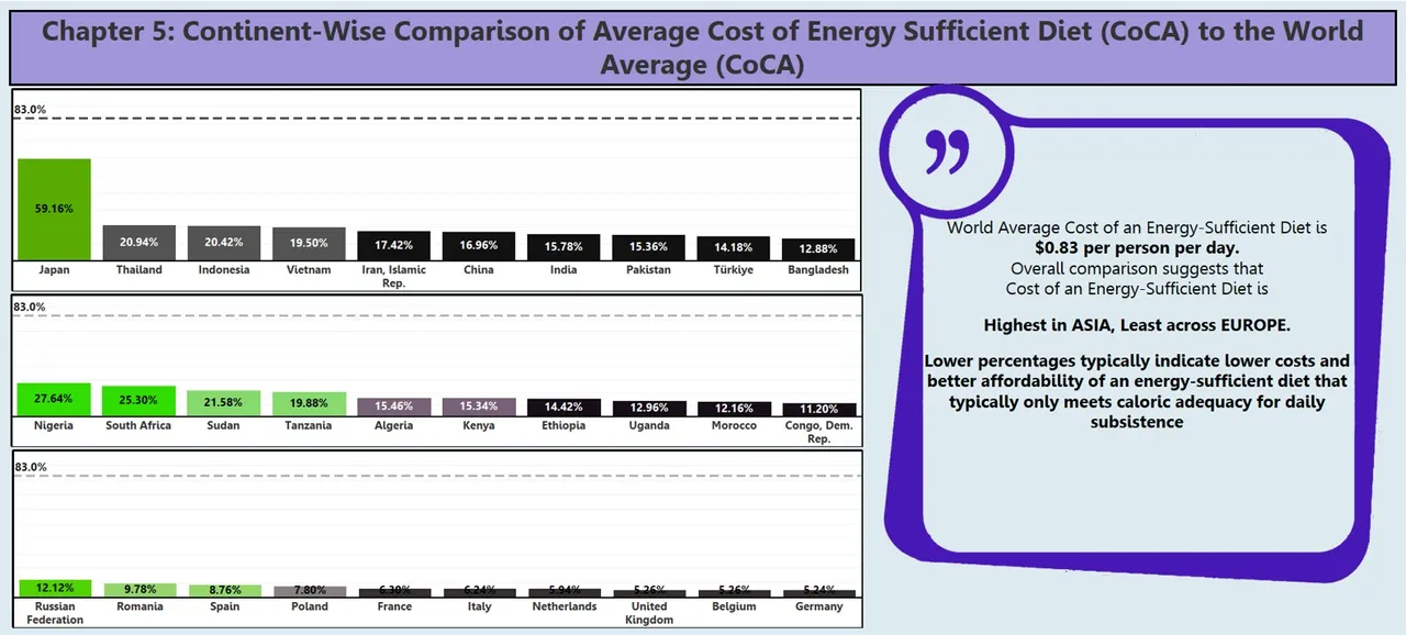
- The world average Cost of an Energy-Sufficient Diet is ($0.83). Overall, Avg(CoCA) in Europe is the least, followed by Africa and then Asia, with Japan (Asia) at $0.59 pppd
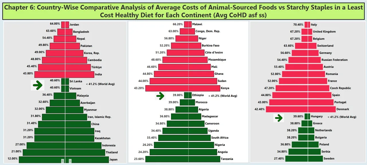
The world average cost of animal-source food versus the cost of starchy staples (CoHD_asf_ss) is ($0.41). Out of the 20 countries sampled from each continent, only 7 countries from Europe, 10 countries from Africa and 12 countries from Asia have Avg(CoHD_asf_ss) values less than the world average value.
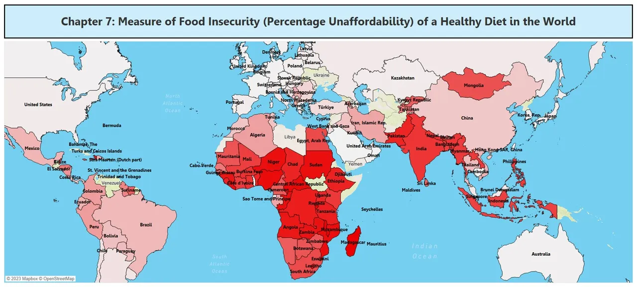
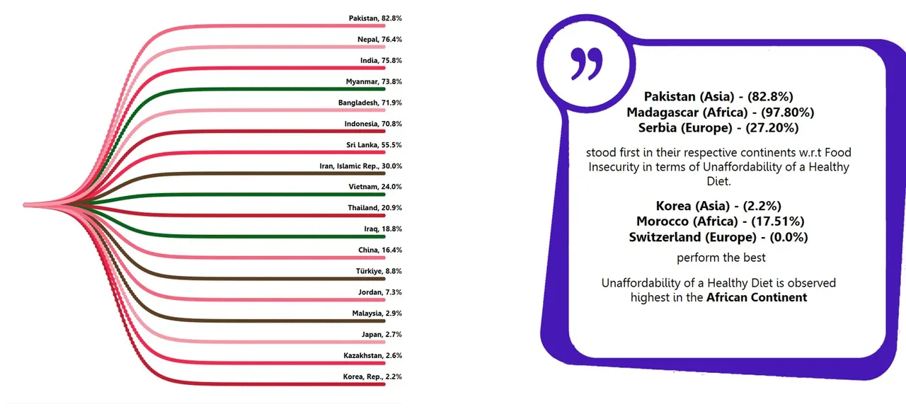
Sub-Saharan Africa - over 90% of the population could not afford a healthy diet as is visible from the World Map
TECHNICAL DETAILS:
- The data related to food groups and their respective costs were initially in a wide data format. Therefore, visualizing the "cost share of each food group as a percentage of the total cost of a healthy diet" in a pie-chart format presented a challenge.
Pie-charts typically require specific dimensions and measures for accurate representation. To address this, it was decided, to pivot the data, transforming it into a tall/long data format. This involved consolidating all food categories into a single column named 'Food Items,' along with their respective cost shares. This transformation allowed for the creation of a pie-chart as intended. - The significance of best-suited charts for specific representations, the importance of a uniform axis for visuals to be compared and of the need to use weighted average concepts, became clearer after the execution of this project
There is a video attached to this post on my LinkedIn Account to showcase the dashboard interactivity, in case you'd like to visualize.
Would also love to hear your thoughts. If you have any questions, suggestions, comments you are most welcome to reach out to me.
Thank you so much for your time.
Have a nice day :)