Hello everybody. Saw the competition from @acidyo and decided to spend my time reminiscing in the field of design. I am interested in doing similar things, so you can say that it was a certain challenge for my imagination.
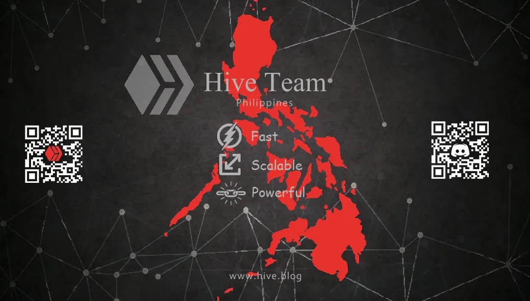
First of all, I decided to deviate a little from what everyone else is doing (and I looked at a lot of work), and in order to stand out, I did not use standard colours. I chose the background that I like the most - a dark background, a texture that resembles a beehive and an element of connection.

Next, I added the main text that I think best describes the Hive. And spent quite a long period of time on the Internet to choose the best logos for each definition.
And in order to make the business card unique for a certain country, I added the PNG of the Philippines and emphasized it a little by using the colour red. And on the sides, I showed where you can place the codes for inviting new participants.
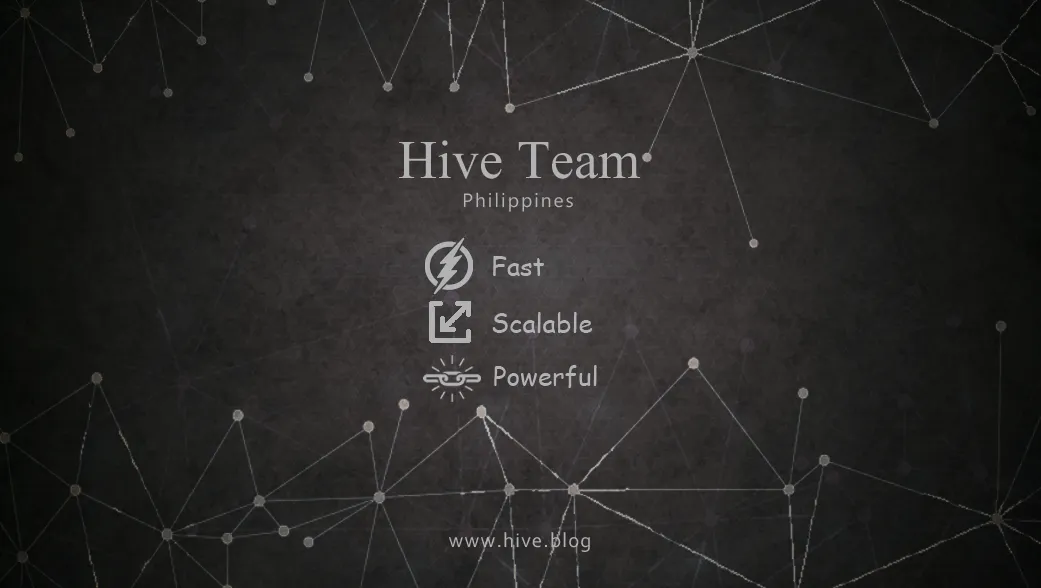
The back part of my business card turned out to be more minimalistic. I used the same background, added the Hive logo, group address and codes for scanning.

Share your thoughts about my version of the business card, I want to develop in this direction in my spare time, so I will be glad for adequate criticism. Just don't throw tomatoes at me :)