The world of a product design management revolves round an idea that can change it all for him. We are called creators but in a simple term it’s UI/UX. I have been working on a project for a while now and this project is a finance app called AFRICO. It’s an app that can be used all over the world but it’s focus on the African currency market.
what inspired the idea.
Many Africa currency have been devalued, in my country (Nigeria) as at 2021 the value of 1 Naira to $1 was 650 naira, in 2022 it was 850 to $1 and currently it is at 1,150 Naira to $1. This is what the people see everyday and feel bad that the economy of the country is affected greatly, yes it is affected because the price of goods and services continue to increase and inflation is the other of the day.
But what happens when we only have an idea of what our country currency is without knowing what the other neighbors countries currency are at too, and this is what prompt the idea of AFRICO.
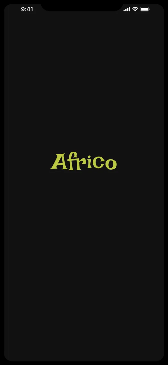
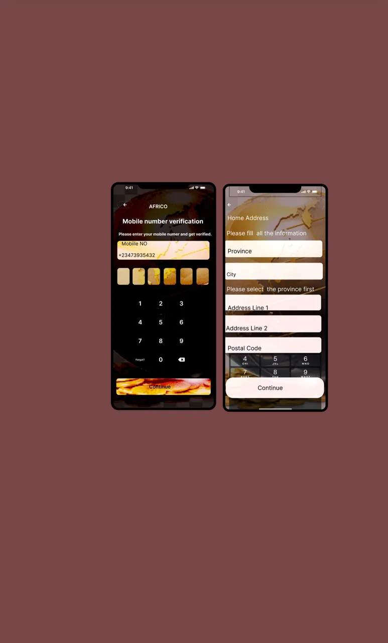
AFRICO is a currency monitoring App that help marketers, travelers, individuals and business owners that trade within Africa. It is specifically targeted at those who would like to know the financial state of other country which will help them make good financial decisions.
Although it is yet to be completed and I’m not working on it alone. At the first stage it looked very hard because most of the work load are on me. The design management I’m using for this project is FIGMA
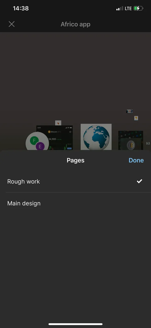
There are two pages templates
- Rough work
- Main design
I wanted to take a screenshot from my desktop to share with you all but it want off so I access FIGMA via my mobile phone to take the screenshot.
- Rough work
This is the page where I do make of the rough design before perfecting it and inserting it into the main design. If one is not careful, they can move in the wrong design into the right place. - Main design
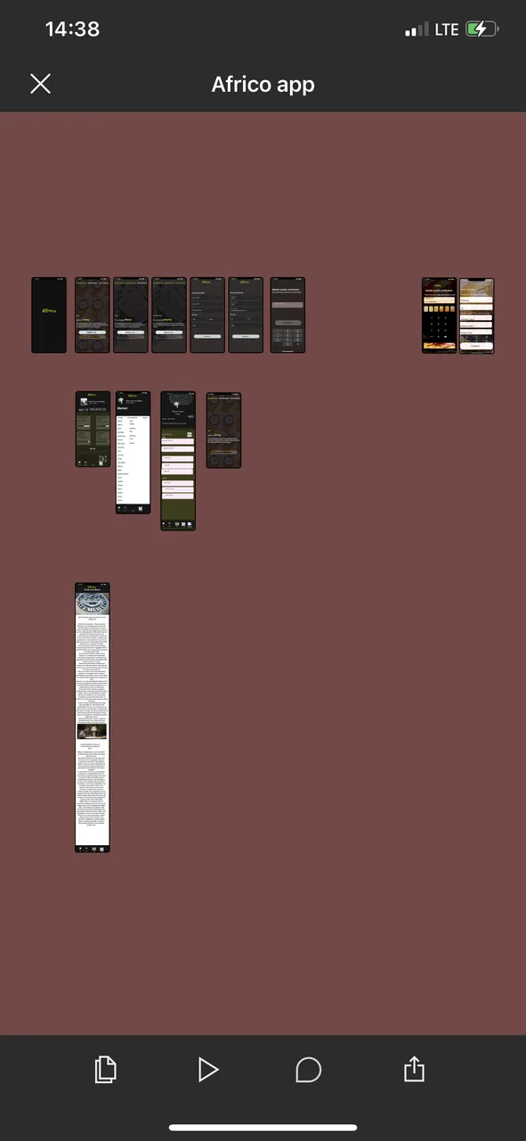
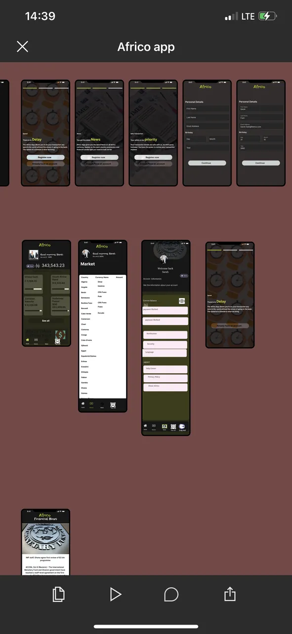
A work in progress. The number of slides are not yet complete, there are still some work to be done on it but I have been unable to finish because I’m working on another conference project that does with cyber security.
The main design consist of the
- Onboarding stage
- Home page
- Account info
- News section
- E.T.C
One of the nightmare of a designer is to design, go off to rest and get back to meet something different in his design which was what happened to me. I stated I was wasn’t working alone on this project and the people I’m working with are more amateurs than I. I gave them both editing privileges and I got back one day to see the design like this
That wasn’t the color we decided on but she said she wanted to add something to make it look different. Well, it very different from what we discussed. The color is meant to be black and yellow.
When it is done I will share the finished work.
The world revolves around tech now, be it fintech, socialtech, fittech. Get a tech man around you today and begin to learn. Also, kudos to the designers of #Inleo UI it was really dope.