I just noticed the publishing UI for the long-form content on Leofinance has been updated and this is probably the best time to offer some #feedback.
Here we go.
1. Best Decision: Remove the Right Sidebar
This is is how the Publishing UI looks now, and the dotted red rectangle is where the right sidebar was initially.
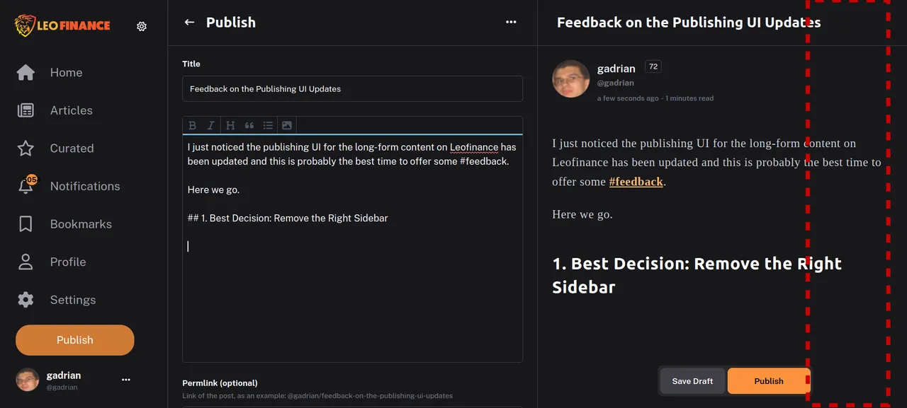
With sidebars on both sides of the screen, that reduced the sizes of the text area where you entered your post and the adjacent preview area.
Not to mention everything looked cramped up in less space. Here's what I mean:
Now the options that were previously included on the right sidebar are listed at the bottom of the post, as on other interfaces too.
2. Autosave Draft Enabled by Default
Enabling or disabling the autosave drafts was an option very "in your face" previously, and you had to manually enable it (after you started adding content, or it didn't work).
Now, you won't even notice it unless you look for it, as it is hidden behind the 3-dot menu at the top and enabled by default.
Much better!
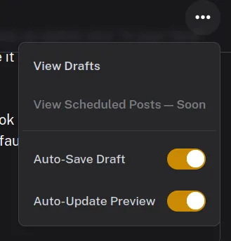
Also there, it is the option to enable or disable the auto-update of preview (enabled by default). I believe it makes sense to have it disabled when you are on the phone (or even laptop on battery) and updating it after every single keystroke would drain the battery faster. Maybe there are other use cases I can't think of right now.
3. The Repositioning of the Post's Options Prevents Some Awkward Issues
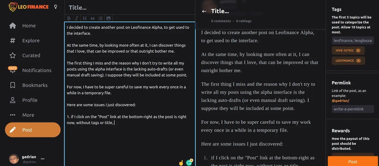
Placing the options on the right sidebar on the vertical came with a number of issues, most of them visual, but functional too.
As far as I had the chance to work with the new options now, after the Publishing UI has been updated, they don't have those issues anymore.
General Impression
My general impression is this is the first time they actually spend some time thinking about the functionality of the long-form publishing interface. They took the right decisions, the interface is clean and simple, but also only the MVP. This needs to be build a lot, even without giving up on its cleanness and simplicity.
Some things that are missing on the Publishing UI or the long-form browsing/viewing options:
- editing
- reblogging (option: auto reblogging your posts)
- the tags of the post when viewing
- remembering recently/most commonly used tags?
- ads? I spend a lot of time on the Publishing UI, and I suppose so do others. I would auto-rotate them less frequently than every min though, advertisers would probably want to pay more for real impressions.