Indeed, I must say that Leofinance keeps getting better and better. I now believe that earlier, when we migrated from the old interface to this new interface, it was just a starting point, like a building that was far from what it was going to be, but now a new dimension and beauty have been beheld, and several filterings have already taken place. Kudos to the architects behind all these designs; for me, they are doing a good and fantastic job out there.
Irrespective of the fact that there are various bugs to be fixed so as to stimulate the proper working of the interface, the bugs already fixed have helped to improve not just the usability and navigation of the interface but also the aspect of speed and response to commands. Take, for example, earlier when, irrespective of how fast your network provider is, if you tap in to a command, it always takes time to respond to what was given. But now the bug has been fixed, and to an extent, one doesn't need to press one's profile to view it; just rest your cursor on the name of the user, and the necessary information is revealed.
The Review
[a]
WORKSPACE:
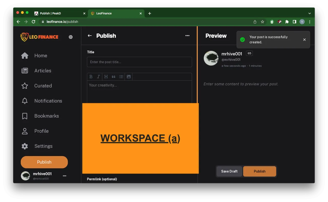
Taking a memory trip down the lane, when the new interface was launched, the workspace earlier on was not even as classified and arranged as this. Just looking at this, I cite professionalism and a reminder of peakD. Analyzing this from the image above, the space is aligned too well in that it is divided into 3 equal halves, one for the normal features added, the center being that of the rough space in the writing of content, whereas the third one is for the preview. Unlike before, where it was just two spaces, the one that could have made it three is much smaller, such that one can barely see what was written on the preview space.
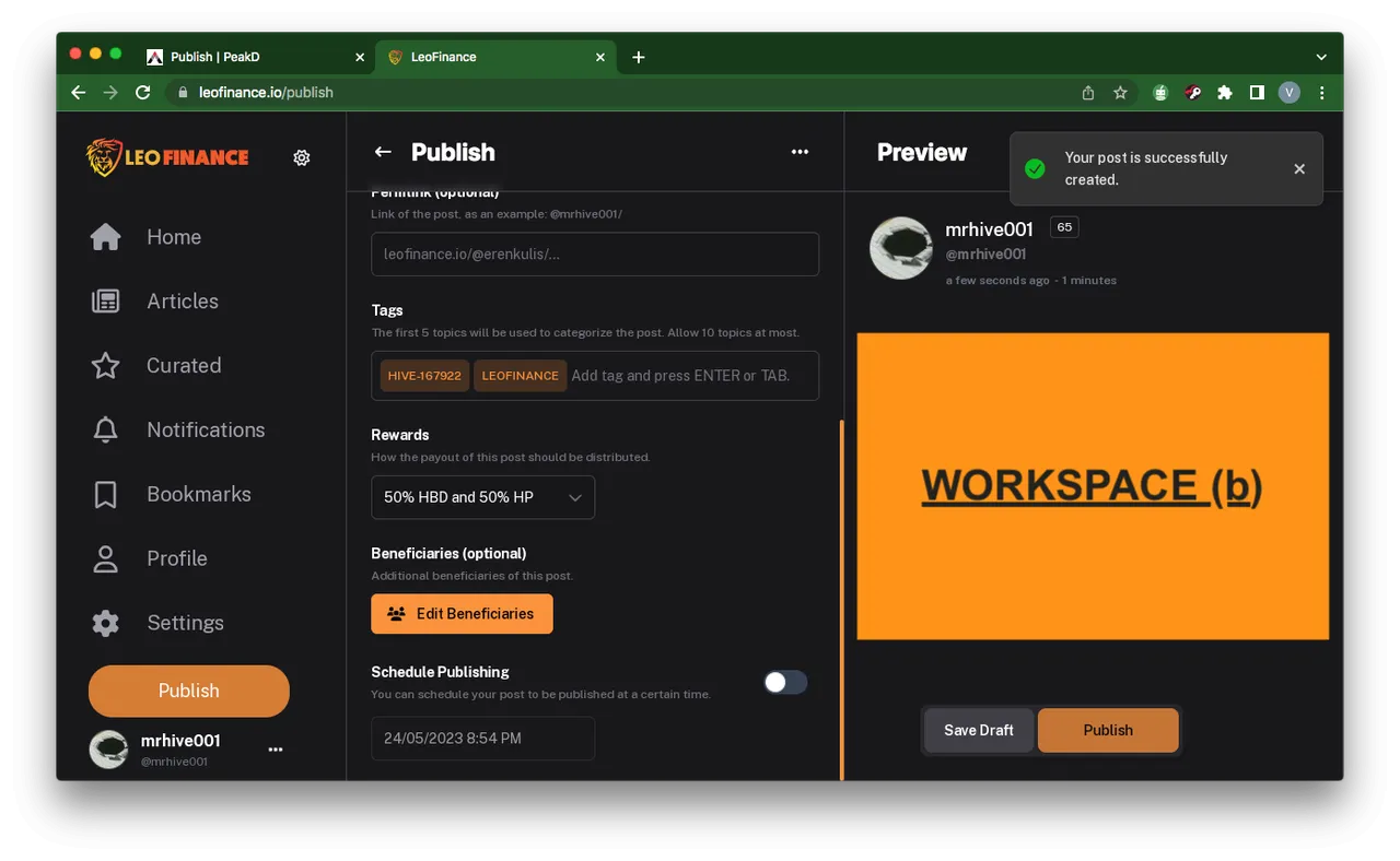
Another excellent piece of UI/UX work was done on this other part of the workspace. Tagging is now normalized so that it appears vertical, unlike the horizontal that it was. It is very free and easy to navigate now. On the other aspect of scheduling posts, it is now very specific in that the time, date, and year are made obvious as one is left to choose.
NOTE that when a post is published, the pleasant feedback like what is seen on the right top side of the image above is something of a tickling effect of confirmation that the post has been published successfully.
[b]
WALLET:
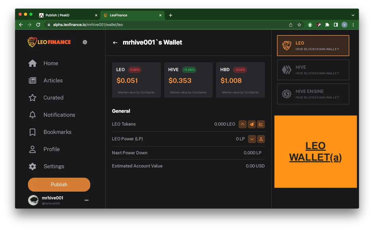
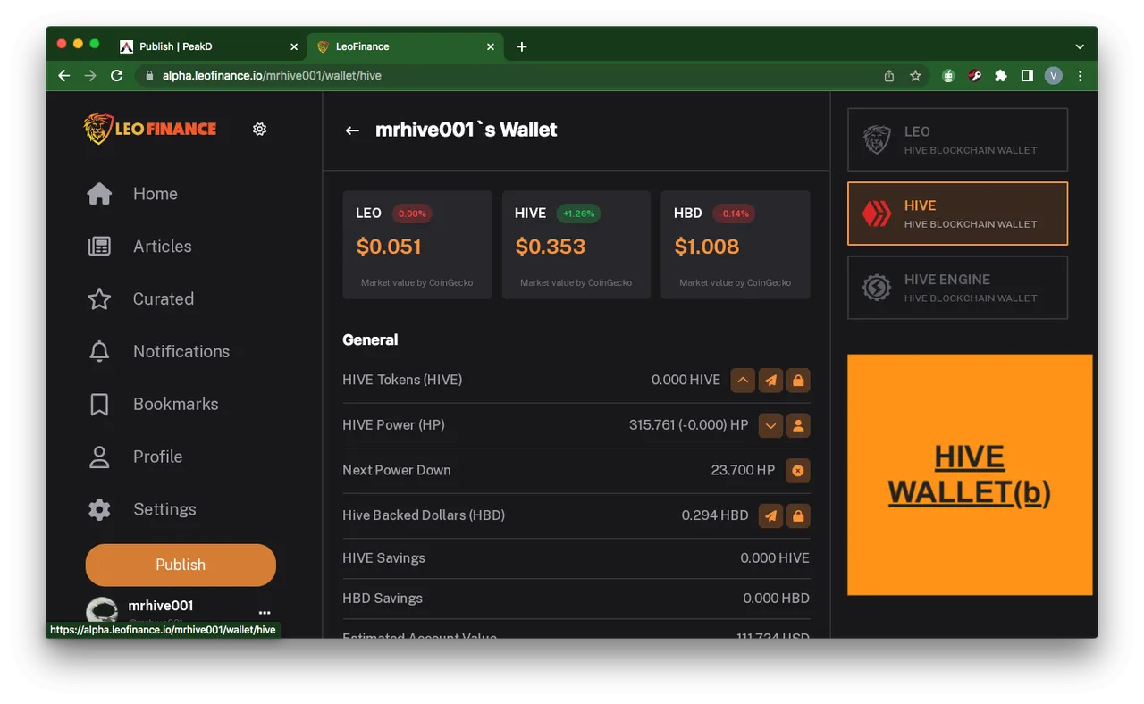
This is another dimension of the new Leofinance interface as it relates to design and freelancing. It is quite divided into three, one being the Leo wallet, the other being the Hive wallet, and the last one being the Hive Engine wallet. The leo wallet being that meant for leo tokens, the amount of leo tokens powered up, the total number of leo tokens, the estimated value of the leo token, and the option to power down This is quite an impressive addition, I must say; its category is top notch.
No doubt is the fact that the arrangement is masterclass owing to the easy navigation that it has. A mere look at the image above already explains what this part of the wallet is all about and the various segments attached to it.
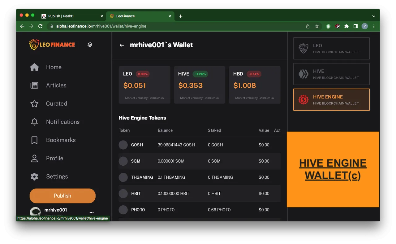
Yet another category of the wallet sphere which is more like a general wallet showing all the tokens accumulated and the value attached to each.
[C]
ARTICLE:
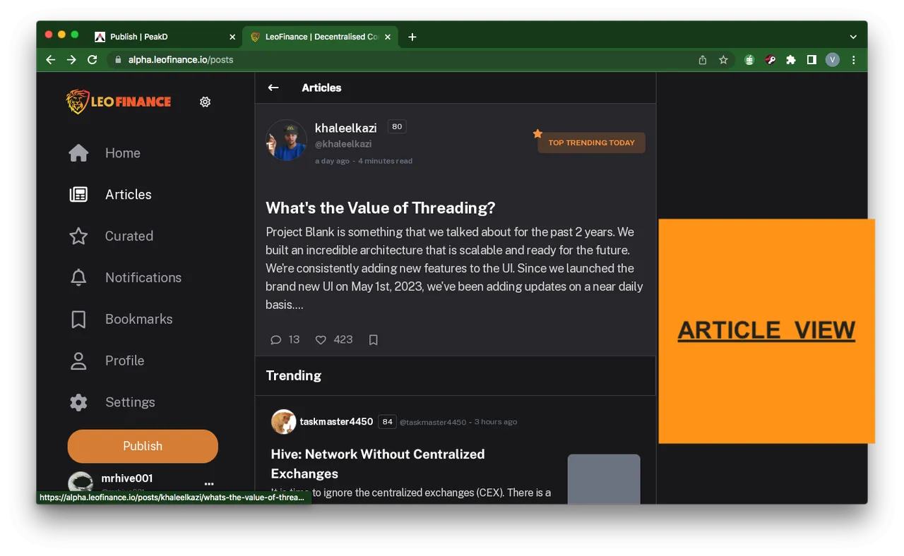
This is another longed for feature that has been waited for by all members of leofinance community. How can one write a post, without the aid of other interfaces one can read the post published another time or day and can't even read others as well, but finally we have it right there with us as the expected is now served and launched.
The Unveiling of Features long waited and sought for earlier before now and the fixing of bugs that earlier on clogged on the interface is an indication that in the sooniverse to come, references to this interface will be made in and out of hive blockchain.
Thanks for stopping by friends.