Designed by mrhive001 using canva
Hurray, it's no longer Blank!
With the integration of these numerous features on this new interface, we can all proudly and evidently say that the blank space has been filled up with interesting features that are top-notch not only to serve for the mean time but also for the great future that leofinance has.
It is also okay to note that these features added are not just for the betterment of the interface but are also user-friendly. They are user-friendly in the sense that they require little or no orientation on how to navigate through them.
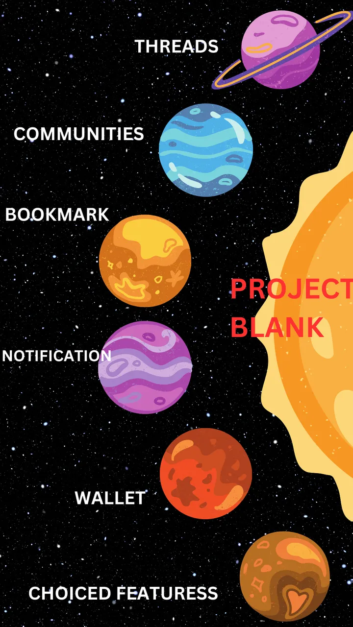
The Features that Filled the Blank Space
(a)
Threads
Threads, which is one of the most enticing features that filled up the blank space on the new interface, has drawn the attention of hundreds, if not thousands, of users on Hive Blockchain. The main reason behind this influx of other hive users is the communion and companionship that come with threading. The building of relationships with other hive users is something that, to a much greater extent, writing long-form content can't do, as some users don't have all the time to read all these long-form contents, so they prefer the short ones. A thread came through and gave the answer.
Outside of the fact that the engagement is top-notch, the social media vibe that follows is something one should experience. Literally all the social media add-ons that accompany engagement are something we experience here on Threads. On the aspect of sports activities and news @wealthwess is overseeing that, on the aspect of foodies, I handle that, also boss @taskmaster4450 that handles music aspect outside of other threads he do is another interesting thing one could experience as thread is just a world altogether on hive.
Threads being a world on itself here on leofinance and hive Blockchain at large has followed so many projects up such as #zealy campaign and then it's like an open field where literally all the threads on different angles one could see and view through irrespective of if the threader is following the one threading it or not.
(b)
Community Segmentation
This is yet another indicative feature to prove that the once-blank project is getting filled up as the days go by. One important and promising effect of this is that not only are features added, but attention is still given to feedback so that bugs can be fixed during the process of adding new features.
The community Segmentation on the project blank is one of the featuress that is interesting and deserves being looked out for. Because the interface isn't only meant for Leofinance users and participators of her project, other Communities outside of Hive are carried along as the interface tends to host them too, irrespective of what could be their interests and projects best befitting their niche.
Citing an example of a user that focuses more on information and new related articles which is seen on @informationwar and #Deepdives community can still decide to use the interface to publish the said and prepared article on the community of intents. Any catch to using the interface when it comes to community Segmentation is the fact that such content might attract curators from the Leofinance community and, as such, might upvote the article. So the creator did not just go with hives and HBD as rewards but also Leo tokens.
(c)
Sensitive Notification and Bookmark Feature
Of no doubt is the fact that this is one of the features that contributed to the filling of the gaps and spaces that made the project blank. Had a feature like this not been added or not been thought to be added, the interface would still have a loophole because notifications are bound to come through.
The Integration of smart and sensitive Notification icons and features into the interface is so much needed that it detects the activities that happen to any account and gives the conclusion and verdict of what happened by responding with pop-up sounds and color identification to signal the user that there are things happening in the background of the account. It transfers the backend activities done on a specific account to a front-end view so that the user does justice to the notification.
The Bookmark Feature is such an important feature on this interface that articles that are written can be bookmarked and somewhat saved so that the reader might come back to them again, provided there is a need for them. If there is an absence of this, then the project is still a bit blank because the necessary tools are not being integrated so that it can equip the sweet spot of the interface.
(d)
Wallet Integration and Division
Surely, indeed, without doubt, this feature contributes immensely to filling the blank space on the project. Because on hive Blockchain there are always and constant earnings, these earnings can be given, but they also need to be monitored and saved. This is just what the integration of the wallet on this interface came to address.
Not just that the wallet was integrated, but rather it was integrated and divided for their respective purposes. The wallet for Leo, the wallet for Hive, and that for other Hive Engine tokens
The division of these wallets into their respective purposes serves it right for a good and standard Interface on hive blockchain, as we all know that leofinance community isn't just the wholesomeness of hive but other Communities follow, which of course might have their community token, so if leofinance interface is built for all irrespective of the other Communities on hive and it's been meant to accommodate all,then there is a need to build that space, and the division of the wallets gave the answer to it.
(e)
Users Choice Features
A well-matched feature on this new Leofinance interface that filled the once-blank space Taking my mind back to one of the podcast that boss @khaleelkazi said that he wants the interface to not just be a user friendly interface but that each user can decide how he or she wants the interface to be for him or her alone.
Proving this, the settings did justice to this, as people can decide the background color suitable for them while using the interface. One might decide to set it to be either white or blank, meaning that we are choice users that determine what we want on the interface and how we want it.
On the aspect of upvotes, one can equally decide the percentage of votes to be cast on each piece of content, be it short form or long form. This proved that it is a user-based interface.
Moreso, on the aspect of determining if one is to see links to posts or not, this is based on the user's choice, as the commands and options on the interface make it so to back the claims that it is a user-based interface.
The above features show that the once-named PROJECT BLANK isn't BLANK again.***
Thanks for stopping by, friends. Be blessed.